
Before i shared Full Width and Centralize Header in Twenty Sixteen (2016). Today i am sharing the modifications (using css) of The Rowling Theme by Anders Norén which is a new theme of wordpress.com. It is a cool theme and you can check Rowling THeme Demo. So lets start with the modifications…
1. If you want to change the Header background color of the Rowling theme by Anders Norén
.header-wrapper {
background: #452632 !important;
}
2. If you want to increase Site Title and Site description’s font color, size and font family in the Rowling theme
*** For site title use this code
.site-title {
font-size: 2.5em;
font-weight: 900;
letter-spacing: 2px;
text-shadow: 0 1px 0 #111;
text-transform: uppercase;
font-family: cursive !important;
}
*** For site Description use this code
.site-description {
color: #999;
font-family: ‘Merriweather’, Georgia, serif;
font-size: 17px !important;
font-style: italic;
line-height: 115%;
margin: 11px 0 0 0;
}
3. If you want to show the Site Title and Site Description to be centered
.site-title {
text-align: center !important;
}
.site-description {
text-align: center !important;
}
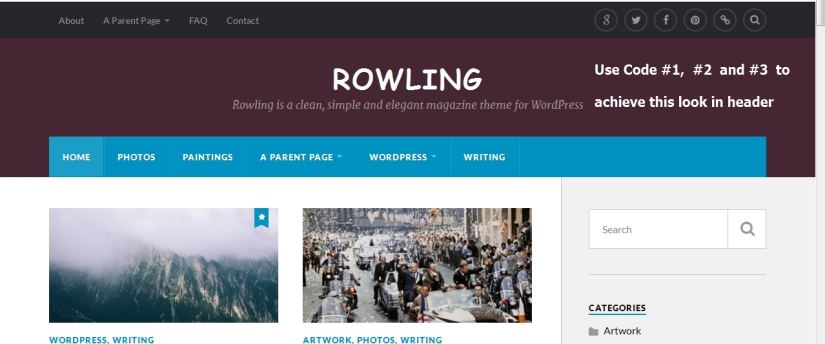
4. If you dont want to show Top Navigation menu in Rowling theme by Anders Norén
.top-nav {
display: none !important;
}
*** If you want to change the Top Navigation menu background color
.top-nav {
background: darkred !important;
}
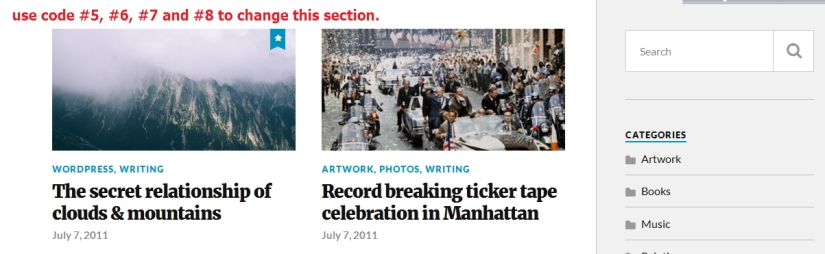
5.If you dont want to show category names and date in homepage posts
** to hide category in homepage
.home .post-categories {
display: none;
}
*** to hide date in homepage posts
.home .post-meta {
display: none;
}
6. If you want to change font color, weight, size and font family in home page posts of The Rowling Theme by Anders Norén
.home .post-title a {
color: red !important;
display: block;
font-family: cursive !important;
font-size: 20px !important;
font-weight: normal !important;
}
7. If you want to change Homepage post category font color, size and font family
.home .post-categories a {
color: blue !important;
font-family: times new roman !important;
font-size: 17px !important;
}
8. Same way If you want to change Homepage post date font color, size and font family
.home .post-meta a{
color: blue !important;
font-family: times new roman !important;
font-size: 17px !important;
}
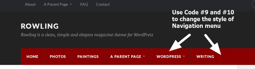
9. If you want to change the Navigation menu (Nav menu) background color
.header-bottom-menu > li > a {
background: darkred !important;
}
.header-bottom-menu > li {
border-top: 1px solid darkred !important;
border-right: 1px solid #333333!important;
border-bottom: 1px solid darkred !important;
border-left: 1px solid darkred !important;
float: left;
}
.header-bottom-menu > li.current_menu_item > a, .header-bottom-menu > li.current_page_item > a {
background: darkred !important;
}
.navigation .section-inner, .header-bottom, .nav-toggle {
background-color: darkred;
}
10. If you want to change Navigation menus hover background color
.header-bottom-menu > li:hover > a, .header-bottom-menu > li:hover {
background: olive !important;
border-top: 1px solid olive !important;
}
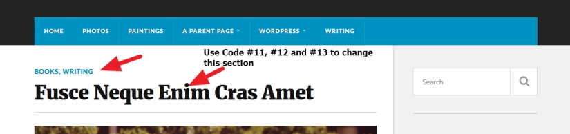
11. If you dont want to show post category at the top of single post page in The Rowling Theme by Anders Norén
.single-post .post-categories {
display: none !important;
}
12. If you want to change the font color, size and font family of category name which is showing at single post page
.single-post .post-categories a {
font-family: cursive !important;
color: darkred !important;
font-size: 17px !important;
}
13.If you want to change single post title’s font family, color, size
.single-post .post-title {
font-size: 2.5em !important;
font-weight: 900;
line-height: 1.25em;
margin-bottom: 10px;
font-family: times new roman !important;
color: darkred !important;
}
14. If you dont want to show date and author name in single post page and make the post full width
.single-post .post-meta {
display: none !important;
}
.single-post .post-inner {
width: 100% !important;
}
15. If you want to change sidebar widget title font color,font size,font family and border color
.widget-title {
border-bottom: 2px solid darkred !important;
font-size: 17px !important;
font-weight: 900;
letter-spacing: 1px;
margin-bottom: 15px;
padding-bottom: 3px;
text-transform: uppercase;
color: darkred !important;
font-family: cursive !important;
}
16. If you want to change sidebar widget links font family, font color, size
.widget-content li a {
font-size: 16px !important;
color: darkred !important;
font-family: cursive !important;
}
17. If you want to change the Folder icons color in sidebar widget
.widget_categories li a::before {
color: darkred !important;
}
18. If you dont want to show related post at the bottom of single post page
#jp-relatedposts {
display: none !important;
}
19. If you dont want to show Tags at the bottom of single post page
.single-post .post-tags {
display: none !important;
}
If you have any issue feel free to ask me question here in comments section
OR
You can take my personal help in skype : om2000_cuet

 All About Basic
Hi – thanks for all these hacks. I wonder if you have any thoughts about whether it is possible to change the layout grid on the front page, so that there are 3 posts per row rather than 2, with smaller and standardised thumbnails?
LikeLiked by 1 person
Hi,
it is possible…but for this the Sidebar from the homepage need to be removed…so that the content section can take the whole space
Om
LikeLike
Thank you. Might it be possible to use the space available now (with the sidebar still there), but change the grid layout for the posts so that 3 can fit where there are currently 2, with smaller featured images and text?
This would be really ideal.
LikeLike
Ok
to show 3(three) column layout maintaining the sidebar in Rowling theme…use these codes
.posts .post:nth-of-type(3n-1), .posts .post:nth-of-type(3n) {
margin-left: 5% !important;
}
.posts .post {
width: 29% !important;
}
.posts .post:nth-of-type(2n) {
margin-left: 0% !important;
}
let me know if it helps you or not
Om
LikeLiked by 1 person
Thank you. Yes it works, but the columns are not quite aligned (the middle column on the top row veers to the left and the image on the 3rd column starts lower down. On the second row, the middle column veers to the right – see here – https://goo.gl/p7lZc1 )
LikeLike
HI
can u share me the site url where you implemented it?
i will check it and will let u know
Om
LikeLike
Thank you. The site is http://transformingautism.co.uk
LikeLike
Thanks i am checking now
Om
LikeLike
HI
use this code please
.posts .post:nth-of-type(2n) {
margin-left: 5% !important;
}
before i used the value “0” … it should be 5%
please let me know
Om
LikeLiked by 1 person
Thanks very much for this. I have updated it and the first row looks perfectly aligned horizonally, but the 3rd image is still lower than the others.
But it seems to somehow push the following rows out. The second row starts with a slight indent, which pushes the 3rd image down to the 3rd row.
But I must say that the theme looks like it will be even better with 3 images per row. It might be a popular update to be able to customise the number of images on each row of the front page – though I don’t know how much work that would entail….
LikeLike
HI
would u mind to try this please
.home .posts .post + .post {
padding-top: 0px !important;
margin-top: 0px !important;
}
let me know what u get
Om
LikeLike
Thank you again
That has sorted out the top row, but:
– The dividing line between the rows has been removed, so they are very close now
– The second and 3rd rows still have only 2 columns
LikeLike
HI
thanks..here in comments section it is tough to help u properly for that issue
as i am unable to check properly the code and to test it…
but can u try to block or delete this code
.posts .post:nth-of-type(2n) {
margin-left: 5% !important;
}
from custom css (where u paste my code) and from style.css?
Om
LikeLike
Hi. I blocked it, and it didn’t change anything. But I noticed 2 things:
1 – If I change the width of .posts .post to 28 (instead of 29), this resolves the horizontal alignment and the 3 columns align perfectly.
2 – If I block the code you mentioned after changing the width, the alignment goes wrong again – so I guess that needs to stay in
3 – The divider has still not returned. If I change the margin and padding to – say – 10 instead of zero, the padding and the divider return, but the padding only returns from the second image, and the divider from the third.
This is what the site looks like now (with columns perfectly aligned) – http://goo.gl/QmnNNk
And below is what the CSS looks like now:
.posts .post:nth-of-type(3n-1), .posts .post:nth-of-type(3n) {
margin-left: 5% !important;
}
.posts .post {
width: 28% !important;
}
.posts .post:nth-of-type(n) {
margin-left: 5% !important;
}
.home .posts .post + .post {
padding-top: 0 !important;
margin-top: 0 !important;
}
LikeLike
Thats great 🙂
i think u got it resolved making the Rowling theme 3(three) column
Om
LikeLike
Yes – thank you for your support. You could issue it as an update – it really looks good with 3 columns.
As for the divider, if I change the last bit of code as below, it comes back, but not for the first image (and the second has the padding but not the divider).
.home .posts .post + .post {
padding-top: 20 !important;
margin-top: 20 !important;
}
It is ALMOST resolved by removing the .post + (I do not know what this refers to but tried it anyway) to leave the following code. This aligns the top row again, BUT pushes this row down, so there is empty space at the top, and a solitary divider above the 3rd image.
.home .posts .post {
padding-top: 20px !important;
margin-top: 20px !important;
}
I am about to leave for Denmark, but will be back on Tuesday, and will pick up any messages again then.
Thanks again for your great support – I think you just improved an already great theme.
LikeLike
HI
can u provide me the pieces of css together which is used to make the Rowling theme 3 column please?
i will share it as update in my main post
Om
LikeLike
Sure, but have left home now. Back Tuesday and will send then
LikeLike
Hi again
Back now, and here is the code. I have also used the techniques in your post to change the size of the heading text so that it is proportionate to the 3 column display.
There are 3 things that could perfect this before you publish it:
1 – Remove the separator from above the 3rd post heading (which pushes the page content down). I’m guessing there must be some logic somewhere that there are 2 columns and so the 3rd image should have a separator above it. Can this be changed so that the separator starts above the 4th image?
2 – Make the new display more responsive to mobile (currently showing one thin column on the left)
3 – In your Rowling Demo, all of the photos are cropped so that they are the same size, making the whole theme look very neat. However, mine crop to different heights, making it look a bit slapdash. Can it be set to crop to the same height?
If you need to see what I mean, my site is http://transformingautism.co.uk/
Rowling is now by far my favourite blog theme (now that it is 3 columns), and these changes would just make it perfect.
Thanks
Guy
/*
MAKE 3 COLUMNS
*/
.posts .post:nth-of-type(3n-1), .posts .post:nth-of-type(3n) {
margin-left: 5% !important;
}
.posts .post {
width: 28% !important;
}
.posts .post:nth-of-type(n) {
margin-left: 5% !important;
}
.home .posts .post {
padding-top: 20px !important;
margin-top: 20px !important;
}
/*
RESIZE HOMEPAGE TITLES ACCORDINGLY
*/
.home .post-title a {
font-size: 22px !important;
}
.home .post-categories a {
font-size: 13px !important;
}
.home .post-meta a {
font-size: 13px !important;
}
LikeLike
HI Guy
thanks
sorry for the late response
so you want the 3 column to be mobile responsive..
am i right?
let me know
Om
LikeLike
That would be great if it is possible. It doesn’t necessarily need to be 3 columns on the mobile, but at the moment, there is sometimes only one very thin column down the left side.
Also, it would be great to solve the issue of the divider over the 3rd image.
It is great – I am just seeing if we can perfect these final things (and the standardised image sizes)
LikeLike
HI Guy
to implement mobile responsiveness in Rowling theme (in 3 column layout) wrap the code i shared and u used in this
@media only screen and (min-width: 760px) and (max-width: 2000px)
{
ALL YOUR RELATED 3 COLUMN CSS CODE WILL BE HERE
}
please let me know if it helps you or not
Om
LikeLike
Yes, that works perfectly, thank you. Now the theme looks good on all devices!!! Getting better and better.
Did you understand what I meant about the divider over the 3rd image? You can see what it looks like at http://transformingautism.co.uk
LikeLike
HI Guy
you mean to remove the top border from every 3rd image ( i mean in the 3rd column posts)
please let me know
Om
LikeLike
No – just the one on the top row. There are dividers above all of the images on the front page to separate the rows from each other. It looks good. But they start on the third image – the first 2 do not have them because they were intended to be on the top row. When it was a 2-columns, this worked exactly as it should, but now that it is a 3 column display, there should be no divider over the 3rd image either. Now the dividers over the images should start on the 4th image.
LikeLike
HI Guy
please try this
.posts .post:nth-child(3) {
border-top: none;
}
Please let me know what u think.
Om
LikeLike
You’ve done it again!! It has gone now. Thank you.
There is still quite a big gap between the blue menu and the start of the images, and if this could be closed that would be great, but the requests are getting smaller and smaller now…
The only other one was about standardising the size of the featured images on the front page.
LikeLike
HI Guy
to reduce the space between blue menu and the featured images in your Rowling theme
try this
.home .content {
padding-top: 0px !important;
}
Regarding the featured image size
actually i can share css to resize them..but some images quality may be hampered
Om
LikeLike
Perfect. It works and now looks great again.
Yes, please share the css to resize them. Is this the same css you used on your sample site where the images were all identically sized and looked great?
LikeLike
Hi Guy
please try this
.home #posts img {
width: 250px !important;
height: 150px !important;
}
OM
LikeLike
Hi again
Sorry – have just noticed an anomoly. The front page is fine, but the category pages (and the tag pages) are still pushed down by a divider right across the top. This is what it looks like – http://transformingautism.co.uk/category/autism/
I guess it is just a question of adding something simple to the CSS to make it apply to these pages too?
LikeLike
HI Guy
would u mind to try this please?
.archive .posts .post + .post {
margin-top: 0px !important;
padding-top: 0px !important;
}
*** i prefer u checke by adding a new post to check the 6th post is working fine or not
Om
LikeLike
Thank you. It works to bring the top row (and the second row) into line, but the dividing line is still over the top row, but not over later rows….
LikeLike
Hi Guy
would u mind to remove my previous code and use this code please
.archive .posts .post:nth-child(3) {
border-top: none;
margin-top: 0px !important;
padding-top: 0px !important;
}
.archive .page-title {
border-bottom: none !important;
}
please let me know what you get
Om
LikeLike
Great – this sorts it out. Thank you again!!!
Final (we hope) code is:
/*
MAKE 3 COLUMNS
*/
@media only screen and (min-width: 760px) and (max-width: 2000px) {
.posts .post:nth-of-type(3n-1), .posts .post:nth-of-type(3n) {
margin-left: 5% !important;
}
.posts .post {
width: 28% !important;
}
.posts .post:nth-of-type(n) {
margin-left: 5% !important;
}
.home .posts .post {
padding-top: 20px !important;
margin-top: 20px !important;
}
.archive .page-title {
border-bottom: none !important;
}
.archive .posts .post:nth-child(3) {
border-top: none;
margin-top: 0 !important;
padding-top: 0 !important;
}
.posts .post:nth-child(3) {
border-top: none;
}
.home .content {
padding-top: 0 !important;
}
.home #posts img {
width: 250px !important;
height: 115px !important;
}
}
/*
RESIZE HOMEPAGE TITLES ACCORDINGLY
*/
.home .post-title a {
font-size: 22px !important;
}
.home .post-categories a {
font-size: 13px !important;
}
.home .post-meta a {
font-size: 13px !important;
}
LikeLike
Pleasure Guy 🙂
Om
LikeLike
Perfect. I set it to 250×115, as many of the photos had been cropped to that size anyway. Only only was distorted, so I cropped it to that ratio and it now appears perfectly.
Thank you – we now have a perfect Rowling theme!!!! I hope others can appreciate it too.
In case you need it, the entire code is:
/*
MAKE 3 COLUMNS
*/
@media only screen and (min-width: 760px) and (max-width: 2000px) {
.posts .post:nth-of-type(3n-1), .posts .post:nth-of-type(3n) {
margin-left: 5% !important;
}
.posts .post {
width: 28% !important;
}
.posts .post:nth-of-type(n) {
margin-left: 5% !important;
}
.home .posts .post {
padding-top: 20px !important;
margin-top: 20px !important;
}
.posts .post:nth-child(3) {
border-top: none;
}
.home .content {
padding-top: 0 !important;
}
.home #posts img {
width: 250px !important;
height: 115px !important;
}
}
/*
RESIZE HOMEPAGE TITLES ACCORDINGLY
*/
.home .post-title a {
font-size: 22px !important;
}
.home .post-categories a {
font-size: 13px !important;
}
.home .post-meta a {
font-size: 13px !important;
}
LikeLike
Pleasure Guy
Om
LikeLike
Hi again – This has been working really great on my site, but now that I am increasing the number of posts, I notice that the front page only hosts 10 stories, and the 11th goes onto a second page. Now that there are 3 columns, 10 stories makes 3.333 rows – so the final row has only 1 story on it and the rest of the row is empty, which looks strange. Is there a way to change the cut-off point that triggers a new page. It would be good if this could be either 9 or 12 stories. Best Wishes
Guy.
LikeLike
HI Guy
sorry for the late response…facing some family issue ..
yes you can show 9 or 12 posts…you can do it from Appearance> Reading option in ur dashboard
Om
LikeLike
Great – thank you. Works fine!! Had missed this message until today – sorry.
LikeLike
Thank you – this works great.
LikeLike
Trying to augment the CSS to remove:
– the featured image on ALL individual posts (displays as thumbnail top/middle)
– the author comment/live search link on ALL individual posts
Found the elements using Google Developer but challenged in the specific naming convention in applying the CSS customization.
Thank you in advance for any help.
LikeLike
HI
thanks
sorry for the late
so regarding your issue
1. To remove the Featured image from single post page in Rowling theme use this code
.single .post-image {
display: none !important;
}
and would u mind to clarify what you mean by
“– the author comment/live search link on ALL individual posts” ?
Om
LikeLike
You are a rock star!!! Thank you! Spend the better half of a week trying every permutation to try and augment that setting via CSS
The second request is the author v-card/comment box that is located at the bottom of every post in this Rowling theme. I have turned off all comments yet every post has a ‘dialogue box’ from the post author (me) including a live link on author’s name to search for all posts by author which in this site is every post and unwanted.
To sum; Wish to have neither the comment box and author name display on any/every post.
Thanks!!!!
Dave
LikeLike
HI Dave
thanks…sorry for the late response
To remove the black author box at the bottom in single post page in Rowling theme use this css code
.single footer.post-footer {
display: none;
}
Om
LikeLike
One related item; when I added the CSS to turn off the featured image on each post, the ‘related posts’ at bottom of post is also gone.
The following settings are checked in the Admin Portal:
==========================
Show related content after posts
Show a “Related” header to more clearly separate the related section from posts
Use a large and visually striking layout
========================
When I applied the CSS script, this is not displayed in any format
Thanks!
Dave
LikeLike
Actually scratch that last post re ‘Related Content’ as the lack of display was due to no content related to a particular post and not the case when I looked at 4 or 5 others.
I would like to move this from the bottom of the post to the display vertically on the left side of the post next to the body of the post.
Sorry about any confusion.
Thank you in advance!!
LikeLike
Hi Dave
To remove the featured image at the top of single post in rowling theme use this code….
.single-post .post-image {
display: none !important;
}
***** this code is not or will not hamper the “Related” posts at the bottom.
LikeLike
Ha! – upon a deeper review of posts in multiple categories, the related content is now not being displayed. Ideally want the related content displayed vertically next to body of post as mentioned above.
Sorry about the confusion but needed to refresh the site opened in a different tab to view post display with most recent changes.
Any help would be welcome.
LikeLike
and it seems like the related posts display is category specific as it displays in some and not others – site has 16 categories.
sorry about confusion but lots of content in the site and there are at least 3 categories that do not display the related content while at least 6 do. Strange….
LikeLike
Not sure if the site just needed more time to completely refresh but now within all of the categories, all posts display the related content posts on the bottom of the post.
Still interested in move up to left side and have the related content vertically display on the left side of post body.
LikeLike
OK, went it and input CSS:
———————————–
.single .post-author {
display: none !important;
}
———————————–
and post-author is no longer displayed. Seems the ‘important’ component was the missing secret sauce from my earlier tries.
Why is this needed?
LikeLike
Hi
it is needed to overlap the previous default code
Om
LikeLike
Still interested in changing to a vertical display on related posts as well
LikeLike
Hi Dave
actually it will need to modify the theme php files which is problematic to help here
Om
LikeLike
OK – I have used Google Developer to find the php files for the various elements on site
For the related posts in php:
===================
======================
Just cannot figure out how to move to vertical side and make changes to template. If that is beyond the goals of your support, I completely understand.
LikeLike
Hi
actually i can help u for that..but that is paid help which i can do to u ( for that issue)..
Om
LikeLike
OK – as a near term work around can I align post-inner to the left border so the white space is no longer there.
Thanks
LikeLike
I successfully used the following CSS
==========
.single-post .post-inner {
width: 100% !important;
}
============
to address white space on left side of post
still trying to address
– image sizing whendisplaying on front page
– single post header align center
LikeLike
HI
thanks
actually if i use css to make the homepage images same height than it would not be a good idea….
Regarding single page header align issue
*** which one u r referring? header image or title?
Om
LikeLike
I figured out that Rowling is best with a 2:1 image ratio and I could either select images in that ratio or edit the images in the featured image media file.
Going to keep the post title left aligned.
The one outstanding current issue is the space allotted to the right widget when viewed on desktop. Seems like too much blank space, not sure if the body can be narrowed to eliminate that spacing.
LikeLike
Hello, I have just added a few more pages to my site. How do I get these pages and their links to also appear on the navigation bar? Sorry, I am very new to this. Thanks!
LikeLike
I have figured it out – there is no need to address this question, thanks.
LikeLike
That’s really great 🙂
LikeLike
Is it possible to hide the author, published by at the bottom of posts?
LikeLike
HI Jon
would u mind to share me the site url where you want to do the change please?
Om
LikeLike
Hi, Could you let me know how to change the hover color for the sub menu items? The text disappears as the hover color is same as background. Website: http://www.thebestdealsclub.com/
LikeLike
HI
to change hover menu color of sub menu items in Rowling theme
.sub-menu a:hover {
color: white !important;
}
let me know if it helps
Om
LikeLiked by 1 person
Worked like a Charm. Thanks a lot! Can you also let know how to do the same in the credits section (footer)
LikeLike
Pleasure..to change footer hover color use this code
.copyright a:hover {
color: white !important;
}
Om
LikeLiked by 1 person
I tried something similar earlier but didn’t work. This worked. Thanks again and appreciate your help
LikeLike
Pleasure 🙂
Om
LikeLike
Hi Om,
Is there a way to display an ad on the right side of the header, next to the site name?
LikeLike
HI
if you are using your own domain and hosting then by modifying the files add can be shown easily
Om
LikeLiked by 1 person
yes, i have my own domain and hosting. the website is http://www.thebestdealsclub.com/
LikeLike
HI
i need to check your dashboard, and for this i need login details..would u mind to contact me in my fiverr address please?
https://www.fiverr.com/om2000_cuet/solve-your-wordpress-blogs-csshtml-and-other-wordpress-issues
Om
LikeLike
I cant figure out how to use my own header with this theme. or if I can just make the logo appear bigger. it just comes out looking pixelated. ideally I would like to use my own image header with this theme. is there a code for this?
LikeLike
HI
what size you prefer for your logo?
let me know
(I will check and let u know in my evening)
Om
LikeLike
hey! i ended up getting so frustrated i just changed my entire theme. the logo size i would prefer is 800 x 384 but it seems the theme restricts the logo to 80 pixel height. i had found a code to resize but it left my logo looking incredibly pixelated, if you could fix this with a code for me i would love this theme.
LikeLike
Ok great …..
Om
LikeLike
cool, just let me know (:
LikeLike
Hi
u solved the issue by changing theme? or u need help for logo?
LikeLike
i would still like help, i want to use the rowling theme if i can fix the logo issue
LikeLike
or if there is a code to add a header
LikeLike
Hi Trillvo
i need to check your dashboard..
would u mind to contact me here please
https://www.fiverr.com/om2000_cuet/solve-your-wordpress-blogs-csshtml-and-other-wordpress-issues
Om
LikeLike
Hi – could you let me know whether it is possible to cap the number of posts that appear on the homepage, i.e. to limit how far down people can scroll? Thank you.
LikeLike
HI
thanks
you can show any number of posts in homepage or blog page..
just go to your dashboard > Settings >Reading> and from that window check “Blog pages show at most” option …from there u can select the number u want to show
Om
LikeLike
Hi there – thank you so much for your reply. Unfortunately, however, I cannot seem to see an option called ‘Reading’ under my settings. My headings are ‘General – Writing – Discussions – Analytics – SEO – Import – Export. Could you help me to find the ‘Reading’ section?
Thanks in advance.
LikeLike
HI
are u using wordpress.com free hosted site?
LikeLike
Yes, I think I must be!
LikeLike
Can u share me screenshot of ur Settings section please?
LikeLike
Sure, how should I do that?
LikeLike
HI
using paint software of windows OS or any other screen capture software
OM
LikeLike
Hi again, I have the screenshot, I meant how should I send it to you? Cheers.
LikeLike
HI
upload the image in ur media library and give me the link
Om
LikeLike
Hello, how can I change the sidebar? My sidebar consists of a search form, recent posts, categories and an archive. But if I go to widgets, I do not see these elements at the sidebar option. My website is http://www.mamalifestyleblog.nl. I hope you can help me.
LikeLike
HI
in you sidebar widget..put any widgets and check again
i think those widgets are showing by default..
please let me know if u got my point
OM
LikeLike
Hello, @allaboutbasic ,
This page is very helpful for me to solve my rowling theme problems so thank you very much indeed!
-May I ask how can I pull the tumbnail images of RSS contents for my sidebar in the homepage? (medyaroportaj.com) I could pull the RSS text contents, but couldnt pull the images.
-Secondly, I have a few category titles. One of is empty now, no contents and I would like to display just an RSS content of another website in that category title. How can I do it?
LikeLike
HI,
in wordpress.com which plan you are using?
let me know
OM
LikeLike
It is business, can write in css panel
LikeLike
ok..got it,
to show RSS Feed, are you using any third party plugins?
let me know
OM
LikeLike
ok..got it,
to show RSS Feed, are you using any third party plugins?
let me know
OM
LikeLike
Not quite sure. I mean i didn’t buy anything, just added that RSS from “widgets” for sidebar in WordPress menu.
LikeLike
Yes, using that widget, i guess images will not be viewable,
i prefer you check RSS plugins for that
as you are using business plan, you should be able to install plugins
OM
LikeLike
Thank you, i did search some of them but always meet RSS plugin solutions for ourselves websites to other websites. Not from other websites from mine. So do you have any suggestion for plugin?
LikeLike
Hello again,
You had asked my wordpress package, it is premium not business, i had said it wrong. pardon me. So as you suggested to me “the featured images in Rss” plugins. It needed to be passed to business plan. Do you have any other suggestion?
Thank you for your support
LikeLike
Hi,
you can’t install any plugins then
so… can’t provide any suggestion
Om
LikeLiked by 1 person
And how can I delete the name Anders Noren from the footer?
LikeLike
HI
to remove Aners Noren try this code
.attribution {
display: none !important;
}
Om
LikeLike
Thans a lot for tour help!
LikeLike
Pleasure 🙂
Om
LikeLike
Hi
I have 0 knowledge in coding. My problem is I misspeled a Category in Rowling theme (russia instead of Russia) and I can’t change it… how to remove or correct a Category spelling?
Thanks in advance?
Tom
LikeLike
HI Tom
remove that category and create a new category using the correct spelling…and assign the posts again to that correctly spelled category?
please let me know
Om
LikeLike
that’s the problem… I don’t know how to remove it..
LikeLike
HI
you should be able to do it from Dashboard > Posts > Categories section?
Om
LikeLike
The hardest thing was to get into dashboard but I succeeded… thank you very much!!!
LikeLike
Pleasure 🙂
if you have any issue u can let me know
Om
LikeLiked by 1 person
Hi
Is it possible to enlarge the Logo on the top right?
I tried this but the result was that the logo was larger but the quality had diminished and was very blurred.
a.site-logo-link img {
width: 128px;
height: 128px;
}
.site-title { padding-top: 20px; }
Is there any way to increase the size and keep the quality?
This is my site.
https://europaunited.eu/
LikeLike
HI Ken
the logo u used “Europe United” is 80×80 in size..
i prefer u use larger logo to use
Om
LikeLike
The problem is though that I used a new logo which is 7070x 5000 but it was still blurred when I tried to enlarge it using the formula I mentioned above.
LikeLike
Ken
actually it would better if u contact me to my fiverr profile…i may need to check the dashboard..
Om
LikeLike
Hi, great post thanks for sharing. Is there any way to add a footer to the Rowling theme with custom CSS or any other way? Thanks in advance for your help 🙂
LikeLike
HI
are u using wordpress.com free site?
in such case there is some sorts of restriction
Om
LikeLike
Hi yes I am using wordpress.com free site. But I can upgrade to Premium is I need to. I know there is an option to use Footer Builder with wordpress.org, but wondered if there is a way with wordpress.com. thank you
LikeLike
HI

wordpress.com has these footer feature only
Om
LikeLiked by 1 person
Ok thank you for your help.
LikeLike
allaboutbasics, I have tried severally to change my header background color with the code you provided above without success. Pls, is there any thing you could suggest to make this achievable for me? Thanks..
LikeLike
HI Femi
in which site you are working?
share me that site’s url
Om
LikeLike
Thanks…my url is oshakmusicblog.com
LikeLike
Hi Femi
please try this code
.header-wrapper {
background: darkred !important;
}
Om
LikeLike
Thanks allaboutbasic..it didn’t work. Any other suggestions?
LikeLike
Where you put the code?
LikeLike
In my theme’s CSS under Header section. Thanks for your time.
LikeLike
Hi Om, is there a way to add blog posts under a second page just like we add on the homepage? thank you. anu
LikeLike
Hi Om, my blog is https://ehottige.wordpress.com/ the content is in Kannada
LikeLike
Hi Anu
i have checked your issue, as you are using wordpress.com free hosted site…so.. it is tough to implement your issue properly..
but..
you can show your blog posts in 2 pages ..1 in homepage and in anyone of your other pages…so.your homepage and that page will be similar
will that be ok to u? i can tell you the technique if you want
let me know
Om
LikeLike
Hi Om,
Then I have few questions please:
1. Do you think I should go for the paid premium options of the same theme?
2. Can I easily move the content I have built to wordpress.org?
3. If the above two are not to be wise options, could you please show me how to reflect a blog post I create in homepage to reflect on other pages? Perhaps that would be a very effective solution.
Thanks much for your quick response.
Anu
LikeLike
HI Anu
thanks
please check this link (screenshot) first (blog posts in homepage and in different page)
LikeLike
om, your ccs ode is helps me a lot. thanks mate1
LikeLike
OM, how to remove “Comments are Closed” in rowling? (i closed all comments in my blog)
LikeLike
Hi Clara
share me the link (url) where Comments are Closed is showing
OM
LikeLike
Hi
Great article.
Is it possible to make the top social icons on the top right of the home page any bigger?
Thanks
LikeLike
Hi Belmira
sorry for the late response
would u mind to share me the site url where u want to do the change?
Om
LikeLike
Hi Om
The URL is http://www.beans-on-tour.com
Thanks
LikeLike
Hi Belmira
please try this code
.social-menu a {
height: 45px;
width: 45px;
}
.social-menu li a::before {
font-size: 22px;
margin-top: -11px;
}
let me know
Om
LikeLike
Thanks.
The code worked perfectly.
LikeLike
Pleasure..please don’t forget to let me know if you have any other issue in future
Om
LikeLike
I am trying to change the color of my main navigation menu hover color. Number ten above, Right now its defaulting to the blue from the theme, I went in to the style sheet and changed the color or the menu but I want to change the hover now. I cant find header-bottom-menu anywhere in the coding and I have inserted my new hex code almost everywhere that I see “li:hover” and nothing is sticking for my hover on the main menu…..pls help it is driving me bonkers
LikeLike
Hi Mandy..just checked, what is your site URL? let me know
Om
LikeLike
Thanks, you made my day
LikeLike
Hello
the theme is not totally responsive, especially on smartphones, because the secondary menu at the top of the page is not visible. how to solve this?
Thanks
LikeLike
Hi Pedro
please share me your site URL to check
OM
LikeLike
Hello
http://www.escolaaugustogomes.pt/website
Thanks in advance
LikeLike
Hi
sorry for the late response….
i have checked your issue
one thing can be done….
1. the top menu which is not showing in mobile… add those menu item in the menu which is showing in mobile but let them not to show in desktop
2. so.. those menu items will not be visible in desktop…but will be visible in mobile
u got the tricks?
let me now
Om
LikeLike
Hi allaboutbasic
Thanks, but this not fixed my problem, because I need both, the primary and the second menu.
Pedro
LikeLike
Hi Pedro
the solution i shared
in mobile…all your primary and secondary menu items will be visible in same menu..u got the point?
LikeLike
Hi
Yes, I understand. But the menus have a diferent importance and it’s interessant tha they don’t appear in same localization.
LikeLike
I see… but if u have two menu burger symbol in mobile site..will that look good?
please let me know
Om
LikeLike
Two menu burger symbol?
If it is not possible I prefer to change the theme to one that the 3 menus are visible.
LikeLike
Hi Pedro
sorry for the late response
would u mind to contact me in my fiverr profile please?
Om
LikeLike
how to remove the sidebar or change its color?
LikeLike
HI
share me your site url
Om
LikeLike
I am having problems with the navigation on smaller devices like tablets, smartphones.
If the menu has many items, the list becomes very long because all menu items are shown at the same time:

Apart from that, it would be great if the theme could only show 1st-level items at the beginning and 2nd-level itmes only, if the relevant 1st level item is selected.
Maybe, you have a solution for that?
LikeLike
Hi Ruediger
have you checked wp responsive menu pluigns ?
LikeLike
So great! Thank you!
LikeLike
Hi,
Any possible way to add an image as the header to this theme?
So far all I am able to do is add a small logo (but not a full length image.)
Can It be done?
Please let me know.
Thank you.
LikeLike
HI
i found you have done this already?
Om
LikeLike
Hi allaboutbasic,
I was able to add an image as the header to the Rowlings theme but it is too big, some of the image is hidden, and does not look good on mobile devices.
https://tomkerasias.com/
This is what I did:
=====================================
/*
Welcome to Custom CSS!
To learn how this works, see http://wp.me/PEmnE-Bt
*/
.header-wrapper {
background-image: url(‘https://tomkerasiascom.files.wordpress.com/2018/02/facebook-cover.png’);
background-size: cover;
background-position: center 15px;
height: 660px;
background-repeat: no-repeat;
}
===========================================
If possible, I would like to reduce the image to about 1/3 its size so it is all visible and have it look better on mobile devices.
Any suggestions would be greatly appreciated.
Thank you.
LikeLike
Thanks
please check this code
@media (min-width: 240px) and (max-width:560px) {
.header-wrapper {
height: 190px;
background-size: 100% !important;
}}
and check your site in mobile device
let me know if it is ok?
Om
LikeLike
Hi There! Is there any way to change the margins in the theme so my posts show closer to the left side of the page? The theme seems to have it set to have a lot of space between the left side of the page and where the post starts.
LikeLike
Hi
please share me the site URL you are working on
Om
LikeLike
Hi… https://www.morediylove.com
LikeLike
HI
would u mind to try this first please
.single-post .post-inner {
float: left !important;
width: 100% !important;
}
LikeLiked by 1 person
That worked perfectly! Thank you so much!
LikeLiked by 1 person
So it looks like I need a little more help. I was able to change the color on the navigation header to the coral that I wanted and the hover color to the tomato color. Unfortunately I can’t figure out how to change the sub headings and sub headings within the sub headings to the LightSalmon color I want. The header is also causing me issues trying to look more aligned. What I mean by that is I have 7 categories in the header now (which I will end up adding more later) but they are all bunched over to the left side and I have a large blank box on the right side. Any help you can give would be much appreciated! Thank you! https://morediylove.com/
LikeLike
HI,
you want to change the sky blue color of the drop down menus?
please let me know
Om
LikeLike
Yes. Change the blue color of the drop downs and make so that there isn’t a lot of empty coral color space on the right side of the category menu.
LikeLike
HI
try this code
@media (min-width: 851px)
{
.header-bottom-menu ul {
background: red !Important;
}
}
let me know if it helps
*** it will change the submenu background color
Om
LikeLike
Submenu background color changed perfectly! Thank you. The spacing on the menu bar didn’t change at all. This is what I put in:
@media (min-width: 851px)
{.header-bottom-menu ul {
background: red !important
}}
Is that right?
LikeLike
Hi,
so you want your top menus to spread more….i mean… the gap between between top menus to increase…right?
*** the code i shared before is only for color change
Om
LikeLike
Ok. Yes, that’s exactly right. If I could spread them out more. Then when I add more categories, I can adjust it according. Thank you again for all you help!
LikeLike
Try this code
@media (min-width:1200px)
{
.header-bottom-menu > li {
width: 14.2 !important%;
text-align: center !important;
}
}
LikeLike
Unfortunately it did not work.
LikeLike
please try this
.header-bottom-menu > li {
width: 14.2 !important%;
text-align: center !important;
}
let me know what u get
LikeLike
Unfortunately that didn’t work. There was no change. Also got an error on the % within the code.
LikeLike
seems there are some wrong when you are implementing it…
i prefer you communicate me in my fiverr profile please so that i can check the dashboard
Om
LikeLike
Hi! I want to change the site-title font type, but I don’t know where do I have to paste the code you wrote 😦 Can you help me? Thanks a lot!!
LikeLike
Hi Mary
what is your site url?
let me know
Om
LikeLike
How can i change the color of the template “white” area left from the .Content area? I would like to change the color of this to black (or something else). I manage to get the .content in the middle to black by using the following code.
.content {
background: #000000;
}
LikeLike
HI Harri
sorry for the late response
would u mind to share me your site url where you are working on please?
Om
LikeLike
Hi, Can I get rid of the problem below???
When I installed Rowling theme on my WordPress blog, all the post content & images move to the left in the WordPress editor. Also, the images look blurry now in the editor & the blog. You can check the screenshot here: https://fulltechhelp.com/screenshot-127/
I really love to use Rowling & don’t want to change it. So please let me know how can I fix that error.
Thanks!
My site URL: fulltechhelp .com (remove space)
LikeLike
Hi Harish
umm
the editor image you shared
are you not using wordpress default editor?
please let me know
Om
LikeLiked by 1 person
Thanks for this article! Is it possible to include an excerpt below post titles when not using featured images? It seems that nothing happens when using excerpt from WordPress options.
LikeLike
Hi Rick
are you using wordpress.com or your own hosting?
let me know
Om
LikeLike
Own hosting
LikeLike
Then it can be done Rick
🙂
LikeLike
Hi, would you be able to help me with my footnotes and endnotes on my website: jewishbelief.org , i want to make them clickable. The posts already up already have that feature because they are imported from another site, but new posts on this web won’t have clickable footnotes. The plugins for this feature don’t seem to work. Thank You!!!
LikeLike
Hi Dovid
sorry for the late response
would you mind to clarify me the issue some more please?
sorry didn’t understand properly
Om
LikeLike
Thank you for getting back. I would like to make that when a footnote is clicked, it will show the footnote without having the need to scroll to the bottom. So I got a plugin called inline footnotes which does that job. However, it only does that with footnotes made manually with the special html code they give. The problem is that my footnotes aren’t done manually rather are copy pasted from microsoft word. It’ll be an almost impossible job to mannualy reformat every single footnote. Is there a way to get the plugin inline footnotes to recognize a footnote pasted from Word? Thank you!
LikeLike
HI Dovid
sorry…would you mind to tell what you are referring as footnote?
when i visited your site https://jewishbelief.org/, i found the blog posts are showing with Image, Category link an title?
Om
LikeLike
When you click one of the posts, you’ll see footnotes in the text. They are blue numbers that stick out
LikeLike
Sorry Dovid
i got your point..not seeing option what you mentioned as u r using copy paste from MS Word
Om
LikeLike
If you click on a article, you will find noticable blue numbers. Those are the footnotes I’m refering to.
LikeLike
Hi Dovid
thanks..sorry for the late
i am checking
LikeLike
Hi, first off all thank you so much for all, i learned a lot from your site. On my blog jewishbelief.org there’s a noticeable small line under each post’s name on the homepage. Is there a way to get rid of that odd looking small line?
LikeLike
Hi Dovid
sorry for the late response
i think you should try this
.home p.post-meta {
display: none;
}
let me know if it helps
Om
LikeLike
Worked like a pro! Thank you!!!
LikeLike
Hi, I realized now that this same small line is under all the articles except for those on the homepage. Is there a way to get rid of em?
LikeLike
HI Dovid
which line you are talking about?
LikeLike
for example, see all the articles under this volume: https://www.jewishbelief.org/category/vol-1-the-torah-g-d-given-or-man-made/
there’s a small line under the headline
LikeLike
Hi Dovid
try this please
.archive p.post-meta {
display: none;
}
let me know if it helps
Om
LikeLike
yes, it worked like magic. god bless you!
LikeLike
Pleasure Dovid 🙂
yes pray for me
LikeLike
Hi, how do I remove “posted by…on” from my posts. I’ve managed to get rid of the date but not the author’s name and “on”. see my web at jewishbelief.org Thank you!
LikeLike
Hi David
please try this
.resp:nth-child(1), .post-meta-author, .post-meta-date {
display: none;
}
Om
LikeLike
Thank you!!! Worked perfectly!
LikeLike
Hi, seems that my web is close to perfection in terms of layout. I have one more issue though. Under the title and on top of the image of each post it shows the comment count. for examples see https://www.jewishbelief.org/does-g-d-exist/ is there a way to get rid of it?
LikeLike
Hi Dovid
please try this
.post-header span.post-comments {
display: none !important;
}
Om
LikeLike
worked, thank you!!!
LikeLike
Hi, could you tell me how to reduce the padding / the space between the top-secondary menu and the Logo-image (and maybe below the Logo Image also? Thank you for your great Service!!!
LikeLike
Hi Manfred
try this code
.header {
padding-top: 10px !important;
padding-bottom: 10px !important;
}
let me know if it helps
Om
LikeLike
Perfect. Thank you very much. I like to use the Rowling theme from now on. Great to know that you are specialist for it and that I can ask you if needed!
LikeLike
sure
🙂
LikeLiked by 1 person
Hi Omprakash, I would like to ask one more question. When I select the Gallery Post format in Rowling I can only click/select ONE Image (in the Image Library) from the featured image section. Do you know how to select more than one and have them shown in the featured image area? Thanks!
LikeLike
Hi Thanks
sorry for the late reply
actually featured image is only to show 1 image
🙂
LikeLike
Thanks – I found an answer here that shows how to do it. To make a Gallery Post in the featured Image area all Images have to be uploaded (they can not be selected from the Library).
https://wordpress.org/support/topic/featured-image-gallery-2/
LikeLike
if you want to show more than 1 image..don’t you think using slider is best option?
LikeLike
I´d like that below the featured images. Which plugin would you recommend?
LikeLike
it would better if u kindly communicate me in my fiverr profile
https://www.fiverr.com/om2000_cuet/solve-your-wordpress-blogs-csshtml-and-other-wordpress-issues
(no need of payment there..just communicate)
LikeLike
OK will do so. Thanks!
LikeLike
Hi, I am using Rowling theme and space between images and text seems too much (more than required) and between the images as well. Can you please help in reducing the unnecessary space. Also, how can I remove comment count from the main/home page?
Thanks in advance.
LikeLike
Hi Tripsygirl
please share me the page / post url where you are facing the issue
Om
LikeLike
Hi..my page URL is https://www.tripsygirl.com/
LikeLike
Hi Om,
It’s https://www.tripsygirl.com/
On the home page, there are no. of comments that display with the post name. I want to remove it.
And if you check any post, then spacing between images and text is more than required, how can I curtail the unnecessary spacing between them.
LikeLike
Hi Ashita
sorry for the late response
For the comments try this
.post-meta {
color: white;
}
For the image issue
.post-content p {
margin-bottom: 10px !important;
}
.post-content img {
margin-bottom: 5px !important;
margin-top: 5px !important;
}
let me know if it helps
Om
.post-meta a:nth-child(2) {
display: none;
}
LikeLike
Hi Om,
I tried editing the “Theme Editor” but it didn’t work out. Neither the comments displayed nor the spacing between the images and text reduced. I may be doing it in the wrong way. If you have steps or screenshots handy, please do share them. Thanks a lot for your help and reply.
LikeLike
You need to put it in Appearance -customize – custom css and then published
LikeLike
Thank you so much. It worked the way I wanted, thanks again for your quick help. Keep up the good work! 👍
LikeLike
Pleasure and sorry as i couldn’t reply tamely
LikeLike
Hi Om,
Can you please also help me in getting an issue resolved.
I’m getting this error in Google Search Console for my website https://www.tripsygirl.com – “Unparsable structured data” – Structured data with syntax errors detected – Invalid top level element “string”.
It had happened after using a SEO plugin, I had deactivated it but still its piece of code was left behind.
LikeLike
Hi Ashita
can u share me any screenshot of the issue please?
LikeLike
Hi,
Please let me know where can I share you the screenshot.
Can you please send me the mail directly.
LikeLike
hey, is it possible to get the search button on the same line as the top menu for mobile? thanks
LikeLike
Hi,
would you mind to share me your site url please?
LikeLike
The site’s currently in staging. Would it help if I shared a screenshot?
LikeLike
Thanks
sorry for the late response
ok share me screenshot, i will check
LikeLike
While using the site on the mobile phone, the search button is not displayed on the top. Is there any way to add it? The only search button that is coming is that of the sidebar after the posts.
https://www.tripsygirl.com
LikeLike
Hi Ashita
yes possible
but for this theme file may need to be modified
LikeLike
Can you please help how to do it. I couldn’t find any option to do so. I checked the whole upper part is missing when a rowling theme sites is opened, like I have added FB and Insta buttons as well but none of them are displayed along with the search button on the mobile phone.
LikeLike
Ashita
it seems you havenot installed jetpack and connected with wordpress.com?
can u try this please?
seems some of your option is unchecked for which top upper portion is missing
LikeLike
I have jetpack connected to my wordpress. Thanks for your help here. I will check the settings.
LikeLike
don’t forget to let me know what u get
LikeLike
Hi Om,
I checked Jetpack settings for Mobile and everything is fine there. I then checked Menu settings and tried to add Secondary menus (although they come same as Primary menus), they are getting displayed towards the left of Social links Menu for desktop but for not Mobile.
Also, I searched and tried other options but none of them worked. Can you please suggest anything, if possible.
LikeLike
Hi Ashita
have u checked Appearance > Customize section?
LikeLike
Hey, yes I checked but I’m not well versed with the coding part. Can you please help with the code to insert in the editor, if possible.
Thanks again.
LikeLike
Ashita, would you mind to contact me in my yahoo again please?
i will share u there
LikeLike
Hello, how to remove the column from in the article page “Read Next” to keep only the column where there is the content of the article and the slidebar. My website is https://tutohelps.com
Sorry for my english, i speak french
LikeLike
would you mind to clarify me some more?
sorry didn’t understand actually
LikeLike
Hello. I am trying to get the social icons to work. How to I get the right icons in the circles. For instance, I want to add a link to my facebook page, and I want the “f” icon inside the circle.
LikeLike
Hi Mikkel
share me your site url to check
Om
LikeLike
Hi, can you please provide a code to capitalize site title
LikeLike
Hi Sahil
try this
.site-title a ,.site-title {
text-transform: uppercase;
}
Kind regards
Om
LikeLike
Thanks for replying Om, it been 3 hours i am on your article, great resource as required. The title code is not working, even first and second point of your original post is not working on my site unfortunately i.e, not able to move the tittle or description in the middle or chage its size, font.
Also if you may can you tell how to decrease the width of sidebar, i mean i need decrease the size of side column.
LikeLike
Thanks for replying, your article is a great source. The original article point no 2 and 3 is not working on my site, even applying this code which you have share not able to change the site title.
LikeLike
Also please share how to add sticky tag on the post.
LikeLike
Hi Sahil
share me your site url please
LikeLike
http://www.diceintelligence.com
LikeLike
Hi Sahil
please try this
To change site title / blog title + making it centered
.blog-title, .blog-title * {
font-size: 27px !IMPORTANT;
font-weight: 900;
letter-spacing: 2px;
text-shadow: 0 1px 0 #111;
text-transform: uppercase;
font-family: cursive !important;
text-align: center;
}
To change site description / blog description + making it centered
.blog-description, .blog-description * {
color: white !important;
font-family: ‘Merriweather’, Georgia, serif;
font-size: 17px !important;
font-style: italic;
line-height: 115%;
margin: 11px 0 0 0;
text-align: center;
}
Regards
Om
LikeLike
Thanks for taking out your time, much appreciated.
LikeLike
Hello, i like very much this theme! How can I set a margin to 0 in all pages? Thanks.
Francesca
LikeLike
Hi Francesca
would you mind to share me the page url you are talking about please?
Regards
Om
LikeLike
Hi, my rowling theme in desktop view shows a lot of blank space to the left below read next..
I have tried to add a lot of css from here n there but nothing helped till now.. Please let me know how he blank space can be removed.
LikeLike
thanks
would you mind to share me the site url to check please
regards
Om
LikeLike
Hi, I am having trouble with the margin on the side bar on the right side in desktop mode. You can see the insides don’t expand out all the way with the exception of the categories widget. Could you possibly help so I can get the margin to line up. Thanks my site url is adrenogate.net/wp
LikeLike
Hi Jerry
it seems the category widget is stretching outside the original width
please use this
select#cat {
max-width: 100% !important;
}
it will correct the category widget and will make it similar to others
Regards
Om
LikeLike
Hi..!
1. I Want to show home icon in social menu ..
2. In mobile /tablet view drop menu nt working properly.
My page :- litegadgets.net
LikeLike
For issue 1, try this
.fa-home:before{display:none;}
.fa-home a:before {
display:inline-block;
content: “\f015” !IMPORTANT;
}
LikeLiked by 1 person
not working. default link icon does not replace with home icon.
LikeLike
I am not seeing the code in your site?
also
please use the Quotation mark ” ” manually in the css (content: “\f015” !IMPORTANT;)
dont copy paste
LikeLiked by 1 person
Great is works… thanks man.. you are awesome.
LikeLike
Hi. I’ve been using your theme with my own CSS edits for years now. It’s a very stable and well made theme. I’m usually pretty good with figuring out the CSS entries entries but for the life of me I cannot figure out how to change the color of the hyper link to blue like it supposed to be. Is the links are showing up as white the same color as the text. I tried the following entries to no success. I made them !important; too… to no avail.
.link { color: #FF0000; }
.link:hover { color: #00FF00; }
If you do happen to look at might website, you can see that the indentation on the right side panel is a bit squished. If you have any recommendations to increase that margin somehow that’d also be great.
LikeLike
Hi Pasco
would you mind to share me the link where u want to change the link color to blue please?
Regards
Om
LikeLike
Well, I want any and all hyperlinks on the website to be blue instead of white. All of them.
Also. How do I change the line spacing for the text in post body?
Thanks!
LikeLike
Ok Pasco
would u mind to share me the url of your site where you are working?
LikeLike
The url of my website is: https://adrenogate.net/wp
Below I have pasted all the current CSS edits that I have applied up to to this point in case you need to reference that for any interfering code when trying to help me apply the changes I’m currently trying to make(changing hyperlink color from white to blue & changing the line spacing in the text body of posts and pages, oh, and also how to changethe background color of all pages and posts to black) . I love your theme. It’s very stable and well-made and also thanks so much for replying to me and giving me your time.
CSS:
.home .post-categories {
display: none;
}
.home .post-meta {
display: none;
}
.home .post-comments {
display: none; !important;
}
.header-wrapper {
background: #000000 !important;
}
p.post-categories { display: none; !important; }
.error404 .post-inner,
.type-page .post-inner {
padding-left: 0%; !important;
}
.single-post .post-inner {
padding-left: 0 !important;
width: 100%; !important;
display: inline-block; !important;
margin-left: 2px; !important;
padding-left: 2px !important;
}
.related-posts {
width: 100%;
display: none; inline-block;
vertical-align: top; /*display the sidebar at the top of the container div*/ }
.sidebar {
display: none; !important;
LikeLike
Hi Pasco
would you mind to try this please?
.content a {
color: blue !important;
}
Regards
Om
LikeLike
Unfortunately that css code didn’t do the trick. Would my Google Fonts plug in that relegates the size and style of the font be overriding these CSS edits? I actually would still like to keep the title of the posts on the homepage white actually but just change the color of the links inside the content of the posts to blue. Would that be possible?
How about changing the background color of the entire site so it’s always black despite your browser settings? All the pages, posts and homepage? I am having trouble with that for some reason even after I was able to figure out much more complicated CSS edits all on my own for other changes.
I also wanted to change the spacing for the text in the paragraphs for the individual posts. I know that I can achieve this through changing the block settings or via a plug-in though. I just thought there may have been a CSS edit. No worries.
Thanks again for trying to help me!
LikeLike
Hi Pasco
please put the css at the bottom of Appearance > Customize > Additional css and publish it Or try to put it at the top and publish it.
if it is not working, that may mean, the css u used earlier has some error, so i prefer u check if you have any error in the previous css u used.
LikeLike
Hi,
Would you know how to have the little round image in the list of the recent posts ?
I can’t see where to make it appear… ?
Thx 🙂
LikeLike
Hi Sylvain
would you mind to clarify?
sorry didn’t understand the issue
also, share me your site url where the issue is showing
Regards
Om
LikeLike
Well, have a look at the Rowling site :
https://andersnoren.se/themes/rowling/
and look the right column : under “About Rowling”, check the “Recent Posts”
Each of them is preceded by an image, a round image (first one a a desert, second a Nintendo, etc.)
On my (localhost, yet) website, i don’t have those round images near my links, they simply don’t appear…
Would you know the css (or the change) needed to make them appear (my theme is brand new, up to date and not modified, btw) ?
LikeLike
There should be specifically Rowling Recent Post Widget in the widget section. Are you using that widget?
normal recent post widget wont show that round image
please let me know
Regards
Om
LikeLike
Yes, that’s right, it is there, i didn’t saw the advanced tab, a bit less obvious to find !
So now, i have the little pictures, but they’re square, not rounded… would you know this css ?
LikeLike
Hi Om,
Many thanks for your replies !
Yes, no problem, i’m using the Rowling Recent Post Widget, and the image appears, but it is a well hidden setup in the advanced section.
I think it will need some additional css to make appear this icon round
On his website, it is the “.rowling-widget-list .post-icon img” icon.
LikeLike
Great thanks,
Can you share me screenshot how the images are looking now in your sidebar please?
Regards
Om
LikeLike
No problem, but how can i send you a screenshot (my website is only on my computer as for now, not online) ?
LikeLike
ok, mail me at prakash02cuet@gmail.com
LikeLike