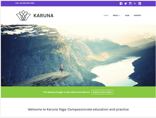
 Karuna is a clean business theme designed with health and wellness-focused sites in mind. With bright, bold colors, prominent featured images, and support for customer testimonials, your business’ brand will shine with Karuna. If you are an Yoga instructor..this theme is for you :). You can check the Karuna theme demo.
You can use my shared code and ask question in the comments section.
You can take my personal help in skype : om2000_cuet . You can Download Karuna theme from here.
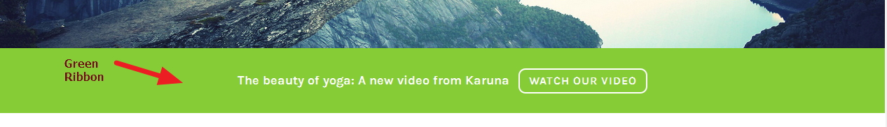
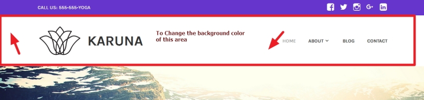
1. If you want to change Karuna theme’s green ribbon’s background color, font family, font color and more use the following code
*** it is actually header widget area from which u can create such green ribbon
.header-widget-area {
color: white;
background-color: darkred;
font-weight: bold;
font-family: cursive;
font-size: 15px !important;
}
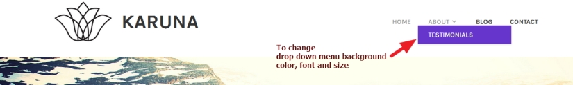
2.If you want to change drop down menu background color, font color, font size and more in Karuna theme use the code below
.main-navigation ul ul {
background-color: darkred !important;
font-family: cursive;
font-size: 15px !important;
}
Also
** To change the menu font color
.main-navigation a, .main-navigation a:visited {
color: darkred;
}
.main-navigation a {
color: darkred;
}
.main-navigation .current_page_item > a, .main-navigation .current-menu-item > a, .main-navigation .current_page_ancestor > a, .main-navigation .current-menu-ancestor > a {
color: darkred;
}
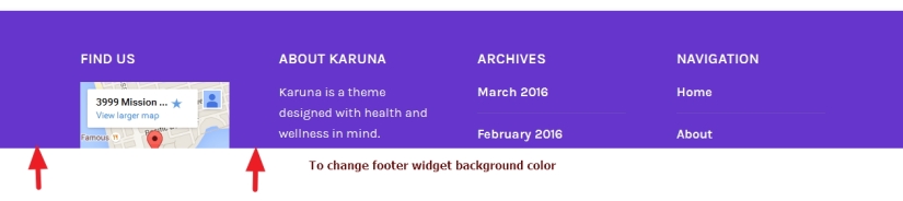
If you want to change Footer widget section background color in Karuna Theme use the code below
#colophon, .footer-widgets-wrapper {
background: darkred !important;
}
3.To Change Top header background color in Karuna theme
.sticky-wrapper {
background: darkred;
}
Blog Page Modifications in Karuna theme
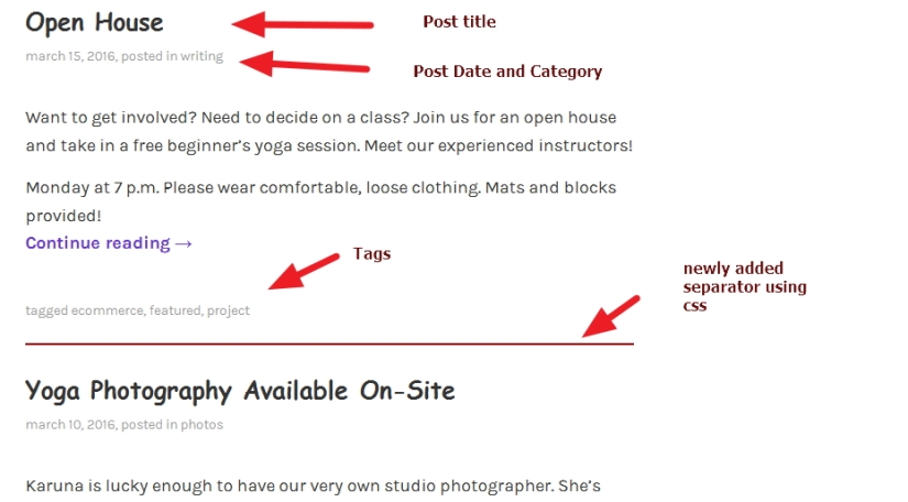
4. If you want to change blog page title’s font color, size and font family
.blog .entry-title a {
color: #333333;
text-decoration: none;
font-family: cursive;
font-size: 25px;
}
5. ALso if you want to change blog page title’s Hover font color in Karuna theme
.blog .entry-title a:hover {
color: #333333;
}
6. In Blog page if you want to reduce gap between posts and put border as separator between posts
.blog .hentry {
margin: 0 0 3.2em;
margin-bottom: 20px !important;
border-bottom: 2px solid darkred !important;
}
7. In blog page and single post page of Karuna theme if u don’t want to show Tags at the bottom of posts
*** it is applicable for single post page too
.entry-footer {
display: none !important;
}
8. In blog page if you don’t want to show Post date and category (meta )
.entry-meta {
display: none !important;
}
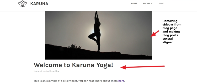
9. If you want to remove sidebar from blog page
.blog #secondary {
display:none !important;
}
.blog .content-area {
float: none !important;
width: 80%;
margin: auto !important;
}
.blog #primary #main {
margin: auto !important;
}
.blog .post-thumbnail img {
margin-left: auto !important;
margin-right: auto !important;
float: none !important;
display: block !important;
}
Question 10: How to replace “Powered by WordPress” and theme Developer info in footer credit section with my own company info in Karuna THeme.
Answer:
1. At first go to Appearance > Editor section
2. Now in the right side you will see many file names… click on footer.php (Please check the image attached and the code i shared below of the image)
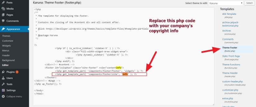
<div class="site-info"> © Copyright info and Year <span class="sep"> | </span> Your Company info or message </div><!-- .site-info -->Question 11: How to disable comments in posts, pages or from other post types in Karuna theme by Automattic.
Answer: Use Disable Comments plugins … this will help to remove comments form and comments not to show in pages, posts etc.
If you have any issue feel free to ask me question here in comments sectionOR
You can take my personal help in skype : om2000_cuet
Like this post?

 All About Basic
Thanks for this! How do you remove the footer credit using CSS? I’m at campbellcomms.ca. Thanks!
LikeLike
Hi Natalie
please try this
.site-info {
display: none !important;
}
let me know if it works
Om
LikeLiked by 1 person
That seems to have worked fine for the inner pages, but the static front page is now buggy when you scroll to the bottom. The screen starts flickering or something weird. This happens on both Chrome and Firefox, but not IE. Is this a sizing issue?
Thanks again for your help!!!
LikeLike
HI Natalie
it seems theme issue is related to the image
can u try to use smaller in height image?
Om
LikeLike
Hi Om,
Thank you so much for your advices !
I have removed footer text with using css, as showed to Natalie.
Do you know how I could write my own footer instead of existing ?
thanks !
LikeLiked by 1 person
Hi Elena
sorry i was away for few days to reply any comments properly
would u mind to share me your site url to check the footer text issue?
Om
LikeLike
Thank you for your answer Om ! Here is my URL: http://blaue-lab.com/
LikeLike
Hi Elena
to add footer issue ..either
1. please check in Appearance>Customize to find out if there is any option to add footer text
otherwise
2. you have to edit the footer.php
if you need help to edit footer php file..please contact me in my fiverr profile…i will need the dashboard access to do that
Om
LikeLiked by 1 person
Hi @allaboutbasic, how can I get rid of the seperator lines in the Footer menu?
LikeLike
HI Paul
share me your site URL
OM
LikeLike
Hi @allaboutbasic, I am unable to reply to YOUr reply on my post so here is my site URL
http://vanvuurencreativestudio.co.za/
LikeLiked by 1 person
Hi Paul
try this code
#menu-menu-footer li {
border: none !important;
padding-bottom: 0px !important;
}
let me know if it helps
Om
LikeLike
This code works perfectly thank you very much @allaboutbasic
LikeLike
How do you set your facebook and twitter icon at the top header?
LikeLike
Hi Joan
are u using wordpress.com site or wordpress.org site?
please let me know
Om
LikeLike
Hi!
I have my website hosted with 1and1 and I have installed wordpress, I am not doing it with wordpress site. I do not k ow if it helps.
LikeLike
Good morning Joan
ok please share me your site url please
Om
LikeLike
Yes! http://Www.Evmallorcars.com
LikeLike
Hi Joan
thanks
please check firs your Appearance > Widget section… if there is any Header widget section or not….
if it has any header widget section….then u can use any plugins or icons to put the social links…otherwise it will need to modify the theme file ( using child theme)
Om
LikeLike
Hi
i want to have different header images for different pages. When I try to change the header image of a particular page(e.g contact us) then it is not reflecting even after saving it. pl advice
LikeLike
Hi
are using wordpress.com or your own hosting?
please let me know
Om
LikeLike
Hi Om
Yes am using wordpress.com. Also there is a add plugin button missing in my admin panel.
Shan
LikeLike
Shan, as you are wordpress.com , so i think u should check theme option ….as there is no chance to modify theme files in wordpress.com so this different page or post different header cant be done
Om
LikeLike
Hello Om,
Do you know how to disabled the Logo resize on scrolling? At the moment my logo changes when I scroll, but i would like it to always stay the same size.
Thanks 🙂
LikeLike
Hi Robert
please share me the site url you are working on
Om
LikeLike
Sure, its http://www.o-n-o.com.au
The logo I’m talking about is the sticky header in the top left. It says ‘ONO’ – I’d like it to stay at the large size if possible.
Thanks 🙂
LikeLike
Robert
please try this
.sticking .custom-logo {
max-height: auto !important;
}
.custom-logo {
width: 202px;
height: 100px !important;
}
please let me know if it helps
Om
LikeLike
Almost fixed 🙂
We’re halfway! Thank you
It is staying the same length, but the height is still shrinking.
Have a look http://www.o-n-o.com.au
Thanks
LikeLiked by 1 person
Hi Robert
would you mind to use this code please
.sticking .custom-logo {
max-height: 100px !important;
}
Om
LikeLike
Can you tell me what code to put in the CSS so that the body font on the homepage is the same size as the other pages (ok to leave header as is).
https://peterthompsonmassage.com
LikeLike
Hi
thanks
would you mind to try this code please?
.page-template-front-page .site-main > .hentry:first-of-type .entry-content {
font-size: 1.125rem !important;
}
LikeLiked by 1 person
Good afternoon, I did you customised help and I need a last one.
I want to change the purple color in the Headband.
Do you have the CCS code as I can change it ?
Here my website
http://www.filierepolymecanicien.ch/
Thanks before
LikeLike
HI
would u mind to clarify what you are referring as “purple color in the Headband” ?
sorry didnt understand it
Om
LikeLiked by 1 person
I did it
.top-bar {
color: white;
background-color: #6636cc;
font-weight: bold;
padding: 0.8em 0;
text-transform: uppercase;
width: 100%;
font-size: 14px;
font-size: 0.875rem;
content: “”;
display: table;
table-layout: fixed;
}
LikeLike
Hello, I did it and change directly in the CCS.
I steel have 2 big problems:
1 ° the footer «Proudly powered by WordPress | Theme: Karuna by Automattic. ”
I can not find a way to remove it, to replace it with the one of my choice.
2° the images I want to insert into my page are small.
It does not want to put full width of my content
If you could help me, I would hold you tight for grateful and indebted
Thanks before
LikeLiked by 1 person
HI
did the previous code i shared worked?
Om
LikeLike
Change background-color: #6636cc;
LikeLike
Ok try this code
.no-top-bar .top-bar {
background: #6636cc !important;
}
let me know if it helps
Om
LikeLike
Hi, how can I change the thin purple header across the very top of the page?
LikeLike
Hi Leanne
would u mind to share me the site url you are working on please?
Om
LikeLike
Hi – This is the site http://innerfulfillment.com.au/ But I don’t have Karuna live yet.
LikeLiked by 1 person
HI Leanne
thanks
just checked ur provided site and found there is no purple line in header….
but purple link is showing below selected menu…is that purple line u want to change?
lease let me know
Om
LikeLike
Hi there… As I said the theme is not live as yet. But you if you go here https://wordpress.com/themes/karuna/ you will see the thin purple line along the top edge of the theme, with the social icons and phone no. in it? That is what I wish to change the colour of.
Leanne
LikeLiked by 3 people
HI Leanne
to change the top bar background color try this code
.top-bar {
background-color: orange !important
}
LikeLike
First of all thank you SO much for sharing this information! It has been a huge help to me. With color customization, I am stuck with one problem: Since this theme is responsive, the menu becomes a button with dropdown options when in tablet/smartphone mode and the color goes back to the Karuna default colors of purple (and then turns green when you tap the button). Is it possible to write CSS code to change the menu button color in tablet/smartphone mode? Thank you sincerely!
LikeLiked by 1 person
HI Lace
would u mind to tell in which site you are working on please?
sorry again for the late reply
OM
LikeLiked by 1 person
Apologies for my late reply as well!
My site is: http://laceymarieeconphd.com
Again the menu color problem is only for tables and smartphones. Thanks again!
LikeLike
HI Lacey
would u mind to tell…for tablet and smartphone..what color change u want for the menu button?
please let me know
Om
LikeLike
I think just white would be fine.
LikeLike
Hi Lace
would u mind to try this please
.menu-toggle {
border-color: white !important;
color: white !important;
}
please let me know if it works
Om
LikeLike
It worked! Eternally grateful for your help 🙂
LikeLike
Pleasure Lace 🙂
feel free to let me know if u have any other issues in future…i will reply u back asap
Om
LikeLike
how do i remove the top purple bar
LikeLiked by 1 person
HI Matt
thanks
please try this code
.top-bar {
display:none !important;
}
LikeLike
I am using Karuna theme.
I’ve installed the Download Manager Plugin.
I know how to remove the sidebar from my regular pages but I can’t figure out how to remove it from the download page – this is the page my customer is directed to once he has paid for my item. The download link is there for him to get his product.
It isn’t technically considered a ‘page’ as it’s a download.
My website is http://www.yolk-marketing.co.uk
Any help would be greatly appreciated.
Thanks
Faye
LikeLike
HI Faye
sorry for the late response…facing some family issue
would u mind to share me any of ur download page url please to check?
Om
LikeLike
Sorry you have some family issues.
One of the urls is http://www.yolk-marketing.co.uk/download/thank-you-for-yo…nload-your-order/
LikeLike
HI Faye
would u mind to check if this code works or not please?
aside#secondary {
display: none !important;
}
Om
LikeLike
Hi, it removes everything from the side which is great but not the details under the download box. Is there additional code for that?
LikeLike
HI Faye
which details it removed?
actually that download page is showing now “OOPS! THAT PAGE CAN’T BE FOUND.” only in my end
Om
LikeLike
I think it’s because the link has been abbreviated on our earlier chat. Take a look here….http://www.yolk-marketing.co.uk/download/thank-you-for-your-order-well-be-in-touch-soon-please-click-the-link-below-to-download-your-order/
LikeLike
Thanks…
just checked..i found the sidebar is not there
and…my code only removes sidebar…not others? everything others are there?
please let me know
Om
LikeLike
Hi, yes, the reference to the blog posts at the bottom are still there.
LikeLike
HI Faye
would u mind to clarify me please?
sorry actually not getting your point
Om
LikeLike
Hi there,
Can you tell me how I can make my site title smaller?
Thank you!
LikeLike
Hi
to change site title font size of ur site…use this
.site-title a, .site-title {
font-size: 1.3em !important;
}
Om
LikeLike
Hi
Great theme!
What CSS can I use to change the color on links (that are now purple when not visited and green when visited) to blue and grey instead?
LikeLiked by 1 person
HI Tullis
in general
a {
color: red !important;
}
a:visited {
color: red !important;
}
*** this will applicable to all links….including menus too… so.. let me know if you need further change
Om
LikeLike
Thanks, but that was not it. Bad description on my part.
If you have a ook at http://www.upplandsschottisen.se/resultat/ you can see that the text that is URL’s to pdf-documents are purple. The same goes for http://www.upplandsschottisen.se/galleri/
And they turn green when hovering over them. I would like to change theese colors.
Is it possible?
LikeLike
HI TUllis
would u mind to try this please
#main a {
color: red !important;
}
#main a:hover {
color: red !important;
}
#main a:visited {
color: red !important;
}
please let me know if it helps
OM
LikeLike
Hi again
That actually changed to much. A friend of mine looked at the source code and found this, and it did the trick
a {
color: #709fe0;
font-weight: bold;
text-decoration: none;
transition: 0.3s;
}
a:visited {
color: #5e5e5f;
}
a:hover, a:focus, a:active {
color: #000033;
}
a:focus {
outline: thin dotted;
}
a:hover, a:active {
outline: 0;
}
Now I only have two problems.
1 When changing the sites size to quite small – or looking in a smartphone, and the menu from the right side of the top bar changes to a MENU-button, it turns lilac / green (standard karuna colors). How do I set my colors on this button?
2 The dropdown lists, when pushing the MENU-button which on my site are dark blue with white text in normal screen size turns dark blue in smart phone mode, so no text is visible. How can I change this?
Thank you so much in advance!!
LikeLike
HI Tullis
*** mobile menu border color of kearuna theme ****
button.menu-toggle {
border-color: darkred !important;
color: darkred !important;
}
**** mobile menu hover color *****
button.menu-toggle:hover {
border-color: darkred !important;
color: darkred !important;
}
For your issue 2
@media (min-width: 240px) and (max-width:640px) {
.main-navigation a, .main-navigation a:visited {
color: white !important;
}
}
would u mind to try this and let me know please?
Om
LikeLike
This worked fine. I have now just discovered another issue on the smartphone size.
If you look att http://www.upplandsschottisen.se on the computer, you see the menu on the right – Dansa schottis – Inför – Efter
These words are darkblue as I want them to be – in the web interface.
However on the smartphone interface they apparently are white, so they are “hidden”
Dansa schottis are just below the MENU button on the smartphone, but not visible.
How can I change this color?
LikeLike
HI Tullis
sorry for the late response
try this code
@media (max-width: 640px) and (min-width: 240px){
.main-navigation a, .main-navigation a:visited {
color: #0b3d92 !important;
}}
LikeLiked by 1 person
I still have one issue on the smartphone. I have iPhone 6. On the screen, when the phone is standing, it looks ok. But if I slip the phone to horizontal position, the words (tävlingsinfo, anmälan, program and resultat, galleri, historik) in the dropdown menus disapear.
I was also thinking, maybe to have the dropdown lists not blue, but white with only a blue frame. So the words are better visible. I can not make the text white since it is the same code for the above menues (dansa schottis, inför, efter) which are on white background.
Is it possible?
LikeLike
HI Tullis
can u share me screenshot how it is looking in ur end in horiontal view please?
OM
LikeLike
How can I upload a screenschot? Or should I send it by e-mail? If so, to which address?
LikeLike
Hi Tullis
upload it to ur wordpress media library and share me the link here?
Om
LikeLike
Here they come. Both screenshots from my iPhone.


LikeLike
sorry for the late Tullis
i am checking
LikeLike
Tullis
please try this
@media (min-width: 240px) and (max-width:980px) {
.main-navigation a, .main-navigation a:visited {
color: black !important;
}}
LikeLiked by 1 person
Hi,
I have the FaceBook widget on my sidebar, but the title of the sidebar is still Karuna purple. How can I change that?
Thank you!
LikeLike
Hi Sarah
please share me your site url to check
Om
LikeLike
http://www.villagedoulas.ca/what-is-a-doula/
On all pages but my static homepage, the sidebar’s title still comes up in the karuna theme purple. I am hoping I can change it. Thank you for replying!
LikeLike
HI Sarah … in that page no sidebar is showing?
sorry..would u mind to clarify me the issue some more? and can u share me screenshot please?
Om
LikeLike
http://www.villagedoulas.ca/about-your-doula/
If you go see that page – the right hand sidebar. Title “Village Doula Services” is in purple still. How do I change that.
LikeLike
Hi Sarah
to change the color of widget title try this code
.widget_facebook_likebox h2 a {
color: black !important;
}
let me know if it helps
Om
LikeLike
Hi,
I am quite new in changing themes. Can you please help by informing which place shall I go to add this code. For e.g. if I need to change the color of Full-Width Header, where shall I go and paste your text as am unable to see any location for this while customizing widgets.
LikeLike
HI
please use Simple Custom CSS plugins to use my provided code
Om
LikeLike
Very helpful.. When I view the site on mobile the menu button outline is purple and when selected and open to few the drop down menu it is green outlined, I can’t find a code to change the purple or the green. Any help?
LikeLike
HI Bobby
would you mind to share me the site url you are working on?
Om
LikeLike
http://www.firstplacecg.com
LikeLike
Hi Bobby
Regarding purple color
@media (min-width: 240px) and (max-width: 560px) {
button, input[type=”button”], input[type=”reset”], input[type=”submit”], .button {
border-color: #6636cc;
color: #6636cc;
}
}
Regarding Green color
@media (min-width: 240px) and (max-width: 560px) {
button:hover, input[type=”button”]:hover, input[type=”reset”]:hover, input[type=”submit”]:hover, .button:hover {
border-color: #85cc36;
box-shadow: none;
color: #85cc36;
}}
Please change the Color Hex code using your one
Om
LikeLike
Hey this worked however now on mobile view when I click the menu and the drop-down appears it’s blue and I don’t see a specific spot for that. Just the menu button
LikeLike
Hi Bobby
please try this
@media (min-width: 240px) and (max-width: 560px) {
.main-navigation ul ul {
background-color: green !important;
}
.main-navigation a, .main-navigation a:visited {
color: white !important;
}
}
Om
LikeLike
My website is still working on other computers and incognito, but when i got to visit site from wordpress in my dashboard it suddenly comes up as this..
Warning: require_once(/home1/firstpl8/public_html/wp-content/plugins/jetpack/class.jetpack.php): failed to open stream: No such file or directory in /home1/firstpl8/public_html/wp-content/plugins/jetpack/jetpack.php on line 71
Fatal error: require_once(): Failed opening required ‘/home1/firstpl8/public_html/wp-content/plugins/jetpack/class.jetpack.php’ (include_path=’.:/opt/php70/lib/php’) in /home1/firstpl8/public_html/wp-content/plugins/jetpack/jetpack.php on line 71
Fatal error: Uncaught Error: Call to undefined function is_user_logged_in() in /home1/firstpl8/public_html/wp-content/mu-plugins/endurance-page-cache.php:235 Stack trace: #0 /home1/firstpl8/public_html/wp-content/mu-plugins/endurance-page-cache.php(272): Endurance_Page_Cache->is_cachable() #1 /home1/firstpl8/public_html/wp-includes/class-wp-hook.php(298): Endurance_Page_Cache->finish(”) #2 /home1/firstpl8/public_html/wp-includes/class-wp-hook.php(323): WP_Hook->apply_filters(NULL, Array) #3 /home1/firstpl8/public_html/wp-includes/plugin.php(453): WP_Hook->do_action(Array) #4 /home1/firstpl8/public_html/wp-includes/load.php(677): do_action(‘shutdown’) #5 [internal function]: shutdown_action_hook() #6 {main} thrown in /home1/firstpl8/public_html/wp-content/mu-plugins/endurance-page-cache.php on line 235
LikeLike
Hi
better u disable Jetpack or cache plugins to check
Om
LikeLike
Hi, Something weird is going on with my website http://www.yolk-marketing.co.uk
I set it up so all posts are on the blog page only. Everything was perfect. I have just returned from holiday and something strange has happened.
When I view my website on a desktop (without being logged in) the home page appears fine. When I view it on a mobile however the home page is my blog page and it appears different. It is only when I click on view full site that I see what the mobile version should look like on my mobile.
When I view my website on the desktop whilst logged in (the customised function) the blog posts all appear on my home page even though the static front page settings are set to just appear on the blog page.
What has happened, is this something you can advise on please?
Faye
LikeLike
Hi Faye
it seems you have mobile theme installed in ur site (check jetpack pluigns option)
if u have any issue try disabling jetpack plugins ( i guess)
please let me know
Om
LikeLike
Thank you, that has fixed it. I appreciate your help.
LikeLike
Pleasure Faye 🙂
LikeLike
Suddenly my social media icons on the main page are gone and when I go on to add them again.. it makes my menu go away.. how did I have both before?
LikeLike
HI Bobby
sorry for this issue i need to check dashboard…
please contact me in my fiverr account
Om
LikeLiked by 1 person
where would I find you at
LikeLike
Here
https://www.fiverr.com/om2000_cuet/solve-your-wordpress-blogs-csshtml-and-other-wordpress-issues
you have to contact me in the provided link
LikeLike
Thank you for such great info — it’s really helped me customize my website!
A question — is it possible to remove the header image on all pages except the main page? I want the header image on the index.html, but for all other pages, I do not want it to appear.
LikeLike
Hi Jesscoll
please share me the site URL you are working on
Om
LikeLike
Thanks! Here’s the URL:
http://communicationcircles.com
LikeLike
HI Jesscoll
try this code
.site-header .size-karuna-hero, .custom-header {
display: none;
}
.home .site-header .size-karuna-hero, .custom-header {
display: block !important;
}
let me know if it helps
OM
LikeLiked by 1 person
I gave it a try, and the first part of the code removes the header from all pages correctly. However, the second part of code puts the header back on all pages, not just the main page.
Any thoughts?
LikeLike
Hi Jesscoll
got it..
Replace my previously shared code with this one
.site-header .size-karuna-hero, .custom-header {
display: none;
}
.home .site-header .size-karuna-hero,.home .custom-header {
display: block !important;
}
let me know if it helps
OM
LikeLike
Thanks everyone, I was so bummed my page was totally different when I changed it to a .nl webpage.. I still have 2 issues on the website. Hope someone can help me out! Website: http://kaatkeepsgoing.nl/ Sorry it’s in Dutch 🙂
1. the sidebar widget for people to subscribe: the ‘follow us’ (in this case ‘volg ons’) still appears in purple. How can I change this to black??
2. In the full width footer, the titles (like category ‘categorie’) appears in another letter style compared to the ones in the sidebar and the letter style at the top of the page. How can I change this?? It appears right in my free blog kaatkeepsgoing.wordpress.com
LikeLike
HI Kaat
Regarding issue 1 try this code
button, input[type=”button”], input[type=”reset”], input[type=”submit”], .button {
border-color: black;
color: black;
}
REgarding issue2
is the issue in your .nl site footer title?
let me know
OM
LikeLike
Hi!
Thanks! I tried the code, but it still remains pink 😦 Sorry
And regarding issue 2: yes the problem is in the .nl site footer title. It is a totally different letter style compared to other titles on the page.. Also small letters instead of capital letter.
LikeLike
Hi Karin
where you put my shared code?
let me know please
Om
LikeLike
I added the code in customizer, CSS. Where I put all the other codes mentioned here. They all worked.
LikeLike
Hi Karin
ok..would u mind to try this
button, input[type=”button”], input[type=”reset”], input[type=”submit”], .button {
border-color: black !important;
color: black !important;
}
let me know if it work?
Om
LikeLike
Hi thanks for the code. I noticed that your last code worked for the mobile website. Unfortunately not for the desktop. But that is fine! Thank you for your help, you are awesome!
LikeLike
Hi Karin
as it is working for mobile..it should work for desktop too
OM
LikeLike
hi om im using the karuna theme and its very streched on mobile and Ipad i have to scroll through right and top to bottom, what can be done to fix this. the website is http://www.stresslessbuddy.com. i se that u give codes as responses where do you want these codes to be put in
LikeLike
Hi Srikripa
your site showing Under Construction?
would u mind to make it live please to check?
Om
LikeLike
Done please check now
LikeLike
Hi
can u share me the page url where the scrolling is happening (scroll right )
LikeLike
Hi Om,
Everything on desktop is fine it happens when i view from a mobile device..
If you go to the home page using a mobile device you can see that I will need to scroll right to see the content
LikeLike
Hi
please try this code
.zw-line-content {
word-wrap: break-word !important;
}
you have to use Simple CUstom Css plugins to use this code
OM
LikeLike
Great That works thanks Om! you are wonderfull
LikeLike
Pleasure
LikeLike
Hey! I am building my first page, teatrozereia.es
I am using the karuma theme, but when I subtituted all #85cc36 colors (links with mouse over them) with my intended color in CSS, this did not change, as you can check in the page. I have scanned the rest of the css in the style page looking for other codes I could have missed, but there is nothing left to change. What should I try?
LikeLike
Goodmorning
where you did the change? in style.css?
let me know
Om
LikeLike
Thanks for the quick reply!
Yes, I modified every hex code in stlye.css
Esaú
LikeLike
HI
ok..but it is not a proper way
OM
LikeLike
Yeah I kinda noticed… So what should I try?
Thanks!
LikeLike
HI
thanks..sorry for the late reply
better you try “Simple Custom Css” plugins..and copy the related css codes and paste there with your choice-able color code
Om
LikeLike
HI
thanks..sorry for the late reply
better you try “Simple Custom Css” plugins..and copy the related css codes and paste there with your choice-able color code
Om
LikeLike
Hi! Thanks for the great advice regarding modifying the Karuna theme.
I am currently building site mosainteriors.wordpress.com and would like the content area to be the same width as the header and footer. Now it’s wider if I choose “full-width page” and narrower if I choose “default template”. Can I adjust it somehow so that either the header, footer and widgets are as wide as the full-width option or the full-width option is as narrow as the rest?
LikeLike
Hi
thanks..sorry for the late response..
seems you have selected to centralize the text?
and try this code….
article {
padding-left: 10px !important;
padding-right: 10px !important;
}
let me know
Om
LikeLike
Further to the last, your help also regarding the following issues would be super appreciated!
– How can I change the hover color for the buttons (menu, “more posts”) etc?
– How can I change the texts on the front page blog area? 1. it now has a title (latest posts) – I would like to remove this title altogether 2. There’s a button at the end saying “more posts” I would like to change this text into Finnish (“lue lisää”)
– Can I adjust the image galleries so that on mobile view there would be eg. only 1 image in a row where in the desktop view there are 3?
– Can I change the background color and font sizes of the sidebar widget area?
– Can I adjust the width of the primary menu? Now it’s too narrow so that I had to use a small font size to make the menu fit onto one row.
– Is it possible to remove the page titles from being visible on the pages?
– Is it possible to remove the banner at the very end of the pages which says “Automattic”?
Thank you in advance if you have the time to answer me.
LikeLike
How can I change the hover color for the buttons (menu, “more posts”)
try this
/***** Menu hover color *******/
.menu-primary-container a:hover {
color: red !important;
}
/***** More POst *****/
.more-recent-posts.button:hover {
border-color: darkred !important;
color: red !important;
}
Regarding Your 2nd Issue
*** I am not seeing any title named “Latest Post” ?
*** as you are using wordpress.com free hosted site..you cant change the More Post button (it is my guess)..but you can try one thing..change ur blog dashboard language..i hope that may work?
Widget section change
***widget title font size
.widget-title, .wf-active .widget-title a {
font-size: 26px !important;
font-style: normal;
font-weight: 400;
}
**whole sidebar background color change
#secondary {
background: green;
}
or
Individual widget section background color change
#secondary .widget {
background: red;
}
/*** Removing page titles ***/
.page .entry-header {
display: none;
}
To remove Automattic
.site-info {
display: none !important;
}
*** please let me know these helps u or not..and let me know if anything remains
Om
LikeLike
Thanks a lot! This worked! Only thing I couldn’t solve was modifying the buttons (hover) and text for blog area. I changed the language for blog dashboard (I think so) but it didn’t help. I’ll try to get some help from WordPress.
Still if you have any idea about whether I can modify the image galleries on the footer widget so that there would be 1 image in a row on mobile while there are 3 on desktop, please let me know!
The title I was referring to on the front page blog area is “Viimeisimmät artikkelit” (latest posts in English). I would really like to get rid of this but don’t know how..
Kind regards
Sini
LikeLike
Hi Sini
** Text for blog are —> please share me the blog page url
** buttons (hover) —> which button you are referring? can u share me screenshot please?
i already shared you these 2 code
/***** Menu hover color *******/
.menu-primary-container a:hover {
color: red !important;
}
/***** More POst *****/
.more-recent-posts.button:hover {
border-color: darkred !important;
color: red !important;
}
didn’t it work?
Regarding footer instagram image
@media (min-width: 240px) and (max-width:560px) {
.wpcom-instagram-images img, .wpcom-instagram-images a {
width: 100% !important;
display: block;
max-width: 93%;
margin-left: auto;
margin-right: auto;
}}
please let me know if it works
Om
LikeLike
Yet another question, is there any idea how I could decrease the space between the content area and footer widget?
LikeLiked by 1 person
Hi
to decrease the gap / space between the content area and footer widget in karuna theme, try this code (code for https://mosainteriors.wordpress.com/ site)
#content {
padding-bottom: 0px !important;
}
let me know if it helps
OM
LikeLike
Hi ,
I cannot find the way to change the size of the font in menu , the number of boxes , their size , their position ( not the drop down menu ) can you give me some advices ?
Thanks , Michel
LikeLike
Hi Michel
which boxes you are referring? you mean number of menu items to show?
To change the font size of menu
.main-navigation a, .main-navigation a:visited {
font-size: 12px !important;
}
let me know if it helps
Om
LikeLike
Hi Om ,
Thanks for your quick reply , your advice it’s working , but this is also driving the font size of the drop down menu , I need to manage differently their font size .
Yes I was meanning the number of items menu boxes 8 if needed and driving their poisitions also
B.R
Michel
LikeLike
Hi Michel
sorry for the late response
To change only parent menu items font size..try this code
#top-menu > li > a {
font-size: 12px !important;
}
also try this code
.main-navigation {
width: 65% !important;
}
Om
LikeLike
Hi Om ,
Thanks , It’s working fine
B.R
Michel
LikeLike
Thanks Michel
please give me a like in my Facebook page
Om
LikeLike
Hi Om,
FB like done !
Many thanks again
B.R
Michel
LikeLike
Pleasure MIchel 🙂
LikeLike
Hello! just wondering if you would be able to help with changing the colours of the links for the archive / categories list on the sidebar for posts?
See here: http://www.inspiredlivingmedical.com/blog/blog-archive/
As well, I was wondering how to change the colours of the ‘submit’ buttons for forms, we use one for sending emails on our contact page:
See here: http://www.inspiredlivingmedical.com/contact-info/
And lastly, I used your css code to change hyperlink colours, but it has now transferred over to the white part of the share buttons on our pages if you can see it is now lime green just like text links are. Is there away to avoid that?
Thanks so much!
LikeLike
Hi Julie
sorry for the late
To change the sidebar widget link color
#secondary .widget a {
color: darkred;
}
To change the submit button color try this code
.contact-submit input {
border-color: darkred;
color: black;
}
please let me know if it works
Om
LikeLike
Hi, how do I change the font size for the widgets in my footer?
http://www.villagedoulas.ca
LikeLike
To further my post – the font sizes are all too big, i would like the Social – Facebook widget to fit in the same line as the contact and page widgets
LikeLike
Thanks
the facebook widget you placed below the Hours and Info widget
to make the facebook widget to be inline with the HOurs and Info widget..try this
.widget_wpcom_social_media_icons_widget ul {
display: block !important;
}
.widget_wpcom_social_media_icons_widget li a {
font-size: 25px !important;
}
let me know if it helps
Om
LikeLike
Thank you, that worked!
LikeLike
HI
thanks..sorry for the late response
please check this code
.footer-widgets-wrapper .widget {
font-size: 15px !important;
}
let me know if it helps
LikeLike
Hi! Thank you so much for the wonderful info regarding the Karuna theme! I have two questions – I am attempting to reduce the padding of my site logo (which appears in the same bar as the navigation menu). I would like it to be to the absolute left of the navigation bar and would also like to reduce the overall width of the navigation bar by decreasing the padding on the bottom and top of the logo.
My second question is about the bar that would normally appear right below the header image slider. How would I go about changing the color of this bar? It is currently white and I would like to make it burgundy. Thanks!
LikeLike
HI Justin
to reduce the padding from the top and bottom of logo try this
.site-branding {
padding-top: 2px;
padding-bottom: 2px;
}
Regarding 2nd issue
** are you talking about the background where the word “Home” is written below top header image?
let me know
OM
LikeLike
This is seriously the most helpful post I have ever seen. You rock!
LikeLike
thanks a lot
Om
LikeLike
Hi Justin,
Hope you can help me out. I have been trying to add sidebar widgets to the static frontage of this theme, but sonar I have been unsuccessful.
Do you have an idea on how I could accomplish sidebar widgets on the static frontpage of Karuna?
Thanks in advance,
Jeroen
LikeLike
Hi Jeroen
would u mind to contact me in my fiverr profile please?
just sent me a message there..i will check..
OM
LikeLike
Hi Om,
I have the same problem like Jeroen, I would like to add sidebar widgets to the frontpage, but I couldn’t find an option. Could you help me please? And when I add a sidebar widget to one page, it appears on every other pages too. I would like to add different sidebar widgets to every single page. Could you help me, how can I do that?
Thank you in advance,
Ib
LikeLike
thanks
would u mind to communicate me in my fiverr profile please?
Om
LikeLike
hello sir i just want to ask why I can’t install new plugins? and it sees.
Geotagging: WordPress.com allows you to geotag your posts and pages, which means you can attach a physical location to them.
LikeLike
Hi
you cant install plugins in wordpress.com free hosted site
Om
LikeLike
Is there a way to have a slideshow on the home page in the header area for this theme?
LikeLike
Hi
are you using wordpress.com free hosted site?
if yes..then you can’t add slider in the header
Om
LikeLike
Hello, I am new to this and just started using Karuna. I’m having trouble finding the editor to type in the code to change the default purple color. I am using wordpress.com (free).
Thank you.
LikeLike
as you are using wordpress.com free hosted site.
you need to upgrade to premium plans to modify the css
OM
LikeLike
I see. Thank you for the quick reply.
LikeLike
I saw a question posted here about how to make the main navigation menu wider, but didn’t see a specific answer. Mine is too narrow for all of my menu categories and goes to two rows. I would like to keep it on one longer row, centered on the page, and can’t figure out how to do this.
LikeLike
Hi Cameron
please try this
@media (min-width: 980px) and (max-width: 110099px) {
.site-branding {
display: none !important;
}
.main-navigation {
width: 95% !important;
max-width: 827px;
float: none;
margin-left: auto;
margin-right: auto;
}}
let me know if it helps
Om
LikeLike
Wow, thank you so much, it worked! I have one other question I wonder if you can help me with…With the sidebar, the main content area where the blog posts are seems a little cramped. Is there a way to increase the width of the main content area/overall page? Thanks again!
LikeLike
HI Cameron
you mean… you want to increase the content section width in homepage and single post page?
so that the gap between content section and sidebar reduces?
please let me know
OM
LikeLike
To clarify, I’m interested to know if there a way to make the entire page wider, including the main content and sidebar. However, it would be useful to be able to reduce the gap between the main content area and sidebar as well. All info is appreciated, thanks!
LikeLike
Hi Cameron
please try this code only to make the left hand content section wider
@media (min-width: 980px) and (max-width: 110099px) {
.site-main {
margin: 0 33% 0 0;
text-align: justify;
}
}
let me know what you think
Om
LikeLike
Thank you so much, yes, this is better! I have one other question I hope you don’t mind my asking. Is it possible to put an image in the top bar portion of the page? I have in mind putting a logo on the left side of the top bar, while having the social media icons to the right. (The icons are already there.) Thanks!
LikeLike
HI Cameron
thanks, sorry for the late response
i found you already did it right?
🙂
let me know
Om
LikeLike
Hi, yes, thanks for checking in. I was able to figure it out, but I have two other questions relating to previous questions I asked….
First, in order to fit my logo in the top bar, I increased the height of the top bar. But now the social icons in the top right are no longer vertically centered. I have been trying to figure it out, but unsuccessfully so far.
Also, I was able to put the logo in the top bar using the code “background-image.” If I wanted to put more content in the top bar, say text or a search box, how could I do that?
Lastly, the sidebars have been removed from all pages, but I would still like the main content area to be wider in the main content area.
Thanks again for all your help!
LikeLike
HI Cameron
for the top bar social icons vertical alignment issue, try this code
.top-bar .jetpack-social-navigation.jetpack-social-navigation-svg {
margin-top: 12px;
}
# for your issue 2 ( adding contents)
** are you using wordpress.com premium plan?
#issue 3
** so u want to make the content section to be more wider? i found it is already wider?
please let me know
OM
LikeLike
Hi, for the second issue, I don’t think I have the wordpress premium plan because I am hosting with Bluehost, and got started through them. I have the Bluehost Prime Web Hosting plan.
For issue #3, yes, I would like the content section more wide. I don’t want it all the way to the edge of the page, but at least as wide as the menu at the top.
Thanks!
LikeLike
Hi Om – I am using the Karuna theme, and I somehow changed two things on accident:
– The testimonials on the tatic front page… it took away the name of the person, but still shows the picture. Not sure how I did that. Can you tell me how to fix it? When I go to the individual testimonials, they are still there but they don’t display on the front page.
– The menu top bar used to have words going across for different pages, but now it drops down if you hover over “home.” Would like to go back to the original settings.
Also, is there a way to change the headings settings, like for headings 5 or 6, to not be all uppercase?
http://www.creativeconnectionsmusic.org
LikeLike
I fixed the second problem, but still wondering about the others 🙂
LikeLike
Hi Megan
sorry for the late reply
Have you checked Appearance > Customize > Content Section ?
there is option to show author bio?
would u mind to check that first please?
Om
LikeLike
Helo Cameron,
Is there a way to change the font color of the “full-width header” call to action button?
site: blog.sone.com.mx
Thanks in advanced
LikeLike
Hi
to change font color of call to action button of your site, try this
.button {
color: red !important;
}
let me know if it helps
OM
LikeLike
Thanks a lot! It worked
LikeLike
Hi!
This thread has been an amazing help! Thank you for your time so far! So I am almost complete with my site but would love it for the header not to scroll when coming down the page. If you have a CSS code to make it static that would be very much appreciated! Thank you again.
LikeLike
The website is: http://www.winningedgecycling.com
LikeLike
Chris
would u mind to try this please
.sticking.sticky-wrapper {
position: relative !important;
}
let me know if it helps?
Om
LikeLiked by 1 person
Thank you for your quick reply. So it helped, but you can see the upper header doubles in width first, but then stays put as you scroll down.
LikeLike
Chris
not sure..but would u mind to try this code please?
body.home.blog.wp-custom-logo.mp6.customizer-styles-applied.hfeed.highlander-enabled.highlander-light.custom-colors {
padding-top: 0px !important;
}
let me know if it helps?
Om
LikeLike
That definitely improved it. The header now just drops one line before staying static. Very close!
LikeLike
Hi Chris
in my end the header is static?
sorry would you mind to clarify?
Om
LikeLike
Hi Om,
You’re right, I just cleared my cache and reloaded and it works great. Is there a way to have the same thing apply to the other pages also? It works on the home page, but not on the others:
https://winningedgecycling.com/about/
Thank you!!!!!
LikeLike
Hi Chris
replace my previous code with this
body {
padding-top: 0px !important;
}
let me know if it helps
Om
LikeLike
Perfect! Thank you so very much for sharing your skills and time. It’s such a talent to be able to do what you do!
LikeLike
Pleasure Chris 🙂
LikeLike
Hi, Om
Is there a way to insert a html code? basically I’m trying to place a Facebook pixel
Thanks in advanced!
blog.sone.com.mx
LikeLike
Hi Nicolas
for this you need business plan of wordpress.com
Om
LikeLike
ok, thank you once more!
LikeLike
hi…
In my blog area I am adding images… All images are coming in different sizes… Some big, some small…
How can I reesize the images in blog posts?
LikeLike
HI
can you share me url where images are showing different size please?
Om
LikeLike
HI Jack
are you talking about the searchbar in the sidebar?
actually i am not seeing any searchbar in the header in your site?
please let me know
Om
LikeLike
Hi, I am having problems with my hyperlink hover colours. the CSS above isn’t working for me, would you be able to tell me what i’m doing wrong? I’ve used:
#main a {
color: red !important;
}
#main a:hover {
color: red !important;
}
#main a:visited {
color: red !important;
}
Also, I am seeing the purple line in the header, only in Google Chrome and IOS, however not internet explorer. Have you seen this issue before? i’ve used the following and its still shows:
.no-top-bar .top-bar {
background: #6636cc !important;
}
my URL is https://mechanika-ltd.com
LikeLike
Hi Adam
sorry for the late response (was busy with family matters)
so have you already solved the issues?
please let me know if you need help..
Om
LikeLike
Does anyone know how to shrink the size of the header image. Not the logo next to the menu but the image under it? http://www.kaskor.ca
LikeLike
thanks,
sorry for the late response
not sure, but are you searching this?
.custom-header {
height: 300px !important;
}
please let me know
Om
LikeLike
I want to change testimonials to show my about me page on the home page. Is this possible? I won’t need testimonials and this would be a good place to put about me info.
LikeLike
HI
are you using wordpress.com free plan?
please let me know
Om
LikeLike
I am using Bluehost, but I have been playing with the theme on the free WordPress as well.
LikeLike
as it is not only css issue, it would better if u communicate me in my fiverr Personal help profile as i need to check the dashboard
Om
LikeLike
Hey Om … I’ve also been working with Karuna theme for one of my clients and making a lot of updates to CSS. It may be helpful to note that for a mobile site, it will need different CSS changes – some of your readers may not realize that they need to change CSS for mobile separately!
LikeLike
Hi Vicky
yes, i know that. For mobile specific change you have to use media queries to implement css changes.
Om
LikeLike
Hi Om. I am using the Karuna theme. When I click on the Page Button although the page displays but it does not navigate to the content. I have a big header image and the content is listed below this. How can I make it navigate to the text below?
LikeLike
Hi Shivaraj
in pages, you want dont want to show the big image?
let me know
Om
LikeLike
Heii Om. I want to show the big picture or some other picture. But, it would be nice to navigate to the text below when I click on the page. So, that it is better readable. Right now it is not visible unless we scroll down past the image.
LikeLike
there is a tricky way to do that..
try this first
Replace the URL of the IMPRESSUM menu url to this
https://www.lyfesutra.de/impressum/#post-11
LikeLike
Hi there, I’m wanting to have header image appear on home page only. Any ideas on how I can do this?
Cheers
LikeLike
Hi
are you talking about the big header image?
please let me know
Om
LikeLike
hi, thsnks a lot for your tips my friend. Hugs and congrats. I want to do the same thing. thet big image, to showit only in the home page, but no inthe internalpages, tou now? But not with the anchor link, because itkat way is not workin g]for me! There is how to do that?
LikeLike
HI Carlos
please share me the site URL you are working on
Om
LikeLike
Hi, amazing help on here. I’ve found more in your comments than in most other sites combined! Two questions. With hyper links, mine go lime green after they’ve been clicked on. I’ve tried: a:visited {color:#404040;} to no avail. Also, my drop down menu on mobile version of Karuna is a good color but on the laptop version, it’s white. I can’t find anything white in my CSS. My site is http://www.beerwanderers.com. Thanks.
LikeLike
For the lime green link issue try this
a:active {
color: #404040 !important;
}
let me know if it helps
Om
LikeLike
Still having the odd green color to visited links. What was offered makes sense but even with important added, it’s not changing it.
LikeLike
please try this
a:focus {
color: #404040 !important;
}
let me know if it helps
Om
LikeLike
That seems to be working well. Only thing is the links are purple before they go green. That is only on these links.
Thanks for all the help.
Sent from Mail for Windows 10
LikeLike
they are purple till i found?
LikeLike
Yes, unfortunately, the green is gone but the purple is still there. Seems my other links are a bit different, too. Will look a bit more closely at them. I guess this is an override of links? Would my own links change in color, too? Thanks again.
Sent from Mail for Windows 10
LikeLike
better you try that
.entry-content a
{
color: darkred !important;
}
.entry-content a:hover
{
color: red !important;
}
Om
LikeLike
That didn’t work, either. I’ll you the code I have, maybe something is blocking something. I did a lot to get the color back to where it was on wp.com….some from your site. Not sure what I would have done without all the help, probably went back to wp.com! haha
.top-bar { background-color:#194E44 } .sticky-wrapper { background-color: #f6be67; }
/* BOOK NOW NAVIGATION STYLING */
.menu-item-6232 > a { border:solid 2px; border-color: #EA1B1B; padding:5px; }
/*END OF BOOK NOW STYLING*/
@media screen and (min-width: 768px) { .sticky-wrapper { background-color: #f6be67; } .fh-button-green { visibility: hidden; } } a, .entry-title a, .entry-meta a, .entry-footer a, .main-navigation a { color:#194E44; } .post-categories {display: none;} .widget { background-color: #000; color: #194E44; } .menu-toggle { border-color: #194E44; color: #194E44; } .main-navigation ul ul { background-color: #f6be67; } .entry-content a:hover { color: #EA1B1B } button.menu-toggle:hover { border-color: #EA1B1B; color: #EA1B1B; } a:hover {color:#EA1B1B;} a:focus .entry-content a { color: darkred !important; } .entry-content a:hover { color: red !important; }
Sent from Mail for Windows 10
LikeLike
It also hovers green just before it becomes the neutral color. No big deal, just thought you should know the overall effect.
Sent from Mail for Windows 10
LikeLike
Hi again, now I’ve managed to remove the previous and next post links. The same purple is in the more posts link and it again hovers to green. Guess it’s the same problem but just putting it out there. Thanks.
LikeLike
Hi. I am using this theme for my art & fiction blog. I like to justify the text so that it looks like an actual book page when you read it. Until now the Justify Text button has worked fine, but as of today it has stopped working. Nor does the shortcut (Shift+Alt-J) work. I need this to work. I don’t like the ragged edge on my paragraphs. Thanks!
LikeLike
Thanks, I just checked your wordpress site and found your text are justified well?
please let me know
Om
LikeLike
I have two different blogs. This is the one I meant:
https://lostsolandotheroddities.wordpress.com/
Notice the paragraph at the top of the latest post. It is not justified.
LikeLike
Try this code
article .entry-content {
text-align: justify !important;
}
let me know if it helps
Om
LikeLike
Hi Om. I don’t really know what to do with that. I’m not really a tech person. More a creative type (as you can see from the site).
LikeLiked by 1 person
Goodomrning
go to your dashboard, then
Appearance > Customize > Additional css
paste my provided code and save it
🙂
hope that will done
let me know if u get it done
Om
LikeLike
I figured out how to do it with html, but I really don’t want to have to do it that way every time. If you will email me (and if you have time, of course), I’ll give you access to the blog and maybe you can straighten out. Would really appreciate it. Thank you.
LikeLiked by 1 person
Ok, mail me at
om2000_cuet@yahoo.com
Om
LikeLike
Om, the function seems to be working now even though I haven’t done anything. Momentary glitch, maybe? I appreciate your help nonetheless. Sorry to have bothered you. Have a great day, my friend!
LikeLike
no problem at all
Om
LikeLike
Added a full width custom HTML footer to my site but the text of the title seems unusually larger. Can I make it smaller? I also added the same widget to the sidebar and all the text is capitalized. Can I control this? Thanks.
LikeLike
For Custom HTML footer text size, try this code
.widget_custom_html h2 {
font-size: 15px !important;
}
and i checked your sidebar, and the text is bigger..but not capitalized?
Om
LikeLiked by 1 person
Thanks, Om. I kept looking around and managed to get the capitalization problem sorted out. Your code worked like a charm. I like the size in the side bar but now the one on the footer is slightly smaller than I’d like. Is it possible to have them differ? If not, it works for me as it is. Thanks again!
LikeLike
For Sidebar, try this code
#secondary .widget_custom_html h2 {
font-size: 23px !important;
}
Om
LikeLiked by 1 person
Thanks, Om. All worked perfectly. Gives me some flexibility and easy to adjust if I want to later. Appreciate the quick help.
LikeLike
Actually, like the sidebar one so much, I added it to everything but the homepage (no sidebar there on Karuna) so that is the only one with the slightly smaller text. It’s not so small and if only on one page, it’s not such a big deal. Thanks for your help once again.
LikeLike
For sidebar try this code
#secondary .widget_custom_html h2 {
font-size: 15px !important;
}
let me know if it helps.
Om
LikeLiked by 1 person
Hi!
Thanks for a wonderful theme!
I cant get my menu to change color from purple, I have tried to do as you wrote above. But I cant get it to change. I new to this, is it in the style.css I will do the changes?
I would like to change from the color purple to the color #3BB3C1. If you hover over the “kliniker” link i the top menu, it still is purple! Please help 😉
What code do I need and where should I put it in?
thanks /M
LikeLike
Hi Martin
sorry i could not check the comments due to sudden illness
do you still need help?
please let me know
Om
LikeLike
Hi Mr Om, I’ve tried some of the solutions mentioned here but it doesn’t work.
I would like to do the following:
1. Change the color of the “Hamburger” menu icon to black when the website is being viewed on Mobile devices.
2. Change the color of the social media icons found at the footer of the page to black.
Thank you so much for your help in advance!
Webpage is at https://savesmartsingapore.com
LikeLike
hi Jim
to change Hamburger menu icon to black in mobile device..try this code
button.menu-toggle .genericon-menu:before {
color: black !important;
}
Footer social icons to black
.jetpack_widget_social_icons ul.size-medium a {
color: black !important;
}
let me know if it helps
Om
LikeLike
Thanks for a great theme! I would like to make the padding between the top menu and the site logo smaller. Or if it is easier to make the site-branding-wrapper wider. So that the menu of 5 pages will stay on the same row. see http://www.eriksson-berglund.se. Right now the last menu topic (kontakt) skips down on the row below. At least it does so on my mac. Is this possible to fix?
thanks /M
LikeLike
Hi Martin
try this code
@media screen and (min-width: 768px)
{
.site-branding {
max-width: 33% !important;
}
}
let me know if it helps
Om
LikeLike
thanks for your quick response!
It worked great! I will ask you again when I meet my next problem! 😉
LikeLike
Hi
Can I reduce the size of the green border around the header?
LikeLike
would u mind to share me the site url to check?
Om
LikeLike
Hi, thanks so much for this post.
I have looked up at the previous comments and they have been immensely helpful.
I have two more questions on my website http://www.toomanytabs.co/
1. IMPORTANT: The titles of the post is a deep purple and yellow when you hover above it on the WEBSITE. However, this does not apply on the MOBILE.. it just appears black. Could you help to make sure the mobile phone also has deep purple titles and yellow once you hover above?
2. This is a bit minor – but the ‘post comment’ color is the light purple of Karuna. How can I change this colour?
Thanks in advance!
LikeLike
Hi Shin
for your first issue
would you mind to try this code please?
.blog .entry-title a:hover {
color: #f6bf69 !important;
}
For issue 2, i think you are searching this
#commentform input#submit {
border-color: yellow !important;
color: yellow !important;
}
Om
LikeLike
Is there a way to remove the purple header at the top of the page. My URL is https://edventureutopia.wordpress.com/ and I don’t think I have access to CSS
thanks
Karen
LikeLike
Hi Karen
sorry for the late response
as you are using free plan…u cant do much changes
Om
LikeLike
Hi Om! Thank again for helping me last time. I would really appreciate if you could help me one more time..!
You know how in the homepage, the number of comments and post date/categories are in 2 different lines? (The number of comments comes after the post excerpt).
How can I make all this into ONE line, so that the homepage looks like this. For example:
july 8, 2019, posted in minimalism / 8 comments
Thanks!
LikeLike
Thanks Shin for your kind support…
that issues are solved from fiverr
LikeLike
Hi Om
Hope you can help… all your suggestions on this page so far have been fantastic but now I’m stuck.
I’ve had to add featured images to my individual blog posts so that they display here in this list of posts – https://thesoulsjourney.co.uk/writing-2/
But I don’t want them to display at the top of each individual blog post – e.g. https://thesoulsjourney.co.uk/2018/05/17/contained/.
Is there any way to add custom CSS to prevent them displaying here?
Many thanks for any help you can offer…
Vic
LikeLike
Hi Vic
would you mind to try this code please
.single .size-karuna-hero {
display: none !IMPORTANT;
}
and let me know if it helps
Om
LikeLike
That’s brilliant! Worked just great…
Thanks so much for your help and the really fast reply!
Vic
LikeLike
Pleasure Vic
LikeLike
Hi Om
Another quick couple of home page questions for you for my site here: https://thesoulsjourney.co.uk/
1) I’d like the background of the Lorem Ipsum text on the home page to be a full-width pale grey background (similar to the Karuna Recents Posts you can add into the front page – see here: https://karunademo.wordpress.com/). Can I do that by adding Customized CSS to the theme or by adding CSS to the Gutenberg block for that bit of text itself?
2) My ‘full-width footer widget’ doesn’t seem to display full-page no matter what content I add to it – any ideas why not?
Many thanks for all your help. Can you send me over a link for your ‘donate’ button so I can show my appreciation?
Best wishes to you
Vic
LikeLike
HI Vic
for issue 1
.home article {
width: 100% !important;
max-width: 100% !important;
background: #efecec;
}
is that something u r asking? let me know
Regarding issue 2
** would you mind to clarify me some more?
sorry didnt understand it
Regarding Donate
😦 actually u can donate me via my fiverr profile
LikeLike
Thanks Om
Issue 1 –
The code you suggest gives me a full-width grey background for the whole of the front page when I add it to Appearance>Customize>Additional CSS (is that where you intended me to put the code?).
But is it possible to only add that theming/grey background to just the one block of text (e.g. the Lorem Ipsum I have on my front page) and leave the rest of the blocks and page background white? I want to create subtle visually-separate elements on the page.
Issue 2 –
I added an Image widget with an image that is 2000×598 px to Appearance>Customize>Widgets>Full-width Footer. But if you look at the bottom of my homepage you’ll see just a tiny image there instead. The same happens if I add other types of widget, the content displays across just 30% of the screen width. I’m not sure why this is?
Many thanks for the fivrr suggestion for donating!
Vic
LikeLike
Hi Vic
for issue 1
*** i prefer u use visual composer plugins or elementor for that
for issue 2
*** please use custom html widget and use img html tag for that ( image widget seems making the image 300px in width only)
LikeLike
Hi Vic
for issue 1
*** i prefer u use visual composer plugins or elementor for that
for issue 2
*** please use custom html widget and use img html tag for that ( image widget seems making the image 300px in width only)
LikeLike
Can I add another issue to the earlier questions…?
Issue 3 –
I’ve added this to my Additional CSS because I couldn’t find anywhere in the Karuna theme to set a site-wide paragraph font size:
p { font-size: 16px;
}
ul { font-size: 16px;
}
But… I need my footer paragraph text to be 15 or 14 px as it doesn’t quite fit. What code do I need to override the above code with a separate size for footer text. I’ve tried this but it doesn’t work – am guessing the two are in conflict and the top-level wins?
.footer-widgets-wrapper .widget {
font-size: 14px !important;
}
Vic
LikeLike
would you mind to try this please
footer p {
font-size: 14px !important;
line-height: 25px !important;
}
LikeLike
Perfect… that’s sorted the footer text size. And I’ve now downloaded the Elementor plugin and will play with that and the HTML widget in the full-width footer later. Big thank you for all your help, Vic
LikeLike
Pleasure Vic
LikeLiked by 1 person
Hello, I really like this theme (Karuna) but I have one annoying issue. When I click on a menu item, it resizes the screen for a second and then goes back. I have tried changing fonts, disabling CSS, and taking off the logo. Nothing works. Can you help? It is for FullLifeNow.wordpress.com. Thanks!
LikeLike
just an update… i had the default theme fonts restored and it works better – no resizing. But, I’d like to change the fonts. What other fonts can I change it to that will not resize the screen?
LikeLike
THe issue you mentioned
that is not happening in my end
have u checked from other computer?
let me know
Regards
Om
LikeLike
Thanks for the quick reply. I had already fixed it by changing it back to the default font. It was trying to load the default font and then switch to another font and that was causing the jumping around of menu text. I’ll just leave it at default font and then change individual font through CSS.
LikeLike
Great
LikeLike
Hi. I can’t get a button to be in the center of the full with header widget. I can get other elements to be in the center, but my button will always go to the left and not the center.
LikeLike
Thanks
would you mind to share me the site url where you tried that please?
Regards
Om
LikeLike
Can’t believe I found your page – I saw this theme previously and tried to help a friend install this for their yoga studio site but really struggled to make all the changes. We went with something different but now I feel like could try this based on your tutorial.
LikeLike
Hi. Great template!
I’ve successfully resized the logo in Karuna using CSS as follows:
.custom-logo {
max-height: 150px !important;
}
With this CSS, it remains at 150px after scrolling. Ideally, I’d like the logo to be this size initially but to still shrink when it scrolls. Is this possible?
Thankyou!
LikeLike
Hi Ben
please share me the site url you are working on
Regards
Om
LikeLiked by 1 person
Hey Om.
Thanks for getting back so quickly!
The site I’m developing is here: https://selsec.org/
LikeLike
Try this code too then
.sticking .custom-logo {
max-height: 50px !important;
}
Regards
Om
LikeLiked by 1 person
Hi Om.
I’m now trying to get the 4 footer areas to appear full width – selsec.org
Is there an easy fix for this?
Thankyou!
LikeLike
You can try this
.footer-widgets-wrapper {
max-width: 100% !important;
}
let me know if that helps
Om
LikeLiked by 1 person
That’s outstanding!
Thank you so much Om, really appreciate your help.
Best regards
Ben
LikeLike
That works perfectly Om.
I’ve set it to 95% for a little padding but your CSS was spot on again – thanks again, you’re awesome!
LikeLike
Hi again Om!
Hope you’re good and don’t mind me pestering you.
Do you know why the site logo is not linking back to my homepage anymore? I’m sure it was working that way at some point…
selsec.org
LikeLike
Hey Om – just to say don’t worry, ignore my last message, I figured it out myself just now.
Thanks again for all your help, it’s most excellent of you.
LikeLike
Thats great Ben
sorry for the late response
LikeLike
Hi Om
Thanks for all your help with the site so far, I really appreciate it. I’m trying to get a dark mode button installed now but it’s created a bunch of other issues. I think I can probably fix most of them myself but do you know how I can get rid of the white bars that have appeared between the blocks on the homepage?
selsec.org
I’m using “Droit Dark Mode” – free version – if there’s a better dark mode plug out there let me know, eh!?
Thanks again,
Ben
LikeLike
Hi Ben
fully not sure if that will help u properly or not
but u can try this
.wp-block-cover__background {
opacity: 1 !important;
}
Regards
Om
LikeLike
Apologies Om, I think I might have sussed that issue out already – they were artefacts from the coloured covers I was using!
Still, if you know of a better dark mode plugin, or if you have any tips for getting dark mode to work better, do still hit me up!
All the best,
Ben
LikeLike
no, sorry Ben
i dont know such plugins
LikeLike
Hi.
When I share the website link – an image that shows up. I would like this image to be that of the logo of the company. Is there anyway to do this on the Karuna website? I have tried to set the featured image but that doesn’t work.
Thanks
LikeLike
Hi Molly
are you referring sharing of posts/ pages in facebook?
please let me know
Regards
Om
LikeLike
Hi Om
I’m referring to when I share a link via WhatsApp.
The featured image is of a picture instead of the header image.
LikeLike
Hi Molly
please replace the image url and try this code, paste the code using “code snippet” plugons or child theme’s function.php
https://allaboutbasic.files.wordpress.com/2023/05/show-logo-while-sharing-in-social-media.txt
Regards
Om
LikeLike