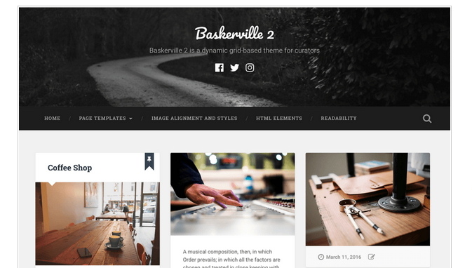
Baskerville 2 is a dynamic, grid-based theme for curators. It’s the perfect way to showcase your posts, videos, images and galleries, and share your favorite quotes and links.
Here i am sharing css code to style your Baskerville theme. To use my provided css I prefer you use Simple Custom Css plugins ( if you have your own domain and hosting) .
So You can use my shared code and ask question in the comments section.
You can take my personal help in skype : om2000_cuet
Question 1 : How to change the black Navigation background to different color in Baskerville theme?
Answer: Use this css code
.bg-dark {
background-color: darkred !important;
}
Question 2: How to change Navigation menu font color, font size and font family?
.main-navigation li > a {
color: white !important;
font-size: .85em;
font-weight: 700;
text-transform: uppercase;
}
*** Currently, navigation menus in Baskerville theme shows capital letter. If you change the “text-transform” value in css to this “text-transform: normal;” the menu items will be showing as Normal and not capitalize
To change the menu separator color use this css code
.main-navigation li::before {
color: white !important;
}
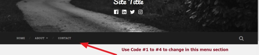
Question 3: How to change menu font color while hover in Baskerville theme?
.main-navigation li > a:hover {
color: yellow !important;
}
Question 4: How to change menu item background color while hover
.main-navigation li:hover {
background: darkred !important;
}
Question 5: How to change Social icons color?
.jetpack-social-navigation-svg .icon {
color: darkred;
}
also
How to change social icons hover background color?
.jetpack-social-navigation-svg .icon:hover {
color: white !important;
}
Question 6: How to change Site title’s font color, size and font family in Baskerville theme?
.site-title, .site-title a {
font-family: “Pacifico”, sans-serif;
font-size: 2.25em;
text-align: center;
color: darkred !important;
}
Also
How to change Site title’s hover color?
.site-title a:hover {
color: blue !important;
}
Question 7 : I don’t want to show post date, comments at the bottom of homepage posts grid
Answer: Try this code
.post-meta.clear {
display: none !important;
}
Question 8 : How to change the color, font size and font family of front page post grid date, comments etc
.post-meta.clear * {
color: darkred !important;
}
Also, If you want to change the hover color of the post date in Baskerville theme
.post-meta.clear :hover {
color: yellow !important;
}
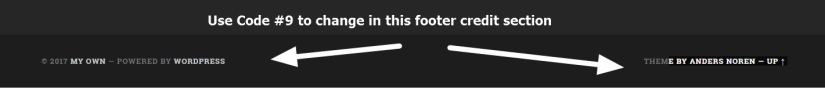
Question 9: If you want to remove Powered By WordPress and Theme by Anders Noren in Baskerville theme
.credits-inner.section-inner {
display: none;
}
Or
If you want to make footer Credit Section ( “Powered by WordPress” section) background color changed
.credits.section.bg-dark.small-padding {
background: transparent;
}
To change the Footer Credit section font color, font family and font size
.credits.section.bg-dark.small-padding * {
color: darkred !important;
font-family: cursive;
font-size: 15px;
}
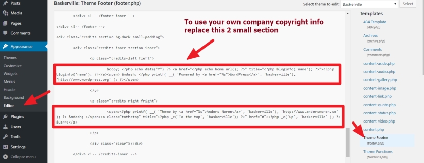
Question 10: How to replace “Powered by WordPress” and theme info in footer credit section with my own company info.
Answer:
1. At first go to Appearance > Editor section
2. Now in the right side you will see many file names… click on footer.php (Please check the image attached)
Question 11: How to change post and page title’s font color, font size and font family in Baskerville theme
.post-header .post-title a, .post-header .post-title {
color: #2B3542 !important;
font-family: cursive !important;
font-size: 28px !important;
}
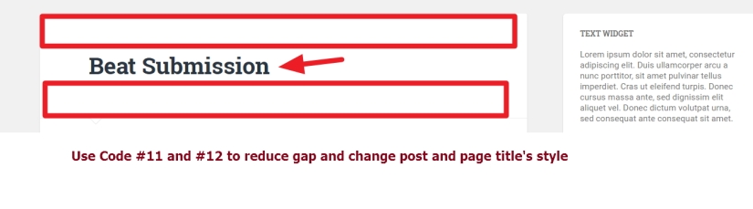
Question 12: How to remove gap just above and below the post and page title in Baskerville theme
.post-header {
padding-top: 12px !important;
padding-bottom: 12px !important;
}
Question 13: How to disable comments in posts, pages or from other post types in Baskerville theme
Answer: Use Disable Comments plugins … this will help to remove comments form and comments not to show in pages, posts etc.
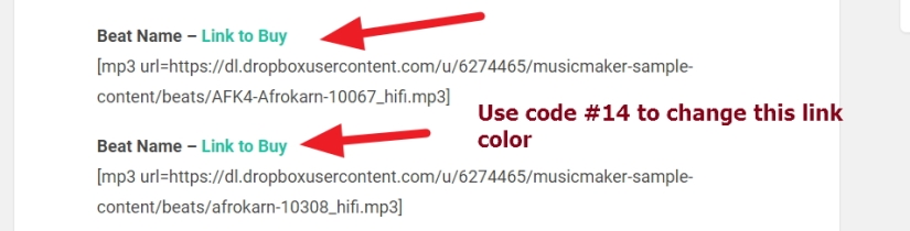
Question 14: If you want to change the link color from green to different one in Baskerville theme
Answer:
body a {
color: darkred !important;
text-decoration: none;
}
If you have any issue feel free to ask me question here in comments section
OR
You can take my personal help in skype : om2000_cuet

 All About Basic
Hi, do I need to have a premium account on WP in order to be able to access the css code area?
LikeLiked by 1 person
Hi Dan
if you are using wordpress.com free hosted site…then you will need to purchase CUstom Design facility from them…or there are some plan you can check in your Dashboard Store > Store
Om
LikeLike
Hi Om, and thank you so much for your help. I have the personal WP plan and it does not include any CSS customization, I guess I need the Premium version, right?
LikeLike
Yes..u have to purchase it for “Advanced Design Customization”
Om
LikeLike
Thanks Om. Would this theme allow me to set up an image as a footer? I know the widget area has 3 columns, can I alter it with CSS? My image is 1200×300.
LikeLiked by 1 person
Hi
i guess it can be done 🙂
Om
LikeLike
You rock, thanks
LikeLike
🙂 Pleasure
LikeLike
Hi Om, I have another question for you: The header on this theme is made to resize depending on the browser, is it possible to make it fix? I am having trouble with the way it looks on a pc
thanks
LikeLike
would you mind to clarify me some more?
by “Fix” what u mean?
Om
LikeLike
I was hoping I could enter the size of the image I have and the header window wouldn’t expand or shrink
LikeLike
so..u want the header image..dandradiss physiomental ..showing good in mobile version..right?
i found currently it is not showing fully in mobile
let me know
Om
LikeLike
it looks fine on IPhone but not on Ipad or PC
LikeLike
Hi
can u share me the screenshot about
1.how it is looking in ur ipad and pc
2. how it is lookingin ur iPhone
please let me know
Om
LikeLike
/Users/AnaLucia/Desktop/ipad.PNG
LikeLiked by 1 person
there you go…sorry about that
LikeLike
Hi
for your ipad view please try this code first
@media (min-width: 768px) and (max-width: 1199px) {
header.header.section.small-padding.bg-dark.bg-image {
background-size: 100%;
}
}
let me know if it helps
Om
LikeLike
Thanks Om, unfortunately it does not work
LikeLike
Where you paste my provided code?
LikeLike
LikeLike
according to your screenshot….the code didnt end.. i mean the ending bracked “} ” is missing?
LikeLiked by 1 person
you are right, my wrong, sorry, it seems to work now….awesome…can you write something like that for the explorer on the pc? I can have a friend check it for me…and by the way, I would be glad to pay you some 🙂
LikeLike
🙂 in my end when i checked your site in my laptop (14 inch)..the header image is fine..but if you share me screenshot how it is looking in ur end then i can check..
and if u want me to support by doing some payment.. please do it in my fiverr profile here
https://www.fiverr.com/om2000_cuet/solve-your-wordpress-blogs-csshtml-and-other-wordpress-issues
*** in the payment page (gig page) ..u have to write “THank you” only
OM
LikeLike
LikeLike
Hi Om, here is the view my friend sent me…were you using explorer in your laptop?
LikeLike
hi
try this code
@media (min-width: 1200px) and (max-width: 115555599px) {
.header {
height: 394px !important;
background-size: 100%;
padding: 0px !important;
width: 100% !important;
}
}
let me know if it helps
Om
LikeLike
It did…a friend is checking it for me…you are my all-time hero
LikeLike
pleasure 🙂
Om
LikeLike
that is the view on the IPad, I don’t have a pc but I know that it cuts part of the bottom of the header, right in the middle of the word “dynamish”, as for the Iphone it looks fine
LikeLike
the link you have shared is not full…i mean.. you seems share me the link of ur ipad directory?
please upload the image in wordpress media librar y and share me the url of the screenshot please
Om
LikeLike
LikeLike
on the css window
LikeLike
can u share me screenshot what you paste there?
LikeLike
LikeLike
Hello, I have a problem, I want the header imagen just white, but, when I up a white Image you see like gray color. Can you help me? Thanks
LikeLike
Hi
what is your site url?
let me know
Om
LikeLiked by 1 person
Hello,
is this https://blog.enriquetaregalabonito.com/
Thanks!!!!
LikeLike
Hi
thanks
please try this
.header .cover {
background: transparent !important;
}
it will remove the grey background from header
Om
LikeLiked by 1 person
Thank you very much you are a genius
LikeLike
Hi Om, I just wanted to say I love this theme! You are very talented and creative. Thank you for providing this and the CSS instructions to go along with it.
LikeLiked by 1 person
Hi – How do you change the height of the navigation bar, as well as the footer bar?
Also, how do you change the colors of the arrows that appear for a drop submenu – both the arrow on the main menu, and the large arrow on the submenu?
LikeLike
Hi Matt
please shar eme your site url to check
Om
LikeLiked by 1 person
I sent you an email and a facebook message. Thanks!
LikeLike
Hi Matt
to change the big arrow color in submenu try this code
.main-navigation ul li > ul:before {
border-bottom-color: red !important;
}
to change the main menu down arrow color
.main-navigation .has-children > a::after, .main-navigation .menu-item-has-children > a::after, .main-navigation .page_item_has_children > a::after {
border-top-color: red !important;
}
To change top menu section height
.search-icon {
height: 43px;
}
.search-icon:before {
line-height: 44px !important;
}
.main-navigation ul li > ul {
margin-top: -6px;
}
*** to change footer section height
i prefer u add some contents first in your site.. that footer issue should be solved if you add contents
Om
LikeLike
Hi Om,
I added this all to my custom css and it doesn’t seem to help. Any suggestions?
LikeLike
can you share me screenshot of your custom css portion please?
LikeLike
I have sent you a screen shot through email
LikeLiked by 1 person
yes checked Matt, you used my code between /* */
please remove those
Om
LikeLike
Matt
i missed this code
#menu-primary > .menu-item > a {
padding-top: 15px !important;
padding-bottom: 15px !important;
}
please let me know
Om
LikeLike
Hi Om, this still does not fix the header thickness issue.
Also, quickly, how do I change this for hover?
.main-navigation .has-children > a::after, .main-navigation .menu-item-has-children > a::after, .main-navigation .page_item_has_children > a::after {
border-top-color: red !important;
}
LikeLike
Hi Matt
i checked and found the thickness issue solved?
have u cleared your browser cache?
please let me know
Om
LikeLike
Sorry, it does work! Only the hover question 🙂
LikeLike
Also, the header thickness only works on the computer web browser – the search icon is misplaced when it’s reduced to the mobile dimensions. Any thoughts?
LikeLiked by 1 person
Hi Matt
for mobile search menu issue try this code
@media (min-width: 240px) and (max-width: 560px)
{
.search-icon:before {
line-height: 68px !important;
}
}
let me know if it works
Om
LikeLike
Hi Om, this works for the cell-phone mobile version, but the intermediary version (ipad?) still has the same problem. Also, the mobile and intermediary version still have a large navigation section – try dragging your browser window to be smaller horizontally and you will see my issue.
I’d be okay with removing the search function alltogether, it is not entirely necessary for me. Could you help with that?
Also, I still have issues with hover colors for this code:
.main-navigation .has-children > a::after, .main-navigation .menu-item-has-children > a::after, .main-navigation .page_item_has_children > a::after {
border-top-color: red !important;
}
LikeLike
Matt
replace my previous code with this
@media (min-width: 240px) and (max-width: 860px)
{
.search-icon:before {
line-height: 68px !important;
}
}
i will check the other issue after this
Om
LikeLike
Yes this works. My site changes at 1000px, I have noticed.
LikeLike
Hi Matt..
regarding hover color issue..
i didnt understand the issue…
would u mind to clarify?
LikeLike
Hi Om,
Concerning the hover issue, I want the color to change when I hover my cursor over it, like the text does – notice how it tuns slightly to grey.
Also, I would like to know how to change the navigation bar thickness for all the mobile versions as well, not just the desktop version.
I have sent you payment through fiverr for your help – it is appreciated.
LikeLike
Hi Matt
to change the hover color of menu items….try this code
.main-navigation li a:hover {
color: blue !important;
}
let me know if it works
LikeLike
Hi Om,
That changes the text, but not the down arrow for the items in the navigation bar with a submenu. It stays it’s default color…
LikeLiked by 1 person
Hi Matt
can you share me screenshot what you are referring please?
Om
LikeLike
Hi, great job!
How do I change the font for the tagline? (Under the title?)
Thanks
LikeLike
Hi Joseph
try this code
.site-description {
font-family: cursive !important;
color: white !important;
}
let me know if it helps
Om
LikeLike
Thank you so much, it worked perfectly!
My site is edureach101.com. Check it out – a lot of the changes are from your help!
LikeLike
Pleasure Joseph 🙂
if you need any other help feel free to let me know
OM
LikeLike
Pleasure Joseph 🙂
if you need any other help feel free to let me know
OM
LikeLike
Hi, I tried this code but nothing changed. I want the site tagline colour and font to change so that it becomes more visible. Here is my weblink
https://thefivethingschecklist.com/
Please help.
I have used tons of guidance from this article, Thank You.
LikeLike
Hi Debosmita
eta try korun
.blog-title a {
color: #fff;
text-transform: uppercase;
}
h3.blog-description {
color: white !important;
font-size: 12px !important;
text-transform: uppercase !IMPORTANT;
}
Kind Regards
Om
LikeLike
Hello,
Can you tell me how I can move the position of the social icons on the header please? They are a little too high for me.
Thanks,
Jimmie Dee
LikeLike
HI Jimmie
please share me the site url you are working
and tell me where you want to move the social icons
Om
LikeLike
Here is it…
http://www.jimmiedeesairguns.com/
LikeLike
Sorry, I should have said, I just want to be able to move them down a little. Also, is there a way to move the title and tag line as well. Just to reposition them in the header.
Many thanks,
Jimmie
LikeLike
Hi Jimmie
to move down the social icons in baskerville theme
.menu-social-menu-container ul li {
padding-top: 34px !important;
}
to move down tagline
.site-description {
margin-top: 38px !important;
}
To move site title
.site-title {
margin-top: 18px !important;
}
please let me know if it helps
Om
LikeLike
Super! Thank you. I add this in the “additional css” page? Sorry. I am very new to all of this and it’s been a big learning curve.
What does the !important mean?
Thanks,
Jimmie
LikeLike
Hi Jimmie
yes you can paste it there
or
you can use Simple Custom Css
also
!important is to give privilege to the css code
Om
LikeLike
Hello,
The code to move the social menu icons didn’t quite work the way I expect. It has appears to have made the header height bigger. This moved the menu down and the header image to increase in size rather than just move the social menu icons.
All the best,
Jimmie
LikeLike
Goodmorning Jimmie
yes.. i also noticed that.but i am not seeing any other better option for that..
but.would u mind to implement it so that i can check some more?
Om
LikeLiked by 1 person
The other code snippets also appear to have a similar effect. Whilst they do move the items, they also drop the menu down. It’s almost as though the theme has been coded with relative value rather than absolute.
All the best,
Jimmie
LikeLike
Hello Om,
I have added the code for the social menu for you to investigate further.
Many thanks,
Jimmie
LikeLike
HI Jimmie
would u mind to try this code please?
.header {
background-position: 62% 53% !important;
padding: 30px 0px !important;
}
let me know if it helps
Om
LikeLike
I’ve added the extra code. I certainly makes a difference and I have moved the social media icons lower making them clearer to find. However, this code only works on a PC browser and has no effect on tablet or phone.
Many thanks,
Jimmie
LikeLike
thanks..just checked and found you didn’t use my provided code
LikeLike
Sorry, I forgot to hit save and publish! It’s live now.
LikeLike
can u create new image for mobile version? link 304x300px in dimension?
if u provide me such image i can check
LikeLike
Will do a little later. Where do you want it as the theme takes just the one image and resizes for all formats I thought.
All the best,
Jimmie
LikeLike
share me image url..i will check and let u know
Om
LikeLike
HI Jimmie
may be several images are needed..
so..without checking can’t tell you properly…
Om
LikeLike
Hi Om, Thanks for helping me before. I have another question:
My site looks fine on my laptop, but it looks different on my ipad and my phone. On the phone especially, the header image looks cut off.
the site: http://www.edureach101.com
I can send you screenshot of the phone view if you’d like
LikeLike
This is how it looks on my laptop: https://drive.google.com/file/d/0B01Nlzh3xNk4ejlkellEWFZrTnc/view?usp=sharing
This is on my phone: https://drive.google.com/open?id=0B01Nlzh3xNk4Q3I3cC1mckZYVmM
LikeLike
Hi Joseph
for mobile…can u share me your header image of 304x300px in dimension?
please let me know
Om
LikeLike
Hi Om,
Here is the original Pic: https://drive.google.com/file/d/0B01Nlzh3xNk4RXFNQWV6cFNQTVk/view?usp=sharing
Here is the pixels you requested (304x300px): https://drive.google.com/file/d/0B01Nlzh3xNk4M1FpUFhkemdDZG8/view?usp=sharing
LikeLike
Hi Joseph
sorry for my being late…
would you mind to communicate me in my fiverr profile please?
just send me a message there
i will need dashboard access to check that
Om
LikeLike
Hi there, is there any chance you could give a demo or an screenshot of how Baskerville 2 Theme would preview on WordPress once I add the WooCommerce Plugin. I would like to install it on this theme as I quite enjoy it, however needs to integrate well with WooCommerce for obvious reasons. Would appreciate the help. Thanks Charlene
LikeLike
Hi CHarlene
you mean..you want to see how the woocommerce product page will be looking in baskerville theme?
please let me know
Om
LikeLike
Yes that is what I mean 🙂
LikeLike
HI
sorry for the late response
have u done any other sorts of modifications in the theme?
let me know
OM
LikeLike
I have customized it a bit if that’s what you mean?
LikeLike
yes…have u done any theme file changes etc?
or just did css customization?
LikeLike
yes…have u done any theme file changes etc?
or just did css customization?
LikeLike
Hello Om!
Do you have some code you could share for Baskerville-2 theme that would allow me to use a different image for each device please? That way I can format my image to correctly fit on each device.
Thanks,
Jimmie
LikeLiked by 1 person
Actually Jimmie
if you could share me the image…then i could check…
or
i have to check the theme code to solve the issue in other way… i need time for this
Om
LikeLike
Actually Jimmie
if you could share me the image…then i could check…
or
i have to check the theme code to solve the issue in other way… i need time for this
Om
LikeLike
I was wondering if you could tell me how to change the color of the tagline as well? Thanks!
LikeLike
Hi Natalie
are you searching this?
.site-description {
color: red !important;
}
please let me know
Om
LikeLike
Hello Om,
Here’s one for you. I have added Pinterest to the social menu but it shows as a link symbol of a chain rather than the Pinterest logo. I am guessing the theme is missing the graphics file for the Pinterest logo. Do you know how to fix this?
My page is http://www.jimmiedeesairguns.com.
You can see I have added facebook, youtube, email and instagram. All of those have the correct logo associated with them.
Thanks,
Jimmie
LikeLike
Hi Jimmie
i just checked and found pinterest icon showing now?
Om
LikeLiked by 1 person
Odd. Mine still shows the chain link. Is there a way I can share a screen grab with you?
LikeLike
Hi Jimmie
sorry, i noticed the chain in header
i need to check dashboard
can u communicate me in my fiverr profile please?
Om
LikeLiked by 1 person
In the spirit of helping each other, I thought I would share the solution that I found…. make sur you use pinterest.com not pinterest.co.uk!
LikeLike
Hi Jimmie
though i think…i can solve the .com and .co.uk issue
Om
LikeLiked by 2 people
Thank you for what you’ve done here! I’ve gotten very close to the look I’m going for. Just a few more things I need help with:
1. Change the font family in the main nav bar
2. Change the background color of the footer.
I’ve looked through your entire post and read all the comments and didn’t see either of these mentioned, so forgive me if I’ve overlooked it!
Thank you again!
LikeLike
Hi
thanks, sorry for my late response
1. to change the font family in the main nav bar, try this code
.main-navigation li > a {
font-family: cursive !important;
}
2. To change background color of footer, try this code
div#footer {
background: darkred !important;
}
let me know if it helps
Om
LikeLiked by 1 person
Worked wonderfully. I want the footer to be white so all the text is disappearing when I change the background. What’s the code to change the text color of the footer?
And, is there any way to change the color of the the search bar widget that I have down there?
Thanks!
LikeLike
Hi
sorry for the late reply
would you mind to try this code please?
div#footer p, div#footer a, div#footer p, div#footer h3 {
color: red !important;
}
let me know if it helps
Om
LikeLike
Hi, Om!
Thanks for your help so far! Once I get one thing fixed to my liking 5 more pop up. Can you help me with any of the following:
1. Search Bar: It turns the right color when you click on it, but I would like it to be that color all the time.
2. Other buttons like “Older posts”: can I change the text of these. I’d like all caps and possibly change the font to a sans-serif.
3. Footer widgets: How can I make the text of these three all look the same? It looks like the middle one is defaulting to bold and the other two aren’t. Can we make the match?
4. Social icons in the footer: How can I change the hover color of these?
Thank you again, so much!
LikeLiked by 1 person
Thanks
1. Are you talking about the footer search widget?
2. To change Older Post font family and all caps
div#infinite-handle button {
text-transform: uppercase;
font-family: sans-serif !important;
}
3. To make the footer widget title to look same
.widget-title label {
font-weight: normal !important;
}
4. To change footer hover color of social icons
.widget_wpcom_social_media_icons_widget li:hover > a:before {
color: red !important;
}
let me know if it helps
Om
LikeLike
For my first question, yes! I’m talking about the footer search widget! Is it possible to change the color?
Also, how can I change the hover color of the Older Post button. It’s the only one that isn’t changing on hover.
THANK YOU!
LikeLike
Hi,
thanks, sorry for the late
to change button hover background color try this code
#infinite-handle span:hover {
background: red !important;
}
Om
LikeLike
How can I change the colors in the footer of each blog post? Not on the home page, but on each blog post page! Thanks!
LikeLike
Hi
for single post page footer background color
.single-post #footer {
background: red !important;
}
also, for single post footer text,links color
.single-post div#footer p,.single-post div#footer a,.single-post div#footer p,.single-post div#footer h3 {
color: red !important;
}
let me know if it helps
Om
LikeLike
Hi Om,
thanks for the great answers.
I have one more question:
Is it possible to make a fixed size of the Blog Archiv Post that they all have the same size in the overview.
THANK YOU!
LikeLike
HI
would you mind to clarify me the question some more?
sorry didn’t get the point
Om
LikeLike
Hi Om,
enclosed a screenshot where I specificate the Problem.
Thank you for your help.
https://www2.wesend.com/redirect?p=nhhit15485
RB
LikeLike
HI
thanks. sorry for the late response
would u mind to tell in which page u r showing the blog posts?
Om
LikeLike
Hi Om,
thank you, the problem shouldn´t be fixed because of the responsive design. Wrong thinking!
Have a nice day.
Rolf
LikeLiked by 1 person
Hi Rolf
using my provide code ( i have shared it newly for desktop version) it will be looked like the image url shared below
@media (min-width: 980px) and (max-width: 2222560px) {
#content .wrap {
padding-top: 10px !important;
}
.entry-header {
margin-bottom: 1px !important;
padding-bottom: 0px !important;
}
.entry-title {
padding-bottom: 2px !important;
}
}
let me know
Om
LikeLike
Thank you for your great help!!!
LikeLike
Hi Om,
one more question to the sides. how can I reduce the space between the menue bar and the first Headline and the space between the first Headline and the beginning of the side text.
thank you very much. 🙂
Rolf
LikeLike
Hi Rolf
would u mind to check the following codes?
#content .wrap {
padding-top: 10px !important;
}
.entry-header {
margin-bottom: 1px !important;
padding-bottom: 0px !important;
}
.entry-title {
padding-bottom: 2px !important;
}
let me know if it helps
OM
LikeLike
Hi Om,
no, with this Code the space is 2px bigger than before.
.entry-title {
padding-bottom: 2px !important;
}
Maybe the text has a bigger padding?
Thank you!
Rolf
LikeLike
I have just started using Baskerville 2 and have access to CSS in my paid version. I have used some of your code above to make modifications. I still have two issues that I will put into two replies.
The first relates to projects. There is no Excerpt field in the project posts, and the More button function is visible in the project post but does not work. This means I cannot control the amount of Excerpt displayed in my projects.
LikeLike
Hi Christine
can u share me screenshot image regarding your first issue?
Om
LikeLike
How do we share screenshots through here – doesn’t seem to want them.
LikeLike
just take a screenshot…indicate what u want in the screenshot…upload it in ur media library and share me the link 🙂
LikeLike
Can you read these image links?


LikeLike
Ok Christine
allow me time
i will check the excerpt issue from home in few hours
LikeLiked by 1 person
The second is trickier. It relates to the Video format in posts.
I have set my entire site up to use either project or post categories as I want all my navigation to be visual. (Most users are limited to smart phones). Where I have a video in a post, and format that post to be video, I would like the video to display and be clickable on the category page. WP support have told me it will only be visible on the home page, and does not work for the other pages, however as it is an available format for any page, i would expect it to work. They have told me to pay someone to fix your template so that it does that, but as the work I am doing is charitable there is no budget for paid fixes.
Could you look at this page and let me know if there is anything you can do to get the video to display? The three empty headings each have a video in the post and are formatted video.
https://housing-alternatives.com/topics/finding-safe-haven/
LikeLike
Hi Christine
are u using wordpress.com business plan?
let me know please
Om
LikeLike
Yes, business plan so I have access to CSS.
LikeLike
In such case, you will need to use child theme and need to modify the template using that child theme to show video
Om
LikeLiked by 1 person
I haven’t wrapped my head around child themes yet.
LikeLike
Looks like I will need to use a plugin to create a child theme. I can look into how to do all that in the next few days. Do you have instructions for modifying the code in the child theme if I get that sorted out at this end?
LikeLike
HI Christine
there is plugins to create child theme, but, to implement your changes it will need to add related template files (php files) in the child theme created.
LikeLiked by 1 person
So if I create a child theme, I presume I can send it to you somehow. What is the best way to do that?
LikeLike
Hi Christine
i will check and will reply you from home..don’t worry
Om
LikeLiked by 1 person
Or can you give me the code and tell me where to put it?
LikeLike
Hi Christine
here is the child theme
https://allaboutbasic.files.wordpress.com/2017/11/baskerville-2-wpcom-child-theme.zip
but.. i have not added the template files in the child theme yet as it seems i need to check your dashboard.
i prefer you contact me in my fiverr profile please
Om
LikeLike
Hi, can you tell me how to decrease the spacing between the content and the top menu? meaghanmoody.com
LikeLike
Hi Meghan
try this
.single .post-content {
padding-top: 12px !important;
}
let me know if it works
Om
LikeLiked by 2 people
Brilliant! Thank you!
LikeLike
Can’t remove “by Anders Noren”…. How do do that in CSS?
.credits-inner.section-inner {
display: none;
}
Doesn’t work..
LikeLike
Hi
share me your site url to check
Om
LikeLiked by 1 person
https://binmalkuerzweg.com
LikeLike
Hi
please try this code
.credits-inner.section-inner.clear {
display: none !important;
}
after implementing, please clear your browser and cache plugin’s cache
Om
LikeLiked by 2 people
Ahh, I see the mistake! Thank you very much! Really appreciate 🙂
Have an nice day 🙂
LikeLike
Hey, I have been struggling to adjust the theme in a few areas… site is http://windowintorrd.apps-1and1.com/. I would love to reduce the menu bar to be thinner – currently showing in orange. Also, when I moved the theme off of wordpress.com I lost the social icons that appeared below the menu, is there a way to get those back (that original site that shows the social icons is https://windowtorrd.wordpress.com/). Your help is appreciated!
LikeLike
Hi
to reduce gap / height of menu in Baskerville 2 theme, try this code
.main-navigation li > a {
padding-top: 12px !important;
padding-bottom: 12px !important;
}
.search-icon {
height: 38px !important;
}
.search-icon:before {
line-height: 40px !important;
}
let me know if it helps
Om
LikeLiked by 1 person
Hi
I would like to have the background picture the be in the foreground, like a main picture on the site on the main page.
In the site there should only be a picture and then the menu and top footer and buttom footer.
Can you help ?
http://www.gadeteamet.dk
Thanks in advance.
LikeLike
Hi,
if i understood properly, you want to replace the grey background with an image? please let me know
Om
LikeLike
Hi Om,
You helped me out before, and I have another question. My website is edureach101.com. I didn’t change or do anything, and now when I go to the website, it shows:
Fatal error: Uncaught Error: Class ‘Hustle_Module_Widget_Legacy’ not found in /home2/edureach/public_html/wp-includes/class-wp-widget-factory.php:100 Stack trace: #0 /home2/edureach/public_html/wp-includes/widgets.php(115): WP_Widget_Factory->register(‘Hustle_Module_W…’) #1 /home2/edureach/public_html/wp-content/plugins/wordpress-popup/inc/hustle-module-front.php(51): register_widget(‘Hustle_Module_W…’) #2 /home2/edureach/public_html/wp-includes/class-wp-hook.php(286): Hustle_Module_Front->register_widget(”) #3 /home2/edureach/public_html/wp-includes/class-wp-hook.php(310): WP_Hook->apply_filters(NULL, Array) #4 /home2/edureach/public_html/wp-includes/plugin.php(453): WP_Hook->do_action(Array) #5 /home2/edureach/public_html/wp-includes/widgets.php(1648): do_action(‘widgets_init’) #6 /home2/edureach/public_html/wp-includes/class-wp-hook.php(286): wp_widgets_init(”) #7 /home2/edureach/public_html/wp-includes/class-wp-hook.php(310): WP_Hook->apply_filters(NULL, Array) #8 /home2/edureach/public_html/wp-includes/plugin.p in /home2/edureach/public_html/wp-includes/class-wp-widget-factory.php on line 100
Can you help me figure this out?
I will pay you for your time.
Thanks,
Joseph D’Addario
LikeLiked by 1 person
Hi Joseph
please contact me in my fiverr profile
Om
LikeLike
Hi Om, I appreciate your willingness to help, but somehow it’s working again.
Thanks anyway!
LikeLike
yes…that’s great 🙂
LikeLike
Hey hey, first of all thanks for your help!! I wanted to use the sidebar widget “Picture” but with the frames and everything inside the sidebar widget the picture gets pretty small. Is there a possibility to shrink the frame inside the sidebar widget to get its content bigger?
LikeLike
Hi cainte77
would you mind to share me your site url where you used that sidebar widget?
i will check and let you know
Om
LikeLike
Hello Om,
thanks for your reply. The site is: https://noller.no-ip.biz/wordpress3/ on the right side you can see the picture of that “palm tree garden” and it would be great to get that white frame around it smaller to display the picture bigger.
LikeLike
Hi cainte77
would you mind to try this code please?
.widget.widget_media_image {
padding: 0px !important;
border: none !important;
}
let me know if it helps
Om
LikeLike
Hey Om,
that worked just perfect!!
Thank you very much!!
LikeLike
Photo Credit for featured image does not seem to work. The only way I can figure to fix it is to manipulate the photo itself to add the accreditation, which is too bad, as the picture is quite nice looking by itself. Will it miraculously fix itself when I change from .com to .org? Or is there something I haven’t tried, yet? (My website is ‘private’ at the moment.)
LikeLike
Hi Alex
would you mind to share me the page ur post URL where the caption is not working?
and i think it will not solve if u change from .com to .org
Om
LikeLike
Hi, Om ~
My new URL is pollutionsolutions.info which is now .org (self-hosted). I am populating it from my .com URL notesonthevine.wordpress.com . Everything was fine at .com – I used my own picture so the credit issue was no longer a problem there, but then I decided to host the site, and changed the domain name. Now, neither Baskerville or Baskerville 2 will let me change the title font. I am considering creating an image with the name already on it, but I’m worried that after all that work, the title will show up anyway, and it will look like a double image.
Then there are the facebook and twitter icons… I can’t find them. I loved them on the title image at .com
Will there be an updated version of Baskerville 2 for self-hosted WordPress sites soon… please?
In the meantime, is there any way to change the title font?
Thanks,
Alex
LikeLike
HI Alex
so you want to use image instead of showing text title…right?? use that image and let me check
Om
LikeLike
All my text in the gallery’s has gone from black to grey, how can this be and do you know if I can change it to black please?
LikeLike
Try this
#bwg_container1_0 #bwg_container2_0 .bwg-container-0 .bwg-title2, #bwg_container1_0 #bwg_container2_0 .bwg-container-0 .bwg-ecommerce2 {
color: black !important;
}
let me know if it helps
Om
LikeLike
Thanks. Worked like a dream 🙂
LikeLike
Could you please tell me How to reduce logo size or is there any option to adjust/drag the logo bit upper or lower from the default place?
PS: when both logo and title is selected for the site
LikeLike
To reduce your logo size, try this code
.custom-logo.jetpack-lazy-image–handled {
width: 120px !important;
}
let me know if it helps or not
Om
LikeLike
Thanks a lot 🙂 , I need one more help from you ; could you please help me to get an infinite scroll for a static page with the post excerpt blog display.I tried many plugins but they change my post display layouts when they load new posts .
Thanks in advance 🙂
LikeLike
Hi
in which site you are working on?
please share me the site url
Om
LikeLike
Hi Alex,
We are using your theme and have created a banner with the suggested dimensions, 1440X220. However, on the published site the image is stretched. Is there a workaround to fix this? Our site is blog.qwill.io.
Thanks,
Lauren
LikeLike
Hi Lauren
would you mind to check if the following code works or not?
.header.section.small-padding.bg-dark.bg-image {
background-size: cover !important;
padding-top: 0px !important;
padding-bottom: 0px !important;
height: 221px;
}
.header-inner {
padding-top: 27px;
}
please let me know
Om
LikeLiked by 1 person
That worked! Thanks so much!!
LikeLike
Hi Om – This worked in that the full banner (1440X221) is now showing on desktop, but the resolution is still low. Are you able to help with that issue?
LikeLike
HI Lauren
please replace my previous code with this
.header.section.small-padding.bg-dark.bg-image {
background-size: 100%;
padding-top: 0px !important;
padding-bottom: 0px !important;
height: 221px !important;
}
.header-inner {
padding-top: 27px;
}
let me know if it helps
Om
LikeLike
Hi Om,
Appreciate the second code, but it added white padding to the top of the image without fixing the compression. I’m wondering if it’s an issue with WordPress itself compressing the image.
Thanks,
Lauren
LikeLike
Hi Lauren
try this
.header.section.small-padding.bg-dark.bg-image {
margin-top: -7px;
}
Om
LikeLike
Hi, Om ~ I started with Baskerville .com. I now have Baskerville 2 .org, hosted by Bluehost. I had more control over my .com Baskerville theme – this one has no ability to change font for the title image area, no social icons at all, and no more ‘blogs I follow’ in the footer. Is there some update I need? I thought these would be available for the upgrade to .org – it never occurred to me that I would get less. (If I have missed them, they are very well hidden.)
Because I cannot change the font on the title, I have been debating adding the title to the image I will eventually install, but I’m not sure the theme will allow me to omit the title once the image uploaded. You can see the site at pollutionsolutions.info
LikeLike
Hi Alex
just connect your .org site to your wordpress.com site using jetpack and you should get all your facility
please let me know if it helps
Om
LikeLike
Hello,
Is there a way to move the header menu (on Baskerville 2) so that it appears above the image at the top of the page? The menu includes the search feature and I would like that to be at the very top of the page instead of between the image and the website content.
Thanks,
Justin
LikeLike
Hi Justin
please share me your site url you are working on
Om
LikeLike
OM Sir; Is there any way to change the effects of drop down menu bar in the mobile version?
I need to turn my mobile version drop menu bar as in the apple.com mobile version site
Please Sir help me,
LikeLike
Hi Srajana
there is plugins for mobile menu.
but if you are using wordpress.com free version site then you cant do much modifications
Om
LikeLike
Thanks Sir ; but I have othe site where I use Baskerville 2 theme with wordpress.org , could you please say me how can I get mobile version drop menu bar in my site same as in apple.com’s mobile version site drop menu bar.
Please mention the available coding or plugin name sir
LikeLike
Hi Srajana
not exactly same
but you can check this
https://wordpress.org/plugins/mobile-menu/
Om
LikeLike
Thanks Sir; If you don’t mind, Could you please write an article on ” let’s encrypt” which provides ” free ssl certificate ” especially for those site hosted under server that doesn’t provide ssh, cpanel ?
LikeLike
Ok Srajana
i will check that too
Om
LikeLike
thanks a ton 🙂
LikeLike
Hi,
Is there any way to make search results to display as a post excerpt rather than full post?
LikeLike
Yes possible…
for this you need to edit the search template
Om
LikeLike
Thanks, but I was not able to find the perfect card for that…. can you please help me out?!
LikeLike
Thanks
sorry for the late response
sure
would you mind to communicate me in my fiverr profile please?
https://www.fiverr.com/om2000_cuet/solve-your-wordpress-blogs-csshtml-and-other-wordpress-issues
Om
LikeLike
Could you please help me to get black transparent bar with option of download and share buttons on my each and every image post ?
please do the needful please 🙂 🙂
Please find the attachment image link below
LikeLike
Hi Aishwaraya
please share me your site url
and also the site url from where u collected the screenshot
Om
LikeLike
Is there any your articles on wordpress free theme of Photomania by WEN Themes ?
LikeLike
Is that WordPress.com theme?
LikeLike
Hi
I have a submenu, when the mouse hovers above any of its items, the parent menu item changes the font color to white. when the submenu is closed (e.g, mouse is moved to another location) the fonts goes back to normal
exampe:
main navigation menu “a | b | c | d ” with black fonts and red on hover
b has submenu ” b1 | b2″
when the mouse overs above b it open “b1 and b2” and changes b into red (so far so good)
when the mouse moves above b1 or b2 then b changes into white
when the mouse moves to d, then b changes inyo black and d becomes red (back no normal)
do you know what causes this behavior and how to fix it?
thanks
LikeLike
solved it
it is in
.main-navigation li:hover>a {}
it had a default of color: white
I changed it to my color for hover
tnx anyway
LikeLike
that’s great
🙂
Om
LikeLiked by 1 person
Hello from sunny Greece! You have done a great job with your site! I have one question: How can I change the color and the hover color of post title links? Thank you in advance.
LikeLike
thanks,
sorry for the late
would you mind to share me the site url to check?
Om
LikeLike
Hello Om 🙂
I read all questions and answers and you actually solved me 3 major issues with your answers above. You are a genius!
I now have one issue that I would really appreciate your help! Header image looks fine in pc and ipad but not on mobile. I used the following two so far and they worked perfectly:
.main-navigation li > a {
padding-top: 12px !important;
padding-bottom: 12px !important;
}
.search-icon {
height: 38px !important;
}
.search-icon:before {
line-height: 40px !important;
}
AND
.header.section.small-padding.bg-dark.bg-image {
background-size: cover !important;
padding-top: 0 !important;
padding-bottom: 0 !important;
height: 221px;
}
.header-inner {
padding-top: 27px;
}
Coudld you please help?
URL is yourworkplaceguru.com
Thanks!
LikeLiked by 1 person
THanks
sorry for the late
try this code
@media (min-width: 240px) and (max-width: 320px) {
.header.section.small-padding.bg-dark.bg-image {
background-size: cover !important;
height: 85px !important;
width: 319px !important;
}
}
please let me know if it helps
Om
LikeLike
Thank you for helping me but unfortunately it didn’t work 😦
LikeLike
can u share me screenshot how it is looking in your mobile
1. without my code
2. using my code
Om
LikeLike
Hi Om,
I’m trying to fix the issue of the mobile drop down menu always being open. I tried the code you provided above regarding this issue by inserting it into CSS, but it did not work. Any insight into this?
Thank you!
LikeLike
Would u mind to share me the code you used please?
Om
LikeLike
Hello – I tried the code you provided above.
.toggled-on .sub-menu {
display: none !important;
}
.toggled-on .active .sub-menu {
display: block !important;
}
.main-navigation .has-children > a::after, .main-navigation .menu-item-has-children > a::after, .main-navigation .page_item_has_children > a::after {
border: 5px solid transparent;
border-top-color: #999;
content: “” !important;
display: block !important;
margin-top: -2px;
position: absolute;
right: 29px;
top: 50%;
z-index: 1001;
}
jQuery(document).ready(function() {
jQuery(‘li.menu-item.menu-item-type-custom.menu-item-object-custom.menu-item-has-children’).on(‘click’,function(){
jQuery(‘.toggled-on li.menu-item.menu-item-type-custom.menu-item-object-custom.menu-item-has-children’).removeClass(‘focus’);
if (jQuery(this).hasClass(‘active’) ){
jQuery(this).removeClass(‘active’);
}
else{
jQuery(this).addClass(‘active’);
}
});
});
LikeLike
🙂
you pasted the jquery code inside css i guess
i prefer you communicate me in my fiverr profile and let me implement it for you
OM
LikeLike
Hi Om,
I have another issue with my website (edureach101.com). Can I request an order for you to help?
LikeLike
Hi Joseph
thanks
sorry i was away and could not reply..
do you still need help?
i am available now
Om
LikeLike
Good day Om, How do i change the submenu colour? Please help
LikeLike
thanks
sorry i was away for illness
i think you are searching this
.main-navigation ul ul li {
background-color: red !important;
}
please let me know if it helps
Om
LikeLike
hi om, greets from germany! my ask your help with baskerville 2? how do i change the color of social media icons (and their hover color) and the color of links in the footer? the problem is here: https://feuerwehrfest-haverlah.de
now its dark grey on black. it should both be white.
thank you.
LikeLike
THanks
just checked the link you shared
seems you already solved the issue…right?
Om
LikeLike
hi om. yes. i found the correct line in the css. one problem left: i‘mnor able to align the text in middle column in the footer „center“ :-((
greets. c.
LikeLike
did you get my reply? can‘t see it above.
LikeLike
sorry for the late reply
just checked your messages
so, what type of alignment issue you are facing for the middle column in footer?
can you share me screenshot?
Om
LikeLike
hi om, in the footer area (contact, impressum etc) i would like to have the left column “align left”, the middle column “align center” and the right column “align right”.
greetings c.
LikeLike
For Middle column
try this
.column.column-2.one-third.medium-padding * {
text-align: center !important;
}
is that something you are asking?
let me know
Om
LikeLike
Great write-up!
I’ve switched from Visual (WP retired my theme last year) to Baskerville 2 and have a few problems with my nave menu:
1. replace forward slash with a pipe between menu items only
2. replace social text with social icons – tried my Visual CSS below but Baskerville doesn’t respond like Visual i.e. icons display but not linked
2. remove forward slash between social icons
3. position social icons (right) but the last icon (RSS) to be inline with right-side of Sidebar
4. header thickness truncates image in mobile device and tablet.
Many thanks
https://imageearthtravel.com/
LikeLike
HI Nilla
for issue 1
would you mind to try this code please
.main-navigation li::before {
content: “\007C” !important;
}
Regarding issue 2 ( replacing social text with social icons)
** I think you already have solved it right?
Regarding issue 3 ( Removing forward slash between social icons)
** same, i am not seeing it?
Please let me know
Om
LikeLike
I Om,
Thank you for your help!
1.I already have that CSS for No. 1 in Customize, but it wasn’t working so thought I’d post the question here.
2. Yes in the nav menu, but the URL links aren’t working for some strange reason.
I also created a separate social menu (not positioned correctly yet) as thought this may be easier to style inline with the nav menu if kept seperate. The links in the social menu icon work, but the links in my nav menu social icons don’t work although URLs, etc. are identical.
Many thanks
LikeLike
Hi Nilla
sorry for the late response, was travelling..
so
*** i checked your css, but not getting the css you added for the pipe issue ( seems you added it wrongly? or the css not published? please check if you have published the css or not)
***regarding social links…i checkd and found the links are working fine (social links which are showing beside top menu)
*** Forward slash not showing in my end between social icons
*** Sorry i didn’t understand the RSS issue
*** Regarding issue 4, can u share me screenshot image of header thickness truncate issue of mobile device?
Regards
Om
LikeLiked by 1 person
Hi Om,
Many thanks for getting back to me and yes, I had a couple of errors in the CSS, also now removed the pipe. If anyone needs the CSS:
/*remove forward slash*/
.main-navigation li::before {
content: “”;
}
/*remove forward slash between social icons*/
li.socialmenu:before {
content: “”;
}
Just created an actual social menu (you can see 2 menus now) so am playing around with positioning that on my header image as can’t position it inline with my nav menu. It displays where I want for Desktop, but of course, it’s hidden when displayed in mobile devices.
The Header image in mobile/tablet devices is still truncated.
Tablet: https://snag.gy/4NKnCh.jpg
mobile: https://snag.gy/DIfKhY.jpg
LikeLike
Hi Nilla
for mobile and tablet header issue, would you mind to try the following codes please?
@media (min-width: 300px) and (max-width: 600px) {
.section.header {
height: 80px !important;
background-position: inherit !important;
}
}
@media (min-width: 650px) and (max-width: 850px) {
.section.header {
background-position: inherit !important;
height: 161px !important;
}
}
Please let me know if they help
Om
LikeLiked by 1 person
Many thanks for the CSS, this now truncates the bottom. The social menu bar is hidden in an actual post when displayed on mobile device, but doesn’t display at all in a tablet. Could this because of this CSS?
Cheers,
Nilla
LikeLike
Hi Nilla
may be
would you mind to check by increasing the height value for mobile and table view css code i provided please?
please let me know what you get
Om
LikeLiked by 1 person
Thanks, have been playing around with the height as the social menu was also hidden. This is the CSS now, which may help someone else:
@media (min-width: 300px) and (max-width: 600px) {
.section.header {
height: 101px !important;
padding: 50px;
background-position: inherit;
}
}
@media (min-width: 650px) and (max-width: 850px) {
.section.header {
background-position: inherit;
height: 235px !important;
}
}
The tablet displays ok, iPhone 5 displays OK, but my Samsung A7 still displays the image truncated. Strange as it displays correctly in the WP dashboard mobile preview.
Many thanks for all your help! 🙂
LikeLike
Hi Nilla
i prefer you clear the cache of the browser of your Samsung A7 🙂
as the code is working for other mobile device..so..it should work in your Samsung A7 too.
let me know what you get
Om
LikeLiked by 1 person
Hi Om
I did that but it didn’t make a difference. I’ll just have to play around with it or leave it as is.
Many thanks for your help.
Nilla
LikeLike
Pleasure Nilla
Om
LikeLiked by 1 person
Hi! I was using this theme with a free plan but when we changed to a business plan, we detected 2 issues:
1. Sticky posts don’t work (they are marked as such)
2. The first posts on the home page show the excerpt only but if you scroll down a bit, the posts start showing the full text.
https://blogstreamcraft.wpcomstaging.com
How can we fix this?
LikeLike
Hi Jenny
would you mind to check if jetpack is installed and connected properly?
Om
LikeLike
Thanks for replying! It says it’s connected.
LikeLike
Funny thing, I rewound the blog to a recent backup and the sticky posts are magically working now, but it’s still showing full posts after the 10th post or so 😦
LikeLike
Hi Jenny
in such case would you mind to communicate me in my fiverr profile please?
need to check dashboard
Om
LikeLike
Hi Om,
I use the them for http://www.sfnewsbrief.com and have an interesting issue. I import posts using the RSS WP Aggregator. and the Baskerville 2 theme. Some of the posts don’t have the continue reading after the excerpt. I don’t understand why what is going on is it a format issue?
LikeLike
Would you mind to check one thing
** those posts which dont have featured image..seems not showing Continue Reading
please let me know
Regards
Om
LikeLike
I have posts that do and don’t have a featured image and they still have “Continued Reading.” The of the posts that don’t have “Continued Reading” have no featued image and one does.
LikeLike
got your point
actually without checking the dashboard can’t provide any solution
Regards
Om
LikeLike
Three of the posts that don’t have a featured image, don’t have “Continued Reading.” One with an image dioesn’t have “Continue Reading,” on the homepage.
LikeLike
got your point
actually without checking the dashboard can’t provide any solution
Regards
Om
LikeLike
I can do that, what is your email?
LikeLike
you better add me in skype
om2000_cuet
Regards
Om
LikeLike
Hi Om,
Thank you so much for the CSS help, it is really invaluable.
Is there a way to change the used link font colour? I managed to change the general colour of links and the hover cover, but some are still the default green.
Many thanks, Laura
LikeLike
Hi Laura
share me your site url where u want to do the change.
and u want to change the Visited link color…right?
Regards
Om
LikeLike
Hi Om,
Managed to sort out the issue. Thank you very much for your help though this page is so useful!
Best,
Laura
LikeLike
Hey there,
I’m trying to find out how I can center a widget in the footer, since I only have one. Can you maybe help me there?
Thanks in advance
LikeLike
thanks would you mind to share me your site url where you are working please?
Om
LikeLike
Hi Om
Do you know of any way to just show a summary of the blog posts on the blog page? At the moment the whole post is being show, and as these tend to be long it’s looking a bit messy.
LikeLike
Hi Philip
are you using wordpress.com free hosted site?
and share me your blog page url
Regards
Om
LikeLike
It’s a paid for hosted site
http://www.hejira-sailing.com
LikeLike
Hi Philip
would you mind to check if you have this option or not?
Appearance > Customize > Content Option
there u will see “Blog Display” option
please let me know if u got this or not
Regards
Om
LikeLike
Hi
No, there is no Content Option or Blog Display in Customize
LikeLike
Hi Philip
would you mind to install Jetpack plugins and check again please?
LikeLike
Installed Jetpack, found and changed the “Blog Display” option…all working and looking great.
Thank you soooo much for your help, you’re a genius!
LikeLike
Pleasure Philip 🙂
LikeLike
Hi Om,
Thank you very much for your great article!
Was really helpfull.
Tony
LikeLike
Hi Om,
Thanks for really detailed article, I have a small issue. I wish to change the color of the site name and tag and the hyperlinks text,
When i use the code from question 6 (using Simple custom CSS) nothing happens. Do you have any suggestion as to why this may happen?
Also where do I change the color or hyperlink text from the current blue ( or teal) to Red?
Many thanks
John
LikeLike
Hi John
please share me your site url
Regards
Om
LikeLike
Hi Om
The site is https://rosecroixswlancs.org.uk/
I have worked out that the site title is a hyperlink. I have change the body a tyoe to red which has change the site title.
I would prefer if this was not a hyper link. I can not locate a .site-title section in the css file so I assume that is why the copied code doesn’t work.
Thanks in Advance
Regards John
LikeLike
Hi John
to change the Site title’s font color
.blog-title, .blog-title a {
color: yellow !IMPORTANT;
}
to change tagline color
h3.blog-description {
color: black !important;
}
let me know if it helps
Om
LikeLike
Hi Om
That works fine , many thanks.
Regards John
LikeLike
Hi Om,
Thanks for the amazing work!
How do I change the background colour of the block at the end of my posts? (where tags, date, etc are displayed)
Thank you for your help!
Christine
LikeLike
Hi Christine
would u mind to share me the url where u want to change the background color please?
Regards
Om
LikeLike
Thank you for your swift reply!
It’s here: https://anglican-church-freiburg.de/2020/11/24/welcome/
I would want to change the following:
1. the colour of the tagline at the top (building a community of grace)
2. the dark grey background at the end of the post and
3. the heading of the footer menu (Policies and Guidlines)
LikeLike
Hi Christine
for issue 2, please try this
.single .post-meta-container, .single .post-meta {
background-color: transparent !important;
background: none !IMPORTANT;
}
For issue 1
p.site-description {
color: white !IMPORTANT;
}
For issue 3
#footer h3.widget-title {
color: black !IMPORTANT;
font-weight: bold !IMPORTANT;
}
let me know if they help
Regards
Om
LikeLiked by 1 person
Yes, it worked!
Thank you ever so much!!!
LikeLike