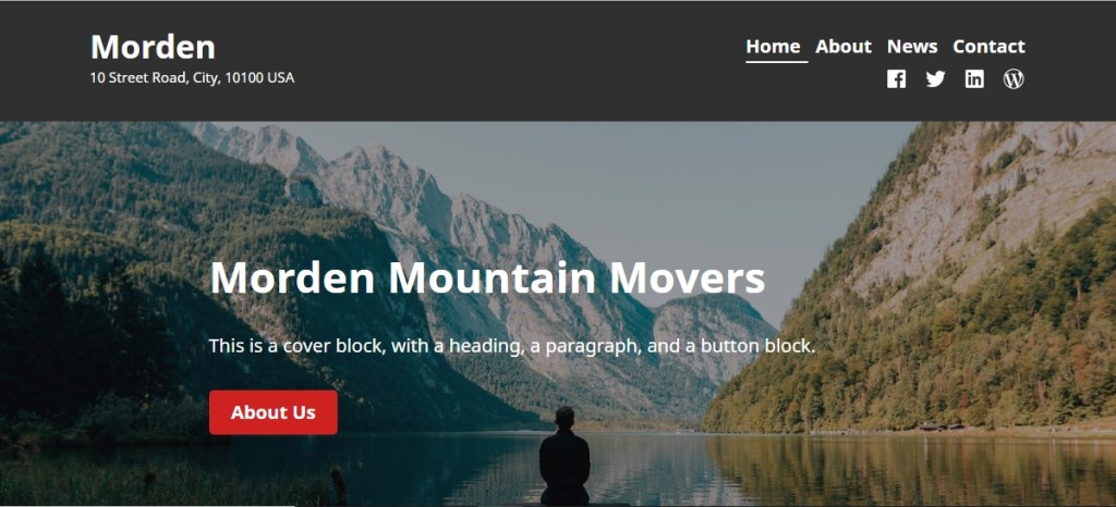
Morden is a functional and responsive multi-purpose theme that is the perfect solution for your business’s online presence. You can see Modern theme demo here. It is actually the Child theme of Varia. So, if you want to use it in your hosting, then you need to use Varia theme as Parent theme.
Header Logo and Menu Container modifications
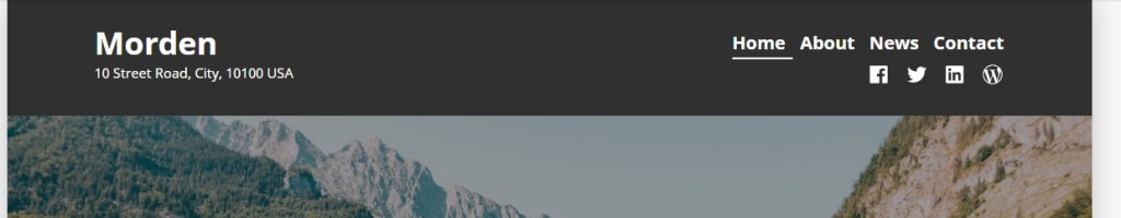
- To change Morden theme top black Header container background
#masthead {
    background: darkred !important;
}
2. To change Site title font size, color and font family
.site-title, .site-title a {
    font-size: 29px;
    color: yellow !important;
    font-family: cursive;
}
to change hover text color of site title
.site-title a:hover {
    color: blue !important;
}
3. To change top primary menu font size, color and font family
ul#menu-primary a {
    font-size: 23px !important;
    color: yellow !important;
    font-family: cursive;
}
To change top primary menu hover text color
ul#menu-primary a:hover {
    color: blue !IMPORTANT;
}
4. To reduce padding or gap from top and bottom of the header
header#masthead {
    padding-top: 4px !important;
    padding-bottom: 4px !important;
}
5. Whole Site Width Increase
@media only screen and (min-width: 1280px){
#page {
    max-width: 95% !important;
}
}
6. To change Block or content section width

.responsive-max-width, .wp-block-pullquote.is-style-solid-color:not(.alignleft):not(.alignright) blockquote, .wp-block-pullquote.alignwide>p, .wp-block-pullquote.alignfull>p, .wp-block-pullquote.alignwide blockquote, .wp-block-pullquote.alignfull blockquote, hr.wp-block-separator.is-style-wide, .entry-content>*:not(.alignwide):not(.alignfull):not(.alignleft):not(.alignright):not(.wp-block-separator), .entry-content [class*=inner-container]>*:not(.alignwide):not(.alignfull):not(.alignleft):not(.alignright):not(.wp-block-separator), .entry-content .wp-audio-shortcode, .post-navigation, .pagination {
    width: 90% !important;
    max-width: 90% !important;
}
7. To change title container background color, title’s own font color, font size and font family
.singular .hentry .entry-title, .page-title {
    background: darkred;
    color: white;
    font-size: 32px;
    font-family: cursive;
}
8. To reduce gap from the top and bottom of the title
.singular .hentry .entry-title, .page-title {
    padding-top: 10px !important;
    padding-bottom: 10px !important;
}
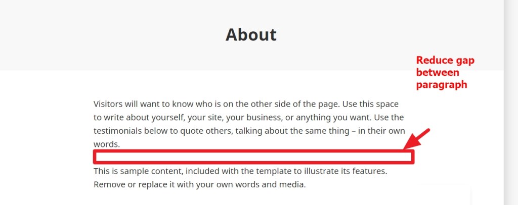
9. To reduce gap between paragraphs in page and post contents
.entry-content p {
    margin-bottom: 10px !important;
    margin-top: 10px !important;
}
10. To change gap or line height between lines and also to change font size, color and font family of post or page contents
.entry-content p {
    line-height: 23px;
    font-size: 15px;
    color: black;
    font-family: cursive;
}
11. If you want to reduce gap between posts list
li.a8c-posts-list__item {
    margin-bottom: 20px !important;
    margin-top: 20px !important;
}
12. To change background color and hover background color of buttons
.a8c-posts-list__view-all {
     background: black !important;
}

button, [type=button], [type=reset], [type=submit] {
     background: black !important;
}
13. In Single Post, if you want to reduce gap between Author box and Next-Previous Post section
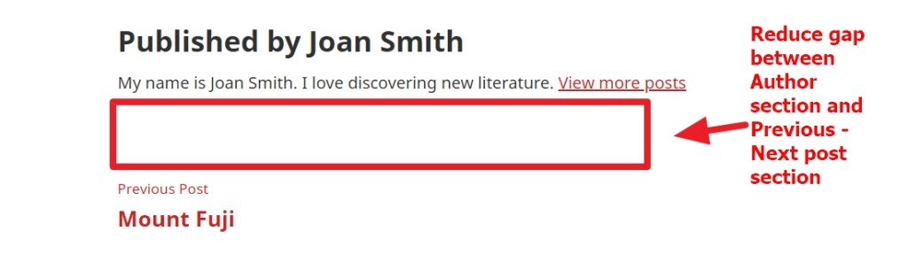
.single article {
    margin-bottom: 0px !important;
}
nav.navigation.post-navigation {
    margin-top: 23px !important;
}
14. Also, to reduce font size, color and font family of “Published by –” author heading
span.author-heading {
    font-size: 23px !important;
    color: darkred !important;
    font-family: cursive !important;
}
Modifications in Footer

To use background color in footer container and also to make the container wider
footer#colophon {
    background: darkred;
    width: 100% !important;
    max-width: 100% !important;
    padding-left: 2% !important;
    padding-right: 2% !important;
}
To change footer powered by font size and color to be changed
.site-info, .site-info * {
    color: white !important;
    font-size: 19px;
}
To change footer menu font size, color and font family
.footer-navigation .footer-menu a {
    color: white !important;
    font-size: 23px;
    font-family: cursive;
}
To change or reduce footer top and bottom gap
footer#colophon {
    padding-top: 10px !important;
    padding-bottom: 10px !important;
}
main#main {
    padding-bottom: 0px !important;
}
To change Block Seperator of gutenberg editor top and bottom gap
hr.wp-block-separator {
    margin-top: 10px !important;
    margin-bottom: 10px !important;
}
How to design Homepage as demo in Morden theme? Here it is from wordpress.com

If you have any issue feel free to ask me question here in comments section
OR
Contact me in skype om2000_cuet

 All About Basic
Thank you for your posts. I always find great information here!
There are a few questions on the Morden theme that I can’t seem to find anywhere else. The site I’m working on is ashleymstokes.com
How do I:
Change highlight color on subnav from red to another color?
Remove space between the header and cover block?
Remove navigation in header?
Remove footer from the home page? (I’m trying to make the home page just a splash page)
Move “Enter” button position on home page? (I tried changing the focal point, tried changing from left to center – nothing works)
I really appreciate all the information you post – it is a blessing.
LikeLike
Sorry – realized that I wasn’t clear on one of the questions. “Remove navigation in header?” should read “…on only the home page.”
LikeLike
Hi Ashley
1) Change highlight color on subnav from red to another color in Morden theme
.site-header-wrap .main-navigation > div > ul > li:hover li:hover > a {
background: green !important;
}
2) Remove space between the header and cover block
#main {
padding-top: 32px !important;
}
3) Remove navigation in header in homepage
.home nav#site-navigation {
display: none;
}
4)Remove footer from the home page? (I’m trying to make the home page just a splash page)
.home footer#colophon {
display: none;
}
.home #main {
padding-bottom: 0px !important;
}
Regarding Enter button
.home a[href=”http://www.ashleymstokes.com/bio/”] {
/* float: none !IMPORTANT; */
margin-left: auto !IMPORTANT;
margin-right: auto !IMPORTANT;
position: absolute;
/* display: block; */
text-align: center;
left: 0;
right: 0;
width: 170px;
}
please let me know if that is ok or not
LikeLike
This is wonderful. Thank you so much.
The only issue we ran into, is that the header and cover block still has space between them on the mobile version. Other than that everything worked perfectly.
If I may ask two more questions (both about spacing).
1. how do I reduce the spacing between header and content?
2. how do I change spacing in bulleted lists?
I can’t tell you how much I appreciate all your help, and the abundace of information in your blog.
-Theresa
LikeLike
Hi Theresa
would you mind to check this for mobile issue
@media (min-width: 320px) and (max-width:668px) {
.home #main {
padding-top: 0px !IMPORTANT;
}
}
for the issues u mentioned
1. how do I reduce the spacing between header and content?
2. how do I change spacing in bulleted lists?
** would you mind to share me the pages where the issues are showing?
Regards
Om
LikeLike
That worked! The mobile version looks good. Noticed that button still isn’t moving off the edge of the door…but that is such a minor thing.
As to the spacing, all the pages (with exception of the home page), I’d like to reduce the space between the header and content by half.
On the Operations page, I’d like to increase the space between bullet points.
LikeLike
Hi Theresa
for the spacing issue please try this
body:not(.home) main#main {
padding-top: 0px !IMPORTANT;
}
To increase spacing between bullet points, try this
.entry-content ul li {
margin-bottom: 22px;
}
let me know if that helps
Regards
Om
LikeLiked by 1 person
So much better. Thank you!
LikeLike
Pleasure
LikeLike
Thank you for your post.
Hope it is okay to ask you two questions from Denmark:
1. Is it possible to make the header with navigation and logo stay on screen at all times when I scroll down the page?
2. Is it possible to remove the gap between the bottom group about us shown on the exsample and the footer?
Thank you very much in advance.
Regards Karin
LikeLike
Hi Karin
would you mind to share me your site url to check please?
Regards
Om
LikeLike
Hi again
I am rebuilding the site, so the page are not online yet and the menu is therefore not the right one. But I have publised the comming front page with a code. I know it wil be shown here 😉
https://gdpr360.dk/forside/
and code is 100508
LikeLike
Hi karin
actually it would better if u create the page fully so that i can check
for issue 1 u can try this though
header#masthead {
position: sticky !important;
top: 0;
}
Regards
om
LikeLiked by 1 person
Hi
That would be really great if you want to help later. Thank you so much. I am a beginner at this, so all the help I can get is fantastic! 🙂
The code is great, but the rows and banner I have, they look like that they are on a top layer, so they hide the header when I scroll. If you want to, maybe you wouldn´t mind checking that too, please.
LikeLike
Hi Karin
thanks, i checked and found you added the code i shared you..
so..if you put contents in the page you will notice that the header will remain stick to the top when u will scroll..
currently your home page is not showing any content so..nothing to scroll…so the code effect not showing
Regards
Om
LikeLiked by 1 person
Hi again
1. regarding the header it is staying – that is GREAT!!! -, but pictures are rolling “over” the menu. Is it possible to stick the header to the toplayer?
2. I think I found out most of the white space near header and footer with help from your code for the header. But when I check on the mobile they are still there. On desktop it looks geat. Only the page Kontakt at the footer am I still having trouble with.
3. I tried this code, but the background is still not changing. Would really like this color: #f1cdbd, but cyan is not working either. Would you mind see what I am doing wrong, please. ?
.singular .hentry .entry-title, .page-title {
background: darkred;
color: white;
font-size: 32px;
}
I have the page online now.
Kind regards
Karin
LikeLike
Hi Karin
would you mind to share me the URL please?
as i check comments in dashboard, it becomes tough to check previous comments..
so please share me your URL when you do comments
Kind Regards
Om
LikeLiked by 1 person
Hi
Sure, of course. I am sorry I didnt write it.I will remember it in the future.
Here it is gdpr360.dk. Thank you
Kind regards
Karin
LikeLike
Pleasure Karin
for the Menu and image issue please add this code
header#masthead {
z-index: 111;
}
let me know if it helps
LikeLiked by 1 person
Hi Om
The code:
header#masthead {
z-index: 111;
}
It worked perfectly! Great!
LikeLike
On the page gdpr360.dk 🙂 Both on the desktop and mobile.
LikeLike
Better you share me screenshot regarding issue 2 and 3 please
LikeLike
Pleasure Karin
Regarding issue 2 and 3
would u mind to clarify issue 2 please? sorry didnt understand
for issue 3– i found u hide that title..and used it different way
LikeLike
Hi
I dont know how to upload screenshots here. So hope this it good enough. If not, please tell me how to upload, tank you:
Issue 2A: If you look at this page https://gdpr360.dk/kontakt/ on a desktop, there is a white space/row right above the footer, which I would like to remove. I dont know if it is because I used a contact form plugin on the page. On the other pages the white space is gone near the header and footer.
Issue 2B: When I look at the site gdpr360.dk on my mobile, the white space/row near the header is still there on all pages, but the space/row near the footer is the same problem as the desktop – Gone on all pages but not on the kontakt page (same url as https://gdpr360.dk/kontakt/).
Issue 3: If you look at gdpr360.dk (frontpage) the title is “on”, The title is “hidden” on all the other pages because I cant get the background color to work. Therefore I made a row and colored the background on that. But is it possible to get the background color on the title space to this #f1cdbd or maybe cyan? It is white right now and will not change wether I write black,red nor cyan in the code. I cant check the page on an Ipad, because I dont have one.
I used this code:
.singular .hentry .entry-title, .page-title {
background: darkred;
color: white;
font-size: 32px;
}
Regards Karin
LikeLike
Hi Karin
Regarding the gap in footer of Contact page
try this code
article#post-206, article#post-206 div {
margin-bottom: 0px !important;
padding-bottom: 0px !IMPORTANT;
}
but there will still gap…because..u have used some blank paragrap below that footer bar..so i prefer u remove those blank paragraph
Regarding issue 2B
i think u r searching this
main#main, #main header.entry-header h1.entry-title {
padding-top: 3px !IMPORTANT;
margin-top: 0px !IMPORTANT;
}
For issue 3
#main {
padding-top: 0px !important;
}
#main header.entry-header h1 {
margin: 0px !IMPORTANT;
background: #f1cdbd !IMPORTANT;
padding-top: 0px !IMPORTANT;
height: 71px;
}
would you mind to test if those work or not
LikeLiked by 1 person
Hi
Regarding issue 2A: It is gone 🙂 Perfect!
Regarding issue 2B: It is gone 🙂 Great!
Regarding issue 3 with the title showing instead of a colored row: There are still problems. On the desktop it looks great on 2 pages
https://gdpr360.dk
https://gdpr360.dk/komplet-loesning
But on the other pages the space height is higher than the 2 pages before
https://gdpr360.dk/raadgivning/
https://gdpr360.dk/risikovurdering/
https://gdpr360.dk/sikker-mail/
https://gdpr360.dk/kontakt/
I have checked that I have no margin/padding on the object(row) below the title space on all pages. I have noticed if I change the height to zero in the code, then the 4 pages look normal, but then the 2 first pages is very small in height. I cant see where I go wrong… On the 2 first pages the following object is a row in full width, and on the other 4 pages the row is aligned center if that can have anything to say…
#main {
padding-top: 0px !important;
}
#main header.entry-header h1 {
margin: 0px !IMPORTANT;
background: #f1cdbd !IMPORTANT;
padding-top: 0px !IMPORTANT;
height: 71px;
}
On the mobile: the title height is the same on all pages – too high. But on the mobile the title space is allso not shown completely from side to side, but is missing a little space on each side, so there is the color white showing. On this page https://gdpr360.dk/kontakt/ the row with contact info near footer has changed too with the white gap on each side as the title par, but only that page… mysterious… About to give up on that contact page.
Thank you so much for all your help. I dont know what I would have done without your help 🙂
LikeLike
Hi Karin
please try this
#main header.entry-header h1.entry-title {
padding-top: 5px !IMPORTANT;
margin-top: 0px !IMPORTANT;
display: block;
/* line-height: 45px; */
padding-bottom: 5px !IMPORTANT;
margin-bottom: 0px !IMPORTANT;
height: auto;
}
header.entry-header {
margin-bottom: 0px !IMPORTANT;
padding-bottom: 0px !IMPORTANT;
padding-top: 0px !IMPORTANT;
margin-top: 0px !IMPORTANT;
}
.home .entry-content {
margin-top: 0px !IMPORTANT;
}
.home .wp-block-group.alignfull {
margin-top: auto !IMPORTANT;
}
.page-id-334 .entry-content {
margin-top: 0px !important;
}
.page-id-334 .wp-block-kadence-rowlayout.alignfull {
margin-top: 0px !IMPORTANT;
}
this will solve the other pages, the 2 page which were working..u need to adjust the full width block
or let me know when u r done i will check
LikeLike
Hi again.
Thank you so much for your help. It is looking great now. There is a white gap on the Kontakt page on the mobile, but that is ok.
Is it possible to hide the title on frontpage, but keep them on the other pages?
I tried the plugin that I used before, but it is not working anymore. I found another, but not used by many. When I activate that one it hides the title but allso the menu, so removed it again.
Regards Karin
LikeLike
Hi Karin
try this
seems you are searching this
.home header.entry-header {
display: none;
}
LikeLiked by 1 person
Hi
.home header.entry-header {
display: none;
}
It is perfect!!! thank you so so much.
And sorry that I forgot the website URL (gdpr360.dk) again.
LikeLike
No Problem
LikeLike
This is very helpful, thank you!
I’m having trouble with the Morden theme and categories. It looks like none of the php files listed in this hierarchy are included in the theme: “category-slug.php → category-id.php → category.php → archive.php → index.php”. As a result, when I use a category on a blog post, if a user tries to navigate to the category, they get a 404 error.
Do you know how to address this?
Thank you!
LikeLike
Hi Lizziedy
would you mind to share me the Category URL you are facing issue?
Regards
Om
LikeLike
https://www.arcticflowerpublishing.com/blog/research/
Thanks!
LikeLike
Hi Lizzie
so u want your post url be like http://urdomain.com/category/subcategory/postslug
something like this?
please let me know
Regards
Om
LikeLike
I’d like a page where all the posts for a particular category are listed. For example, if I go to https://www.arcticflowerpublishing.com/blog/ (autogenerated) and click the “Research” link under “Sample Research 1”, it brings me to https://www.arcticflowerpublishing.com/blog/research/, which looks like should also be autogenerated. However, it doesn’t get generated. This goes into a little of what I’m talking about: https://www.wpbeginner.com/wp-themes/how-to-create-category-templates-in-wordpress/. It looks like there is already supposed to be a category.php file in the theme, but I can’t seem to find one.
Thank you!
LikeLike
Hi Lizzie
thanks
actually you used “Blog” as category, generally we create “Blog” as a page and in that blog page all posts from all categories should be showing…
another fact is
suppose you create a post named “Hellow World” and you put this post under “Research” category
so when you will go to that “Research” category page ( it will be auto generated) ..that Hellow World post will be showing there
Please let me know if any confusion
Regards
Om
LikeLike
Thank you again! I removed the “blog” parent category and have the research, etc., categories as top level categories and it’s now working. Thank you!
LikeLike
Another question: my logo is above the text rather than next to the text on desktop: https://www.arcticflowerpublishing.com/
The height is 60px as specified here https://wordpress.com/theme/morden#logo
Any tips on how to get the logo next to the text?
Thank you!!!
LikeLike
For the logo
would you mind to test this please
@media (min-width: 960px) {
.site-logo {
position: absolute;
left: -103px;
top: -11px;
}
}
LikeLike
This worked, thanks!
LikeLike
Pleasure Lizzie
🙂
nice to know it helped
LikeLike
Hi.
I’m currently using the Morden theme under a free wordpress plan and I am having trouble with the mobile representation of my website’s homepage, booking page, and review page. When I open my website on my mobile device, several paragraphs of the homepage do not appear, and the booking page and reviews are missing several paragraphs and sections.
I found that when I the site works properly only when I click “view full site.” Could you tell me how to make the “Full site version” on mobile as a default for my website?https://samstutoringcompany.wordpress.com/
Or would you recommend an alternate solution?
Thanks so much for your time and help!
Sincerely,
Sam
LikeLike
Sam
in free plan you only can use which the theme/wordpress.com is providing
extra you cant do
Regards
Om
LikeLike
Hi,
Great Theme! I have one question: I’ve been trying to change the hover background and text colour of the Menu button when Morden is in Mobile view. I have used the following code but the colours still appear in default red background and white text.
.a8c-posts-list__view-all {
background: black !important;
}
button, [type=button], [type=reset], [type=submit] {
background: black !important;
}
Best regards,
Fernando
LikeLike
Hi Fernando
please share me your site url to check
Regards
Om
LikeLike
Hi,
The website hasn’t been published outside of my WordPress account — will you be able to see it if I share the link?
LikeLike
Thanks
actually need to see the site live somehow
🙂
LikeLike
Hi, sorry about the delayed reply.
Here is the link: https://youngpolandartsandcrafts.org.uk
1) As you can see in Mobile view, the Menu button appears in default red background and white text when clicked. It would be great to be able to change that to other colours.
2) I am now also having problems with the masthead and not being able to change the font size or font colour despite using the code you mentioned above. I can change the background colour — temporarily in white-smoke so that I can see the white text.
3) Would there be an option to have the masthead menu for Desktop centred rather than to the right?
4) Would it be possible too to reduce the space between the columns in Home?
Thank you so much!
LikeLike
For issue 1
@media (min-width: 320px) and (max-width: 767px) {
label#toggle-menu {
background: green !IMPORTANT;
}
ul#menu-top-menu a {
color: black;
}
}
For issue 2
to change menu items font size
ul#menu-top-menu a {
font-size:15px !important;
}
For issue 3
@media (min-width:1200px) {
.site-header-wrap .main-navigation {
justify-self: flex-start !important;
}}
For issue 4
** are you referring the space between book | Exhibition | Artists and Designers ?
please let me know
Regards
Om
LikeLiked by 1 person
Hi,
Many thanks for all this — you are a star!
Regarding issue 4, yes I meant the spaces between Book, Exhibition and Artists as well as the white padding to the edge of the webpage because I would like Book and Artists to be right up against the edge without white padding.
Regarding issue 2, is there a way that I can change the typeface colour on the masthead too? And to change the selected page on the masthead not by having an underline but by showing it in a different colour instead?
Best regards
>
LikeLike
To remove the selected menu items underline
li.current-menu-item a {
box-shadow: none !IMPORTANT;
}
To change menu item color
li.menu-item a {
color: red !IMPORTANT;
}
please let me know if it helps
For issue 4
** actually only css cant help that…need more modifications
LikeLike
This is great, thanks!
No worries about issue 4. One last question: Is there a way that I can get the embedded YouTube in Homepage to be full width and also to play captions automatically?
Many thanks for all the other help — super helpful!
>
LikeLike
Hi
thanks
to make your embeded youtube video full width
.home figure.wp-block-embed {
width: 100% !important;
}
and you want to play it automatically you mean?
Regards
Om
LikeLike
Hi,
I mean to turn on English subtitles automatically if someone clicks the video to play.
Regards
(sent on the move)
>
LikeLike
the subtitle issue seems different
i mean.. video editing facts..
not related to css
LikeLike
Hi,
Thank you so much for the full-width YouTube code. For showing the subtitles, I shall use a plugin to activate the captions to on/off automatically.
Best regards!
>
LikeLike
pleasure
LikeLike
Hello,
I just started using the Morden theme and immediately decided I wanted a different color for the header. I see you have posted how to do that above, and I can certainly make sense of the code, problem is: I don’t know where/how to add it. is it Additional CSS? WordPress requires a Business plan for making these changes? Thank you.
LikeLike
Hi
if you are using wordpress.com free hosting…then you need minimum premium plan to use the codes
Regards
Om
LikeLike
Hi! Omg you’ve saved me so far and I am VERY grateful.
BUT I can’t remove this whitespace after all your help above
See here – http://www.midnighthealth.com.au/
I want it to look like the template.
LikeLike
Hi
would you mind to tell which white space you want to remove please?
Regards
Om
LikeLike
It’s ok – I worked it out!
Thanks again for creating this page- very useful.
LikeLike
I do have one more question, SORRY!
Can you tell me how I can replicate the right-hand navigation in the top with home, about etc. with social below? I have created social icons now with a plugin but not sure how to add the text above with links.
Thank you!
LikeLike
you can check Appearance > Menu > Manage Locations
Regards
Om
LikeLike
Hello…and thank you for this wonderful resource!
I am trying to implement step #6 to expand the text to the full width of the white space background:
http://staging.pennscreekguides.com
I’m not certain if it matters, but I installed the Morden theme first and created a child from that vs. starting with the Varia as the parent…not sure if that’s part of the issue.
Any help or direction you can provide is much appreciated!
Joshua
LikeLike
Hi Joshua
the link u shared is not working in my end?
Regards
Om
LikeLike
I just tried now logged out of WP and using a different browser and it came up. Could you try again and see? Thanks!
LikeLike
Thanks
ok
please check these codes
.entry-content-container {
padding-left: 2% !important;
padding-right: 2% !important;
max-width: 100% !important;
}
#main div.entry-content-container p {
max-width: 100% !important;
width: auto !important;
}
Regards
Om
LikeLiked by 1 person
Daaaaanngggg!! How do you do that?! Works now…thank you!!!!
LikeLike
Thanks a million again for your help!
Last questions…
1) Can the menu item at the top of the page be centered on the page?
2) Can I then evenly spaced with a certain number on the top row, and a certain on the bottom? I have 12 menu options that I’d like to have 6 on top, 6 on the second row.
3) Can the menu be moved to below the Header Image?
Thanks!
This is my staging site: http://staging.pennscreekguides.com
This is the original site. Client would like a similar look to the menu here: https://www.pennsguides.com
Thank you!
Joshua
LikeLike
sorry…it’s https://www.pennscreekguides.com
Thanks!
LikeLike
Hi Joshua
can u try this
@media (min-width: 768px) and (max-width: 1024px) {
#mega-menu-wrap-primary #mega-menu-primary > li.mega-menu-item a {
text-align: center !important;
}}
#mega-menu-wrap-primary #mega-menu-primary {
text-align: center !important;
}
#mega-menu-wrap-primary #mega-menu-primary > li.mega-menu-item {
text-align: center !important;
}
}
@media (min-width: 1025px) {
#mega-menu-wrap-primary #mega-menu-primary > li.mega-menu-item a {
text-align: center !important;
}}
#mega-menu-wrap-primary #mega-menu-primary {
text-align: center !important;
}
#mega-menu-wrap-primary #mega-menu-primary > li.mega-menu-item {
width: 16%;
text-align: center !important;
}
}
LikeLiked by 1 person
Insane!!! How do you do that?! I can follow some of that but man alive, that’s insane!!
So it centers it up beautifully…thank you! Is it possible to move it below the Header Image? That’d be my last request, promise! Thank you!!!
LikeLike
Or maybe more better stated, below the Site Title and Headline.
LikeLike
Hi Joshua
actually to move it below the menu
it will need to modify the theme file
only css cant help
LikeLiked by 1 person
No worries…thanks a million for all your help!
LikeLike
First, thank you for this great information. I have already utilized several CSS suggestions. However, I am having an issue with there still being a white space between the nav bar header and the main image block on the home page. I’ve used your CSS code to delete titles on all pages and tried using some of the CSS you suggested above, but there is still white space.
Currently, my CSS is:
h1.entry-title {
display: none;
}
#main {
padding-top: 32px !important;
}
Can you take a look and let me know what I am doing wrong?
URL: https://5md.347.myftpupload.com/
Many thanks!
LikeLike
please try this
let me know if it helps
.home main#main {
padding-top: 0px !important;
}
.home .entry-content {
margin-top: 0px !important;
}
Regards
Om
LikeLike
I still have a band of white showing. Is there anything else I can check?
LikeLike
Please add this too also
.home article header.entry-header {
display: none !IMPORTANT;
}
LikeLike
HOORAY!!!! You are my hero. Thank you so very much.
LikeLike
Pleasure
LikeLike
I copied this CSS from your first notes, hoping to change the size of the primary menu font… but no luck.
ul#menu-primary a {
font-size: 23px !important;
color: yellow !important;
font-family: cursive;
}
Any suggestions?
URL: 5md.347.myftpupload.com
LikeLike
Hi
are you putting the code in Appearance > Customize > Additional CSS portion?
and the url u shared seems not working
Regards
Om
LikeLike
https://5md.347.myftpupload.com/
Perhaps I have competing CSS? Yes, putting under Appearance>Customizing>CSS
h1.entry-title {
display: none;
}
.home main#main {
padding-top: 0px !important;
}
.home .entry-content {
margin-top: 0px !important;
}
.home article header.entry-header {
display: none !IMPORTANT;
}
ul#menu-primary a {
font-size: 23px !important;
color: yellow !important;
font-family: cursive;
}
LikeLike
Hi
would you mind to try this code for the menu please
ul.main-menu li a {
color: red !important;
font-size: 12px !IMPORTANT;
font-family: cursive !IMPORTANT;
}
let me know if it helps
Regards
Om
LikeLike
Trying to add padding to the site title/nav bar. I see your directions here, but not sure into which file this should go. I added to the stylesheet file with a 20px padding and there was no change.
header#masthead {
padding-top: 4px !important;
padding-bottom: 4px !important;
}
LikeLike
Hi Lisa
try to add the css code in Appearance > Customize > Additional CSS portion and publish it
Regards
Om
LikeLike
PERFECT! Another excellent solution. Thank you for your assistance.
LikeLike
What a wonderful resource. My question is whether there is a way to make the Custom HTML footer widget that is currently displaying my copyright appear below the site title and footer navigation, and extend across the full width of the page. Eventually, I want to add my TOS and Privacy Policy links next to the copyright. My URL: https://friendsoftheapostleislands.org/
Thanks! Jon
LikeLike
Thanks,
that can be done, but need to modify theme footer php file
Regards
Om
LikeLike
Hmmm. That may be above my ability. How about simply making the contents I put into the footer widget run across the full width of the page where it is? It looks like it might be set up inside of columns? (Just a guess)
LikeLike
You can test this code to see how it looks without changing position
section.widget {
width: 100% !IMPORTANT;
text-align: center;
margin-bottom: 10px !IMPORTANT;
}
footer#colophon {
text-align: center;
}
nav.footer-navigation {
/* text-align: center !important; */
/* display: inline-block; */
/* position: relative; */
flex: none !IMPORTANT;
width: 100% !IMPORTANT;
float: none !IMPORTANT;
}
ul#menu-footer-navigation {
display: block !IMPORTANT;
flex: none !IMPORTANT;
justify-content: center !IMPORTANT;
text-align: center;
}
aside.widget-area.responsive-max-width {
margin-bottom: 0px !IMPORTANT;
margin-top: 14px !IMPORTANT;
}
Regards
Om
LikeLike
Fantastic! One last thing on that – how to hide the site name in the footer only?
LikeLike
I think I figured it out. This makes it disappear from the footer… is that the correct solution?
Jon
.site-info .site-name {
display: none;
}
LikeLike
That’s great
LikeLiked by 1 person
Thanks to your tips, I’m making great progress! Here’s a question about the post template: Right now featured images span the entire width of the browser window and are huge. How can I change that so they are the same width as the body of the post? Example URL: https://friendsoftheapostleislands.org/2021/04/15/on-the-islands-and-on-the-air-apostle-islands-symposium-recap-on-wisconsin-public-radio/
LikeLike
please try this
.single-post figure.post-thumbnail {
max-width: calc( 782px – 32px) !important;
}
let me know if it helps
LikeLike
It doesn’t. However, if I replace the “calc(782px-32px)” with a fixed dimension, the image on the page does respond to that. Even if that’s not a good solution, it seems to indicate that the calculation part is the issue.
Example:
.single-post figure.post-thumbnail {
max-width:800px !important;
}
LikeLike
Update. Oddly, I removed the calc part to put in fixed width and experiment with other calcs, which worked (I was trying “calc(100% – 30px);”… and now your solution works. No idea why.
.single-post figure.post-thumbnail {
max-width: calc(782px – 32px) !important;
}
LikeLike
Nice to know it is working now 🙂
LikeLiked by 1 person
Hi there! I searched the comments but couldn’t seem to find exactly what I was looking for: Is there a way to make only the banner image the full width of the page? Like in the preview how the image of the mounts is the full width, but everything else isn’t? Thanks!
LikeLike
Hi Nicole
can u share me your site url where u r working please?
I will check and let u know.
Regards
Om
LikeLike
Sure thing! Thanks so much for the quick reply. The site is dunnwrightremoval.com. Looking for the image with the truck to stay the full width of the page, but I’d like all the text and other elements to not be the full width.
LikeLike
Hi Nicole
thanks, just checked, it seems you have just started your site?
i think it would better if you create few of your post and page first and then i check
also, i prefer you use Elementor builder ( it is free) but has premium plan too
LikeLike
Sorry to hear you’re not sure on that one! For anyone who’s curious, I found a workaround by just using an image for the header and stacking all the elements on top. Needed a spacer then at the top of the image to align the navigation header correctly.
Thanks!
Nicole
LikeLike
Thats great, thanks Nicole
LikeLike