Twenty Twenty now arrived and become the new WordPress default theme. Mainly it is designed with the flexibility of the block editor at its core but you can use Visual Composer or Elementor too. You can use it for your organization or business and also for your traditional blog, the centered content column and considered typography makes it perfect for that as well. Here I am sharing some CSS Modifications which you can use
Download Twenty Twenty Child Theme
Download Twenty Twenty Parent Theme from wordpress.com

To change Widget title font size, font color, font family and space below the widget title
.widget .widget-title {
    margin-bottom: 3rem;
    font-size: 2rem !important;
    color: darkred !important;
    font-family: cursive !important;
}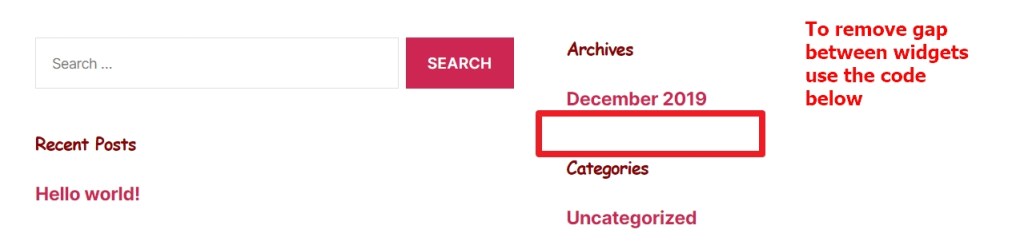
To remove gap between widgets
.footer-widgets .widget {
     margin-top: 2rem !important;
}
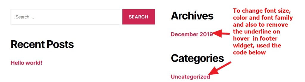
To change font size, color and font family of footer widget links and also to remove underline on hover
.footer-widgets a {
    font-size: 15px !important;
    color: blue !important;
    text-decoration: none !important;
    font-family: cursive !important;
}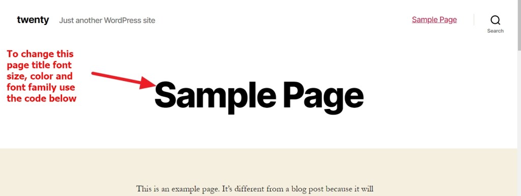
To change page title font size, color and font family in twenty twenty theme
h1.entry-title {
    font-size: 29px !important;
    color: darkred !important;
    font-family: cursive !important;
}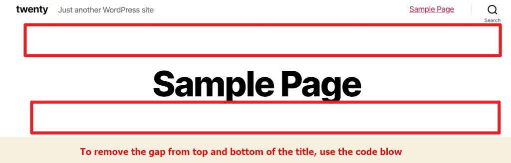
To reduce or remove gap from top and bottom of the title in twenty twenty theme
.singular .entry-header {
    padding-top: 2rem !important;
    padding-bottom: 4rem !important;
}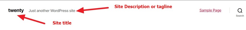
To change site title font color, font family, font size and text decoration
.site-title a {
    font-size: 23px !important;
    text-decoration: none;
    color: darkred !important;
    font-family: cursive !important;
}
To change Site Description or Tagline font size, font family , color and to make it bold
.site-description {
    font-size: 23px !important;
    color: darkred !important;
    font-family: cursive !important;
    font-weight: bold !important;
}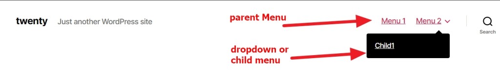
To change parent menu items font size, color , font family and font weight
ul.primary-menu.reset-list-style > li > a {
    color: red !important;
    font-size: 15px !important;
    font-family: cursive !important;
    font-weight: bold;
}
To change drop down or child menu black background color to a different one
ul.sub-menu {
    background: red !important;
}
body:not(.overlay-header) .primary-menu > li > ul:after {
    border-bottom-color: red !important;
}
To change dropdown/child menus font size, color and font family
ul.sub-menu a {
    font-size: 16px;
    color: white !IMPORTANT;
    font-family: cursive !important;
    font-weight: bold;
}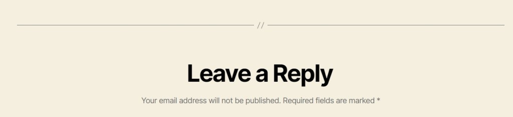
To change font size, color and font family of Leave A Reply in twenty twenty theme
.comment-reply-title {
    font-size: 2.6rem !important;
    line-height: 1.2;
    margin-bottom: 6rem;
    color: darkred !important;
    font-family: cursive !IMPORTANT;
}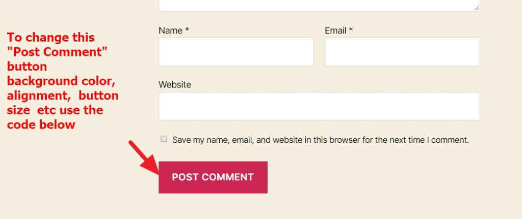
To change “Post Comment” button font size, background color, Alignment and button size
input#submit {
    font-size: 12px !important;
    color: white !important;
    background: darkred;
    display: block;
    margin-left: auto;
    margin-right: auto;
}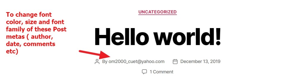
To change font color, size and font family of these Post metas ( author, date, comments etc)
ul.post-meta * {
    font-size: 12px;
    color: black !important;
    font-family: cursive !important;
}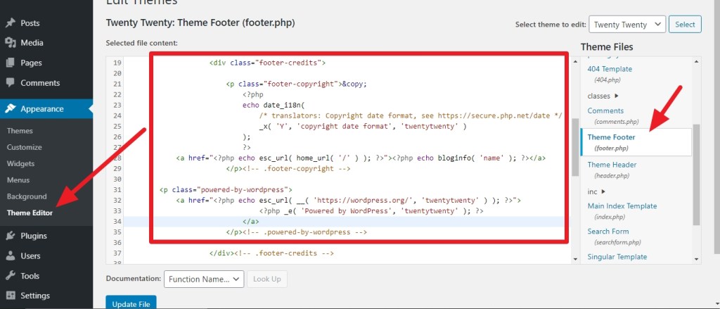
To change Footer Copyright information check the screenshot above, here i showed how to do it by editing the footer.php . I have not used any plugins for this. Use the Child Theme of Twenty Twenty to modify theme files.
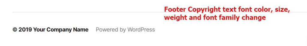
To Change Footer copyright text font size, color, font family and font weight
.footer-credits * {
    color: darkred !important;
    font-size: 14px !important;
    font-family: cursive;
    font-weight: bold;
   }
Twenty Twenty Theme with Gutenberg Editor
If you have any issue feel free to ask me question here in comments section
OR
Contact me in Skype: om2000_cuet

 All About Basic
Hi! Do you know how to reduce the amount of space between header and first block? Thanks!
LikeLiked by 1 person
Hi David
would you mind to share me your site url where you are working please?
Regards
Om
LikeLike
The css to reduce the space between the header and first block isnt working for me. Not sure what I’m doing wrong. Do you mind taking a look?http://thebillieholiday.org/
LikeLike
Hi Deniz
which space u r referring?
can u share me screenshot please?
LikeLike
Thanks a lot for sharing these css snippets Prakash Chowdhury! Made my day!
All the best!
Larry
LikeLike
Pleasure Larry
LikeLike
How hide tags in twenty twenty theme .please tell me.
LikeLike
thanks
please share me the site url where you are working please
Regards
Om
LikeLike
How can I change the color of the header?
LikeLike
Hi Jeff
share me the site url you are working on and by header you means the h1, h2 headers?
let me know
Regards
Om
LikeLike
Thank you so much for this post! I have used several of these to help customize a couple of sites. This is such a great resource! I’m trying to add a top bar (above the nav menu) with a phone number and a book now button sitewide on wordpress twenty twenty. Can you point me in the right direction for help with this? Thanks!
LikeLike
Hi Justin
https://jcan.co/
is that where you are working?
let me know
Om
LikeLike
No, that’s just my site. I’m working on https://azfunandsun.com . It’s a really simple site. Thanks for your help!
LikeLike
Hi Justin
thanks
for this you need to modify the header.php file to include that feature
Regards
Om
LikeLike
For a topbar in the twenty twenty theme, what line of code do I need to put in the header.php file. For Beginners this is hard 🙂
Best from Germany!
Regards
Daniel
LikeLike
Hi Daniel
what changes u want to do in the topbar?
Regards
Om
LikeLike
Thanks for this tutorial! really good and with useful tips.
A question: is there a way to change the text in the “Leave a Reply” area? eg instead of “Leave a Reply” change to “What are your thoughts?”
LikeLike
Hi Luis
are u using wordpress.com?
LikeLike
hi! yes. It’s hosted in a local provider and WordPress.com is installed. I am running the “ˇwenty Twenty” theme
LikeLike
thanks Luis
would you mind to share me your site url to check please?
Om
LikeLike
I am trying to use this CSS to not display the header name in 2020 theme;
.h1.entry-title {
display: none;
}
Which theme file should it go in? style.css, header.php? If I can get it to work I will put it in a child thesem
LikeLike
Remove the Dot before h1
Regards
Om
LikeLike
glass500.com
1. How to limit the cover header height or make it responsive? There is currently too much white space between background image and Entry Title.
2. How to make the background image responsive? I would like max image width 400px.
Thanks I’ve found your WP theme customization pages excellent over the years.
LikeLike
thanks, i just checked the site and there is no background image showing?
LikeLiked by 1 person
Thanks for the reply. I have a background image that looks like text: “Up to $500 for solving the crime.”
Here’s a screenshot: ttps://drive.google.com/file/d/10BlX9TCVsj1WoLHypsKKdn1n4cqphPdn/view?usp=sharing
THank you!
LikeLike
thanks actually the way u have implemented…better u create a child theme and use the image directly in header file
LikeLike
Thanks a lot for your tutorial! i really appreciate it
LikeLike
Pleasure
LikeLike
Namaskaram !
Can you please help me with changing the width of a paragraph H2 in twenty twenty?
I need it to be full width like an image.
Thanks a lot for your post!
LikeLike
Thanks Oliver
would you mind to share me the url where you are facing the issue please?
Regards
Om
LikeLiked by 1 person
I work on local server, but i allready manage to change it.
Can please show me how to shrink the header, is in a fix postion and on desktop version is covering a part of my menu(sliding menu, i use the mobile version in all widths)
LikeLike
Thanks Oliver
actually it would better if i could see the site live
Regards
Om
LikeLike
Thank you. This was very helpful. You should consider doing videos. 🙂
Stay safe.
LikeLike
Thanks for the great input, I have applied some changes to my site. Waiting for more 😉
LikeLike
Very useful – many thanks.
Nick
LikeLike
Your tips are awesome! I want to reduce the size of the secondary menu at the bottom. Can you please provide the code for that?
LikeLike
Sure,
share me your website url
i will check and share u the code
Regards
Om
LikeLike
site is johnpdriscoll.com I did just remove the menu, but would love the code anyway. Also want to reduce the size of the hero text. Thanks again!
LikeLike
your site is looking like this in my end
Regards
Om
LikeLike
How do I hide the entire header for a specific landing page? Just looking for the css code. I know the page ID already. Thanks!
LikeLike
Hi Zelma
please share me the page url you want to hide the header
Regards
Om
LikeLike
OM,yes, I have been having terrible loading problems with http://www.johnpdriscoll.com. Sometimes it looks like the screenshot you took, sometimes normal and sometimes it won’t load. It is making me so crazy. There must be some conflict somewhere. I am likely going to have to change themes! Any suggestions from you would be appreciated.
LikeLike
I think you have cache plugins installed in your dashboard…right?
if yes Deactivate it
or
share me the list of active plugins
Regards
Om
LikeLike
Thank you for this post. I’ve got three issues I would greatly appreciate help with re: Twenty Twenty theme. 1) how can I change the default width of the content block to be wider? 2) how can I change the post tags location on a single post page after changing the size of the post content? and 3) how can I change the size of the video player to the maximum width of the content area?
LikeLike
Hi Jeremy
would you mind to share me your site url please
also
in which page u used video player? share me that url too
Regards
Om
LikeLike
Thank you for this great post! I learned to do modifications to Twenty Twenty theme with the examples you gave. I have one question, how to change the desk top expanded menu’s title font size and color in additional CSS? With the expanded menu title I mean the text ‘menu’ which has three dots next to it. I would like this text to be little larger and to have same text color what rest of the menu text items have.
LikeLike
Hi Tero
would you mind to share me your site URL so that i can check?
Regards
Om
LikeLike
Hi. The site I’m managing is in http://www.rogatchi.org. So great if you have time to see it.
LikeLike
Hi Tero
please try this
span.toggle-text {
color: #8b0000 !IMPORTANT;
font-size: 2.2rem !important;
}
let me know if that helps
Regards
Om
LikeLike
Wow! Thank you. That worked. You’re so amazing!
LikeLike
Thank You for sharing ur know, I really appreciate this 🙂
LikeLike
pleasure
LikeLike
Hello !
Thank a lot for your help.
To reduce or remove gap from top and bottom of the title in twenty twenty theme I use your CSS Modification :
.singular .entry-header {
padding-top: 2rem !important;
padding-bottom: 4rem !important;
}
It works perfectly for PC media, but it doesn’t works for tablet and mobile size. Do you have a solution ? I want to reduce the gap particularly for the mobile version of my site where the title take 1/3 of my page… and the gap take the rest !!
In addition, this CSSworks only in Pages and not in Articles. Is it normal ?
thank for your help
LikeLike
Would you mind to share me your site url to check please?
LikeLike
Thank you so much. It worked for me!
LikeLike
Hi,
my site is here: https://tarieli.lipartia.com
some questions:
1. How do I remove category name in the blog post?
2. Can the text of the blog post be the same font and size (or even bigger) as the font of the post’s date and author?
3. Is there a way to make the blog post wider than now?
LikeLike
Please try these first
you used some break
in the post text…check by removing those
.entry-categories {
display: none;
}
.entry-title, .entry-title a {
font-size: 1.8rem !important;
}
.entry-content, .entry-content p {
max-width: 71% !important;
margin-left: auto;
margin-right: auto;
}
Regards
Om
LikeLike
Is there a way to remove the header completely?
LikeLiked by 1 person
yes
if you share me your site url, i will give u the code
Regards
Om
LikeLike
Hi! Thanks for this tutorial – super useful!!
I wonder If there’s a way to give the page titles a left alignment rather than central?
Thankyou!
LikeLike
Hi Hannah
would you mind to share me the site or page url where you are working and want the change please
Regards
Om
LikeLike
this is so awesome – i love this tutorial – your site rocks and is one of the best site of its kind. keep up the awesome and outstanding page – it is so great
LikeLike
Such a useful website! Can you tell me please the css code that would change the “To the top” verbiage (located in the right side of the footer) to “Crow’s nest” My website is https://www.marcustibesar.com THANK YOU!
LikeLike
Hi Marcus
it is not css issue actually, but you can change the “To The Top” text from footer.php
you can check that file
Regards
Om
LikeLike