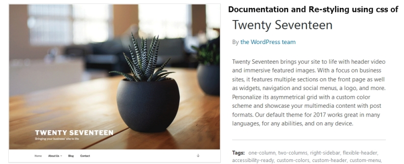
Twenty Seventeen theme is a new theme by WordPress.org and wordpress.com. Twenty Seventeen brings your site to life with header video and immersive featured images. With a focus on business sites, it features multiple sections on the front page as well as widgets, navigation and social menus, a logo, and more. Personalize its asymmetrical grid with a custom color scheme and showcase your multimedia content with post formats. Our default theme for 2017 works great in many languages, for any abilities, and on any device.Twenty seventeen theme comes with the latest update of wordpress 4.7. Here I have shared some css code to stylize your twenty seventeen theme.
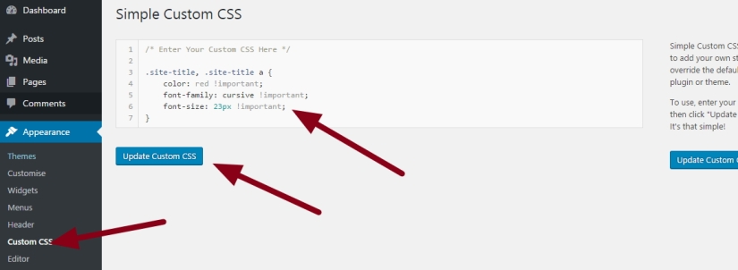
For wordpress.org users you have to install Simple Custom Css plugins to use my provided css.
You can use my shared code and ask question in the comments section.
Question 1: If you want to change / reduce height of header image in twenty seventeen theme
.has-header-image .custom-header-media img, .has-header-video .custom-header-media video, .has-header-video .custom-header-media iframe, .has-header-image:not(.twentyseventeen-front-page):not(.home) .custom-header-media img {

height: 66% !important;

object-fit: fill !important;

width: 100%;

max-height: 100% !important;

display: block !important;

position: relative !important;

}
#wp-custom-header {

height: 100% !important;

}
.admin-bar.twentyseventeen-front-page.has-header-image .custom-header-media, .admin-bar.twentyseventeen-front-page.has-header-video .custom-header-media, .admin-bar.home.blog.has-header-image .custom-header-media, .admin-bar.home.blog.has-header-video .custom-header-media {

height: calc(71vh - 32px) !important;

}
Question 2 : If you want to change site title font color, size and family of twenty seventeen theme, use the following css code
.site-title, .site-title a {

color: red !important;

font-family: cursive !important;

font-size: 23px !important;

}
*** To remove page title from twenty seventeen theme and remove gap
.page #content {

padding-top: 13px !important;

}
.page .entry-header {
display: none !important;
}
Question 3: If you want to change site description’s font color, font size and font family
body.has-header-image .site-description, body.has-header-video .site-description {

color: white;

opacity: 0.8;

font-family: cursive !important;

font-size: 23px;

}
Question 4: How to change the ‘Proudly Powered By WordPress’ text in the footer
at first go to Appearance > Editor > footer.php and replace the mentioned text with the following

<div class="site-info"><a href="Your URL"> Your Footer Text </a></div>
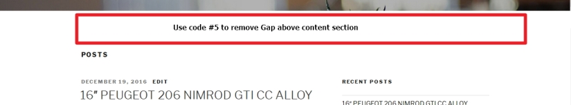
Question 5: How to reduce gap just above the content section
#content {

padding-top: 35px;

}
Question 6 : How to increase Twenty seventeen content section width
*** at first increase the wrapper width ***
.wrap {

max-width: 1145px;

padding-left: 3em;

padding-right: 3em;

}
*** 2nd — increase left side content section width ***
#primary {

width: 70% !important;

}
*** 3rd — decrease right sidebar width ***
.has-sidebar #secondary {

width: 26% !important;

}

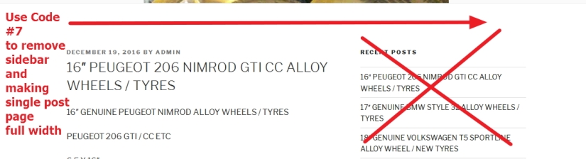
Question 7 : How to remove sidebar from single post page in twenty seventeen theme and make post page full width
.single-post #secondary {

display: none !important;

}
.single-post #primary {

width: 100% !important;

}
Question 8 : How to remove featured image from single post page in twenty seventeen theme
.single-featured-image-header {

display: none;

}
Question 9: How to remove Post date and post author in twenty seventeen theme?
.entry-meta {

display: none !important;

}
Question 10 : How to change font family, font size and font color in single post page title of Twenty seventeen theme
.single-post .entry-title, .page .entry-title {

font-size: 1.625rem !important;

color: darkred !important;

font-family: cursive !important;

}
Question 11: How to change font family, font size and color of Post date and Post author
.entry-meta * {

color: darkred !important;

font-family: cursive !important;

font-size: 13px !important;

}

Question 12: How to change home page or archive page (category page) single post title and archive page title’s font color, font size and font family in twenty seventeen theme
.entry-title, .entry-title a {

color: darkred !important;

font-family: cursive;

font-size: 24px !important;

}
Question 13: To change category name at the top of archive or category page at twenty seventeen theme
.archive .page-header h1.page-title {

color: darkred !important;

font-family: cursive;

font-size: 16px !important;

}
Question 14: How to hide or remove the category name at the top of category or archive page in twenty seventeen theme
.archive .page-header h1.page-title {

display:none !important;

}
Question 15: How to remove Featured image from single post page in twenty seventeen theme
.single-post .single-featured-image-header {

display: none !important;

}
Question 16: How to change content section font color, font size and font family in twenty seventeen theme
.entry-content {

color: black !important;

font-size: 15px !important;

font-family: cursive !important;

}
Question 17: How to remove comments section in twenty seventeen theme
#comments {

display: none !important;

}

Question 18: If you want to change background color of footer widget / Prooudly Powered by WordPress section
#colophon {

background: darkred;

}
#colophon * {

color: white !important;

list-style: none !important;

border: none !important;

box-shadow: none !important;

}
Question 19 : How to change sidebar widget title’s font color, font size and font family in twenty seventeen theme
.widget-title {

font-size: 15px !important;

color: darkred !important;

font-family: cursive !important;

}
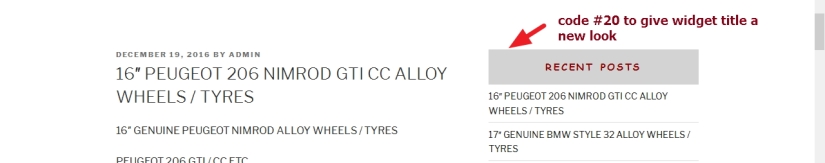
Question 20 : How to center the widget title, provide background color and remove space below the widget title
.widget-title {

text-align: center;

background: lightgrey;

padding: 5% !important;

margin-bottom: 0px !important;

}
Question 21: How to change links color, font size and font family showing in widget section in twenty seventeen theme
.widget li a {

color: darkblue !important;

font-family: cursive !important;

font-size: 14px !important;

}
Question 22: How to change hover link underline and hover font color for links showing in widget section
.widget li a:hover {

box-shadow: none !important;

color: darkred !important;

}
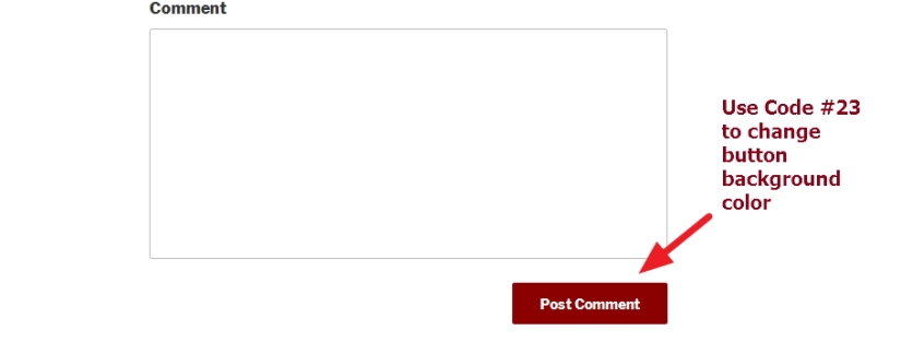
Question 23: How to change submit or other button background color in twenty seventeen theme
button, input[type="button"], input[type="submit"] {

background-color: darkred !important;

}
Question 24: To move Navigation menu to the top
@media (min-width: 760px) {

.navigation-top {

position: absolute;

top: 0px;

width: 100%;

height: 70px;

}

}
as you wanted to put navigation menu to the top, the inner page header image may be overlapped, so use this code too
@media (min-width: 760px) {
.custom-header {
position: relative;
padding-top: 70px;
}
}
Question 25: How to create Single / One Page Website using Twenty Seventeen Theme?
Answer: Here it is ; Creating Single Page Website
Question 26: Twenty Seventeen Child theme for major theme file modifications
Answer : Download Twenty Seventeen Child Theme Zip file for your major modifications.

 All About Basic
Hello,
Thanks for this post! Really helpful.
I do want to change the website title and description font family and size but …. applying your code in the beginning of style.css doesn’t work.
Am I doing something wrong ?
Thanks!
LikeLike
HI Guillaume
try to use Simple Custom Css plugins and put my code there
Om
LikeLike
Thanks!
LikeLike
It does work for the site title but not for the site description …
Also “body”is highlighted red in the Custom CSS editor
.site-title, .site-title a {
color: #333B97 !important;
font-family: helvetica, cursive; !important;
font-size: 36px !important;
body.has-header-image .site-description, body.has-header-video .site-description {
color: #333B97;
opacity: 0.8;
font-family: cursive !important;
font-size: 23px;
Any suggestion ?
:)
LikeLike
HI Guillaume
share me the site url where you are working on
Om
LikeLike
http://calypsoimports.com/
LikeLike
HI Guillaume
ok try this code to change font family and other styling of site description
.site-description {
color: #333B97;
font-family: cursive !important;
font-size: 23px;
}
Om
LikeLike
no luck :(
I’ll try to dig around … Thanks for the help thought !
LikeLike
Oh wait … sorry, I forgot a } …
it works perfectly ! Thanks !!!
LikeLiked by 1 person
Great :)
LikeLike
hello,
thank you so much, it is fantastic!!
Do you know how to change the logo position? it will help me a lot :-)
Thanks and have a nice day
Johanna
LikeLiked by 1 person
Goodmorning Johanna
please share me the site url you are working
and in which position u want to put it?
Om
LikeLike
Hi Om
Thanks a lot, finally for the logo, I found a solution.
But I have another question :-)
I add a css code to remove the title of the pages, it’s ok and works well but now I have a big white gap instead of the title, certainly dur to the padding or margin, can you tell me how to reduce it ?
Do you have a tuto to make the menu one page responsive as on the twenty seventeen demo ?
It would be nice
Thanks again :-)
Johanna
LikeLike
HI Johanna
to reduce gap at the top of the page title …try this code
.page #content {
padding-top: 13px !important;
}
let me konw if it works
Om
LikeLike
Hi Om
It work for the page itself but not for the page on the scrolling homepage, and I would like to reduce the gap on the home page when I scroll with the mouse. I don’t know if you will understand well… :-)
LikeLike
HI Johanna
can you share me screenshot which section of homepage ( to reduce gap) you are talking about please?
Om
LikeLike
You can go on my website surlinstant.com
And on the homepage, when you scroll with the mousr, you have a fisrt text block which begins with “Felicitations”. There is a big white gap before.
If you continue scrolling, the second text block has also the white gap and so on.
Do you see it?
LikeLike
HI Johanna
please try this code
.home .entry-header {
margin: 0px !important;
}
.home .wrap {
padding-top: 20px !important;
}
These codes are applicable for homepage
please let me know if they works
Om
LikeLike
Hi Om
It works very well
Thanks a lot
Johanna
LikeLiked by 1 person
thats great Johanna :)
LikeLike
Hi Om
As you know well the twenty seventeen theme, can I annoy you one more time?
I uplaoded a video on the header, on mobile device (iphone), the video doesn’t appear, do you know why ?
I uploaded mp4 video with 7mo weight but the theme is probably not video responsive, can you confirm ?
Thanks a lot and happy new year :-)
Johanna
LikeLike
HI Johanna
Happy New Year to you too :)
sorry for the late response..was busy whole day..
the video is not showing in your mobile…i guess the mobile browser you are using doesnt support tag you used to show the video…
if u use youtube video..does it show?
or
better you use any other sort of plugins
Om
LikeLike
Hi Om
Thanks for your reply. Even when the video is on youtube, it is not responsive on mobile phone (iPhone), don’t worry, i will do without. I think it comes from the theme.
Thanks a lot for all
Johanna
LikeLike
HI Johanna
if you use youtube i can help to make it responsive i guess
so..if u wise i can give a try
Om
LikeLike
thanks a lot for your help, I prefer to keep my videos on my server :-) No problem for the responsive video, I found another solution.
Do you know if it is possible on the homepage, to have a background image on the first text “Felicitations” ?
Many thanks again :-)) you are wonderful !
LikeLike
Hi Johanna
thanks..sorry for the late response (facing little family issue)
yes there are other solution (using plugins…i cant suggest them properly to you as it will need to check dashboard)…
and.. i found you are using an image for the text Felicitation….so u need background image where?
can u share me any mockup screenshot about ur issue?
Om
LikeLike
Hi,
I have pretty much the same question. I want to place my logo in the upper left corner of my front page, because it would fit much better with the colours of the head photo. I managed to put it somehow more on the right side with the Advanced Twenty Seventeen plugin, but can’t find how to move it upwards. You can find my site at http://thedioramaproject.com/
Thanks!
Sanne
LikeLiked by 1 person
Hello, I encounter the same problem as Johanna, my video in background does not pass on mobiles and tablets.
The video is hosted on youtube because too heavy for the server and I want it to start on all types of media. Can you help me please
LikeLike
HI
thanks
please share me the site url to check
Om
LikeLike
Hello, the url of my site is http://portail.acoeurdart.fr/
thank you in advance
LikeLike
HI
i checked your site using http://ipadpeek.com/ and i found the video background is showing properly?
please let me know
Om
LikeLike
Hello I just check on http://ipadpeek.com/ also I find that it works.
However, when I go to my site https://portail.acoeurdart.fr/ of my laptop or my tablet the video still does not turn.
LikeLike
HI
when i checked https://portail.acoeurdart.fr/ in my laptop the video is playing in background well?
which browser, and which Operating system you are using?
let me know
Om
LikeLike
Hello
On my laptop the video works well.
The problem arises for tablets (ipad …), cell phones (windows phones, samsung, iphone …)
LikeLike
Hi, Thank you very much for such a helpful post. I removed the header but I am having some trouble removing a white bar at the top of the page, maybe you could please guide me on which way to go to do this.
Thank you very much
LikeLike
HI Juan
please share me the site url where you are working
Om
LikeLike
Thank you very much!
Alex from Germany ;-)
LikeLike
Pleasure Alex :)
LikeLike
How to reduce space between primary content and rigth sidebar.
Thanks
LikeLike
HI
thanks ..sorry for the late response (facing little family issue)
so you want to increase width of your left side content section so that it almost touch the right sidebar?
please let me konw
OM
LikeLike
Hi Om,
I would like to float the text on a page (not a post) to the left (under the title) instead of floating it to the right, as is the default. Do you have any ideas?
Cheers,
Chris
LikeLike
Hi Chris
thanks …sorry for the late response
would u mind to tell in which site u want to do the changes please?
also
would u mind to clarify me the issue some more please? sorry didnt get the idea of ur issue properly
Om
LikeLike
Hi Om,
It was a very quick response, thank you! What I want to do seems to be a little complicated. I would like to change the page template so that the text appears on the left side of the page, under the heading. At the moment, it appears on the right of the page. I have not launched the site yet, but the temporary sandbox site is here: rudge.philamentjournal.com/blog/. On the pages, such as the “About Chris” page (http://rudge.philamentjournal.com/blog/about/), I want to move all the text to the left. This, I think, involves changing the php in the page template page, and maybe the functions.php?
Thanks for you help!
Chris
LikeLike
Hi Om !
Hope I can ask a you question about the Twenty Seventeen theme. I’ve installed the wpforo (forum) plugin and I want to make the forum full width.. with that I mean I don’t want the column with the page title, but only the content (the forum) in full width. With your question 6 answer above I couldn’t make it work.. a couple of other things worked perfekt. Second question is the main content.. it’s wider now but the title column still to width… how do I reduce this without modifiying the content column either ? Hope you can help me !
With kind regards, Martijn (the Netherlands)
LikeLike
HI Martijn
would u mind to share me the forum page url where you want to do the changes please?
** please dont mind if i am little late to reply
Om
LikeLike
I changed the site now to ‘one clumn’ and the forum is wide (wide template) but.. this is not what I wanted.. I would like to have 2 columns with the page title column only very small (http://www.mfc-ikarus.de/wp/community/)
Next problem seems to appear in the openingsscreen (scroll down) the weather-station widget is now below the text and the widget does not appear beside the text..
LikeLike
Hi, Thank you very much for such a helpful post.I increase the content section width with code #6.It works well on my PC,but not suit for my phone.What should I do if I don’t want the code works on my phone?Thanks for your reply!
LikeLike
HI Jiang
thanks..sorry for the late response…
to solve the issue please wrap my code in the following way
@media only screen and (min-width: 980px) and (max-width: 20000px) {
my code will be here
}
please let me know if you got it
OM
LikeLike
Hi OM
Thanks for your reply.I have used the method and it really works well.My problem has been solved.Thank you very much!
LikeLike
Pleasure Jiang
Om
LikeLike
Hi Om,
Thanks for your help. After looking after a solution for the ‘Proudly Powered By WordPress’, I finally found your web, and after a couple of minutes I fixed it!
You Rock!
Cheers
Mario
LikeLike
Pleasure Mario :)
LikeLiked by 1 person
Hi Om!
Thanks a lot for your codes about Twenty Seventeen, it helps a lot. Can I ask one more question?
How can we remove the underline from the link? I try a lot of codes but none seems to work :/
Thanks for your help :)
Ogzy
LikeLike
Hi Ogzy
try this code please
a
{
borber-bottom:none !important;
}
LikeLike
Hi Om,
Thanks for your answer! I tried your code but it doesn’t work. The underline is still here!
Here is my website in case you want to check: sophierabia-psy.ch
Thanks a lot for your help
LikeLike
HI Ogzy
your site showing Under Construction…
would u mind to deactivate it for a day so that i can check?
and is the underline in links showing in homepage?
let me know please
Om
LikeLike
This is all great, thanks so much for the info. I was wondering if I could get some help. I followed all the instructions on question 6, saved/updated it all, and it’s not changing the content or side bar widths. If you have any insight on how to trouble shoot it, I’d so appreciate it. Thank you!
LikeLike
HI Jake
would u mind to tell which site you are working on please?
OM
LikeLike
Thank you for this post! Having a list of all of the selectors really helped me, especially when figuring out how to remove the padding around the page content.
LikeLike
Pleasure Erika
Om
LikeLike
Hello Om, First, thank you for the helpful post, I used the footer code and it worked perfectly. I cant seem to get the code to remove the side bars to work, on a state front page. Is there any way you can help me please?
LikeLike
Hi Juan
thanks
please share me the site URL you are working on
OM
LikeLike
I’ve been messing around with twenty seventeen trying to get the header image to fit 100% width at all times, (as in @media responsive/mobile view) and at a complete loss.
Any ideas?
ie: http://dev.wolfeblog.net
LikeLike
Hi Wolfe
not sure..but would u mind to try this code please?
.custom-header-media {
height: 100% !important;
}
header img {
position: relative !important;
}
let me know what u get
Om
LikeLike
Nope, not working. I even gave it a shot at placing it with the @media brackets as well as at the end of the css. And since it’s the width rather then height that is the main issue for me, I tried that as well. In fact it doesnt seem to effect it all. the @media version of the header image is unchanged for the cut off. annoying as hell.,
LikeLike
Thanks so much, very helpful! I am looking to increase the width of the content on on all pages (not posts)… is their a way to do this? Also, I donloaded CSS plugin, – do we just put all these codes in that box … just making sure … it seems awfully easy, but I have never done it before – I am using 2017 and would like to make some of these changes above, thanks again so much!!!
LikeLike
HI Kevin
thanks
would u mind to share me the site url where you are working on please?
and
yes..just put the css code in the box and it will work
and..
you want to increase width 100% by removing the sidebar?
let me know
Om
LikeLike
Great – thanks – just launched though it is not done, but wanted to check some stuff with it live … http://www.kevinmccarthyshows.com – I’d like the width to be 80 or 85% so there is some padding on each side… right now it’s way to thin.
Here’s a couple of issues now that I have it up… If I am asking too much, I apologize – whatever you can do to help is fine.
1. Width on each Page -I think 100% might be too much? whatever you think…
2. I tried to change the text font to regular black, but it won’t let me for some reason – I have Advanced Twenty Seveeteen
3. There is a ton of space between content and the Menu bar… I tried putting your code into CSS but didn’t work for me
4. Can I change the fonts on the entire site to Arial? Can you explain how?
Or is there one your suggest? I don’t like the current one… something like Arial would be great.
5. Can I easily make one of the menu buttons a direct link to another page in my site? In the drop down in shows I have a couple that repeat.
6. Footer – Looks like crap, I try to make changes but not sure how to change things up
I did this site on my own – it was the first time I ever did anything in WordPress… I got farther than I thought I would! Everything is backed up so that is all good..
I am so grateful for your help!
Thanks so much!
Kevin
LikeLike
ONe more thing, when updating the Simple CSS – if you have multiple codes, where do they go? all in between brackets? or doesn’t it matter…
Sorry again if I asked for too much… if it is too much, just let me know, If you can help, that’d be huge… don’t know where else to turn, got pretty far on my own, but now need help……thanks!
LikeLike
Here’s more info that might help – I cut and pasted this from an older website not done in wordpress, there was HTML attached to it and I wonder if that is effecting something… for example… I have the plug in “Advanced Twenty Seventeen” and yet if I go to Global Advance Typography… I changed the text color to solid black and the Link color to Red… but neither is working… something is preventing the color of text and the color of link from changing…. if I have too many questions, maybe you do a paid help session? just don’t to ask too much…
LikeLike
Ok, sorry again about all the posts and all info… I researched more and just figured out a few things! Thanks so much!
#1 – working on it right now
#2 is done – see code
#3 is done – see code
#4 is done – changed it to Open Sans
#5 is done – I used a plugin
#6 – found youtube video on how to do it
.site-header-main {
padding-bottom: 0;
}
.site-content {
padding-top: 0;
}
.entry-content p, .entry-content b, .entry-content strong {
color: Black !important;
font-size: 95% !important; (brought the font size down a bit which is what I wanted, too)
}
LikeLike
Hi Om, Maybe you can help me? On the twenty seventeen theme, I would like to make a change if possible to the top navigation menu. I would like to make the menu two lines instead of one line – where I can pick 3 or 4 links that I want on the first line, and then 3 or 4 other links on the second line. I know I can place many links on the menu and it will become two lines long (but it’s really one line long with overflow). Can I do this? For example: (first line of menu): Home, Page 1, Page 2, Page 3 —— (then second line of menu) Page4, Page 5, Page 6. I appreciate your time and look forward to your answer. Thank you so much. JS
LikeLike
Hi Joe
yes..that can be done by modifying the theme file ..adding an additional menu system below the current one
Om
LikeLike
Thank you for taking the time to answer my question, Om! I do appreciate it. So, I hate to bother you more, but could you give me a little more instruction on how to do the information you’ve mentioned above? Which file would I modify? Do I look for certain information and just copy and paste a second instance right under the first one? I’m using the twenty seventeen theme if you can use that as an example. If it’s too complicated and you’d rather not tackle that much information, I surely understand. Thank you again in any case! Joe
LikeLike
i have a problem. I have adapted the solution of question 1 in the Style.css. However, I now have the problem that my header image is consumed. If I reset the changes to the original, but nothing happens and it remains so. Do you have a solution?
LikeLiked by 2 people
Hi
would u mind to try this code please
div#wp-custom-header, div#wp-custom-header * {
height: 100% !important;
position: relative !important;
}
let me know if it helps
Om
LikeLike
well thanks it works
LikeLike
Hi Om,
Great post! super helpfull.
My question is: how do I get rid of the word ‘POSTS’ above my frontpage post.
My site only has one post and a sidebar. I don’t need to specify that posts are shown on the left side of my frontpage.
Thanks
Olaf
LikeLike
HI Olaf
please try this code
.home header.page-header {
display: none !important;
}
let me know if it helps you
Om
LikeLike
That worked a charm! Thanks, you are a lifesaver.
LikeLike
Thanks in advance for your help! Trying to wrap text around slider with picture right justified…
Code is likely wrong, but I looked all day and couldn’t find anything online wrap text with Unite Gallery – if there a better gallery for this or …
Is Code Wrong
https://kevinmccarthyshows.com/?page_id=370
code
This program was developed by Kevin specifically for a school in the Clarence district using “RESPECT” as their main theme for the year and the show was a big success! The students learn important lessons on how to be respectful to everyone, not only teachers & parents, but fellow peers as well. Kevin shows students why [unitegallery Respectslider catid=1]
it is important to be respectful and outlines the key ways of giving and showing respect. Kevin discusses how everything you will want in life requires getting along with other people. Learning how to give and show respect is one important key to life-long success. Kevin excites audiences with fun, familiar, and upbeat songs and actively engages the students for an enjoyable and memorable learning experience.
[/code]
LikeLike
Hi, thanks for your help! I need one more customization… I need my logo centered in the header and title below it centered, also in mobile mobile. Can you help me?
LikeLike
Hi Marco
please share me your site url to check
OM
LikeLike
http://www.bioalkimia.it
Thanks!
LikeLike
HI Marco
just checked
by center you mean..to position the logo center of the screen? i mean to position the logo in the middle from top?
please let me know
Om
LikeLike
Yes logo a center and text title below, like in mobile version…
LikeLike
I guess i solve it with media query:
@media only screen and (min-width: 768px) and (max-width: 10000px) {
.site-branding {
padding-right: 25em;
padding-left: 25em;
}
}
Can you delete link from website from my post please?
LikeLike
Hey Om,
I want to remove the Page titel und follow your instructions from question 2, but nothing happens. At the moment i have two page titles, but would like to have only my own.
Do you have a solution for me?
Best Regards
Marcel
LikeLike
HI Marcel
you want to remove “Willkommen” from your homepage?
please let me know
Om
LikeLike
Hey Om,
No i want to remove for example the “Start” over the “Willkommen” from the “Willkommen”-Page.
Is that possible?
Regards
Marcel
LikeLike
Hey om,
my problem is done.
Other question is how can i give the upper menu more wide, so that all menu points are in a row?
Regards
Marcel
LikeLike
Hi Marcel
try this code
.navigation-top .wrap {
padding: 0.75em 0em !important;
}
this code is for ur site http://carport-infos.de/
also
would u mind to tell what was your previous issue and how u solved it ? sorry..ur comments went behind others…
Om
LikeLike
at the first problem, the code from your question 2 has remove the Page title. I forgot to update my page. -.- :D
LikeLike
Ok Marcel
if u need any help, feel free to ask
Om
LikeLike
Hey Om,
thanks man ;)
Regards
Marcel
LikeLike
Second problem for me are two vertical black stripes for video on header from youtube…why?
Thanks!
LikeLike
HI Marco
your site seems in Maintenance Mode?
Om
LikeLike
Hi Om,
Thanks for a lot of useful information, much appreciated.
I’m almost done with my personalised twenty seventeen website theme – free version (working on it in desktop server mode before I publish it). But I have spent hours trying to figure out how I can have both the logo (to the left) and menu navigation (to the right) in the header? I have removed the site title and tagline and tried to add so many different CSS codes to my custom CSS plugin but nothing has worked unfortunately.
Thank you so much in advance,
Best regards,
Cecilia
LikeLike
HI Cecilia
actually it would better if i could check your site Live…
it will require theme file modifications to do so ( as i guess)
OM
LikeLike
Hello OM,
Thanks for your prompt reply.
I would like to avoid to set it live yet.
I can send you screengrabs if that would help?
Thanks, -Cecilia
On Fri, Feb 3, 2017 at 1:50 PM, All About Basic wrote:
> allaboutbasic commented: “HI Cecilia actually it would better if i could > check your site Live… it will require theme file modifications to do so ( > as i guess) OM” >
LikeLike
HI Cecilia
ok..
share me the backup of ur wordpress ( zip it and give me with database)
Om
LikeLike
Hello Om,
Of course, not a problem. Please see attached zip file I just backed-up and downloaded.
I would like my header to be displayed as this website: http://liviaskitchen.co.uk/ (with logo, menu and social media on the header, same line but with the social media icons at the very end instead).
Also, with the featured image that I have with the page called The Smaka Story at the front page I would like to display it like http://liviaskitchen.co.uk/ (several of photos slides with arrows on the side for the guest to flick through, I don’t need to be able to add text on top of the photos), is this possible?
I just saw that my mobile version is showing this white border on the top and bottom of the menu, I have tried to remove it but haven’t succeeded.
Many thanks, Om. – Cecilia
On Fri, Feb 3, 2017 at 2:12 PM, All About Basic wrote:
> allaboutbasic commented: “HI Cecilia ok.. share me the backup of ur > wordpress ( zip it and give me with database) Om” > Respond to this comment by replying above this line > > New comment on *All About Basic * > > > > *allaboutbasic* commented > > on Twenty Seventeen Theme: Modifications of header, footer, sidebar, > contents and documentations > . > > > in response to *smakasnack*: > > Hello OM, Thanks for your prompt reply. I would like to avoid to set it > live yet. I can send you screengrabs if that would help? Thanks, -Cecilia >
LikeLike
Hi Cecilia
seems u forgot to share me the zip…
would u mind to upload the zip in dropbox and give me the link please?
Om
LikeLike
Hi again Om,
Sorry I forgot to add the link, here it is: https://www.dropbox.com/s/2uas2mhtjfdyr4p/Cecilia_smakasnack-dev_twentyseventeen%20theme.zip?dl=0
LikeLike
Hi Cecilia
share me the zip of ur modified twenty seventeen theme too
Om
LikeLike
Hi Om, Can’t find where my plugin theme-junkie-custom-css back-up the css changes I have added in a file so I have just pasted them in a doc and uploaded to dropbox:
https://www.dropbox.com/s/8lq8p1qkaq9uqhb/All%20CSS%20I%20have%20added%20in%20the%20Custom%20CSS%20on%20my%20wordpress%20website.rtf?dl=0
Thanks Om,
-Cecilia
LikeLike
Hi Cecilia
so u didnt modify theme file?
it would better if you share me the theme u r using
LikeLike
Hi Om,
No, I haven’t modified the theme file only added the css codes using the TJ Custom CSS plugin and add it straight to the Appearance – Custom CSS and save. Is this incorrect? I’m using the twentyseventeen theme,
Thanks,
– Cecilia
LikeLike
HI Cecilia
thanks..sorry for the late response
i tried to import the database in my localhost wordpress setup and it is showing error?
have u exported the database properly?
let me know
Om
LikeLike
Hi Om,
Thanks for your email. Yeah I belive so, I’m accessing my wordpress via the desktop server and loggin in on wordpress.com and I don’t have any error message showing up. What would you suggest me to do or how can I find out if I have exported the database properly?
Thanks,
Best regards
Cecilia
LikeLike
Hello again Om,
I have just added two files (gzipped and zipped) to dropbox that I exported from phpMyAdmin as I just realised that it was this file you meant? Thanks in advance.
https://www.dropbox.com/s/mzi6or2ff85rlfv/Cecilia_smakasnack-dev_twentyseventeen_theme.sql.zip?dl=0
https://www.dropbox.com/s/i9hxu6if0w36t1g/Cecilia_smakasnack-dev_twentyseventeen_theme.sql_gzipped.gz?dl=0
Best regards
Cecilia
LikeLike
Cecilia
sorry for the late
allow me time I will let you know asap
LikeLike
Hello Om,
No worries, looking forward to hearing from you.
LikeLike
Hi Cecilia
sorry for the late
http://davidrev.joymaa.com/
your database was problematic but i managed it to upload
one thing is..what i found …what u wanted ( to align logo and menu)..u already have implemented it in ur dev site?
please let me know
Om
LikeLike
Hi , I couldnt remove the gap between header image and below place where writing guitarplayer , songwriter etc.. please see below link : http://www.ozgurhazar.com
LikeLike
Hi
please try this code
.header-image-slider {
margin-bottom: 0px !important;
}
let me know if that helps
*** it will reduce gap between header image and your image (holding guiter)
Om
LikeLike
Hi Om,
First of all, Thanks a ton for all your useful tips.
In my website, I want my content width to be full width. I DO NOT want sidebar or sidebar space either to the right or left. Is it possible? If possible please provide with a suitable CSS. The one mentioned in your tips didn’t work.
Second, I have embedded some videos in my website. I want to decrease the height and width of the video window, so that in a row I can fit upto 3 columns of video. Please help.
TIA
LikeLike
Hi TIA
share me your page or post url where u want it full width….
also…
have u installed Simple Custom CSS? my code should work..
please let me know
Om
LikeLike
Hi Om,
Please find the url where I want full width. Similarly I want full width in all the pages.
http://www.yourhallofframe.com/who-are-we/
No, I have not installed Simple Custom CSS. I try to avoid using many plugins. But I am using the Additional CSS option in the Customization menu.
Also let me know the solution regarding embedding videos.
Thanks.
LikeLike
Hi
for full width page (mainly to increase the content width) try this
#primary {
max-width: 100% !important;
}
.wrap {
max-width: 1000px;
padding-left: 1em !important;
padding-right: 1em !important;
}
Regarding video..
share me the page url where u used the video
Om
LikeLike
This is the page in which I want to reduce the height and width of the video window, so that I can fit three videos in a row.
http://www.yourhallofframe.com/cinematography/
LikeLike
HI
the iframe code u r using for videos..there are height and width option… u can check by reducing that prarameter
Om
LikeLike
Hi I tried to insert your code but I continue having the same problem….the width of my homepage is limited….can you help me?
LikeLike
HI NickGritti
have u installed Simple Custom CSS to use my provided code?
let me know please
OM
LikeLike
Yes I tried with Simple custom css too…but the width of the content remain the same
LikeLike
Hi Om, I’m trying to make a site with a fullscreen slider using the Master Slider plugin. Is there a way to get rid of the white space at the bottom of the page, so the slideshow will fill the screen?
This is the site:
http://cairngallery.space/
Thanks
LikeLike
Hi Sped
the site you shared is not opening in my end?
Om
LikeLike
That’s strange – I just tried it on my friend’s computer and it worked ok… I wonder why that would be. Do I need a Gravatar account?
LikeLike
HI Aled
it is working now..sorry seems it was due to my ISP
please try this code
.home div#page {
display: none !important;
}
let me know if it helps
Om
LikeLike
Perfect! Thanks so much Om, you da best. Thanks for your fantastic page. Will come to you for any future queries.
LikeLike
Hi Om, I managed to set the slider to the correct size for my screen, but it is obviously different on different screen sizes. Do you know of a way to make the page responsive?
LikeLike
Hi ALed
just checked..i found ur slider is responsize…and it is responsive as ur site is already responsive
have u found any page which is not responsive?
let me know
Om
LikeLike
That’s interesting- I get a white band at the bottom when looking on a Mac screen – although it fits my PC laptop perfectly. If I made the image larger, would it resize automatically? Thanks Om.
LikeLike
Hi Aled
yes that white band is showing in my end too… I think by making the image to cover the full space in mobile..may not look good
Om
LikeLike
In fact could there be a bit of code that would zoom the page so that if you were viewing on a mobile device it would fill the screen? Sorry to keep bothering you!
Aled
LikeLike
umm no Aled
LikeLike
Hi Om, need your assistance. I try to used your trick number 6, but it doesn’t work at all. what I do is just copyed your script. please help me.
thank you
LikeLike
Hi Brian, would u mind to share me the site url where you are working please?
Om
LikeLike
still at localhost om. in building progress
LikeLike
HI
ok..
have u installed Simple Custom Css plugins?
try to paste my code in that plugins
OM
LikeLike
THANKS FOR the codes. i want to ask if i need to first create a child theme before making these modifications
LikeLike
Hi
Child theme is not mandatory if u use Simple Custom Css plugins…..
if u modify theme files…in that case child theme is mandatory
OM
LikeLike
I want make the slider of twenty seventeen theme header image please help
LikeLike
Hi Ramees
it will need to modify header.php file of twenty seventeen theme
OM
LikeLike
Hi OM, I am also wanting to replace my header image with a slideshow. I see you’ve been so kind to help others here! Would you mind helping me? coloradofruit.org/wchs
LikeLike
Hello ! thank you so much for your article. Tho I have a little problems and I saw a person Jiang commented you about the width code column doesn’t work for phone, you suggested to her to put :
“to solve the issue please wrap my code in the following way
@media only screen and (min-width: 980px) and (max-width: 20000px) {
my code will be here
}
please let me know if you got it”
But I don’t get it, as I had your code in the “additional css” I dont know where to put what you suggest and which code. Sorry I’m bit lost for this.
Thank you for your answer
LikeLike
Hi Chucky
you want to make ur site to be wider in mobile view?
if yes share me your site..i will share you the code
OM
LikeLike
yes exatcly, I did put the code on #6 for the website wider; which works like a charm but it doesn’t fit to mobile http://lekadre.com
LikeLike
Hi Chucky
to make your site wider for mobile view ( twenty seventeen theme) try this code
@media only screen and (min-width: 240px) and (max-width: 580px) {
#primary {
width: 100% !important;
}
.has-sidebar #secondary {
width: 100% !important;
}
}
let me know if it helps
Om
LikeLiked by 1 person
works like a charm OM, thank you so much
LikeLike
pleasure :)
LikeLike
I want remove header image but i can’t.
Please help me!
LikeLike
Hi
would u mind to share me your site url please?
Om
LikeLike
topm4a.com
LikeLike
And i want hide or remove date post and “POST” character on homepage

Thank Sir!
LikeLike
Hi Tom
to remove date from homepage posts
.entry-meta {
display: none !important;
}
To remove the word “Post” from homepage post try this
header.page-header {
display: none !important;
}
*** To change the top image…
have u checked Appearance > Customize section?
Om
LikeLike
Thank Sir! i had remove “POST” and header image, but i only remove post date on homepage, don’t remove on post single. plz!
LikeLike
HI TOm
in such case replace this code
.entry-meta {
display: none !important;
}
with this
.home .entry-meta {
display: none !important;
}
let me know if it helps
Om
LikeLike
Hi Sir!
“.home .entry-meta {
display: none !important;
}”
this code is not work like i want. It is still remove all. help me more…
thank you so much!
LikeLike
Hi
have u removed my previous code?
u need to remove my previous entry-meta code to make it work for homepage only
Om
LikeLike
Oh yeah! i had removed date post. So how to remove space and change location MENU like this picture (https://i.imgur.com/azo9RVel.png) . Plz help me! thank sir!
LikeLike
Hi Tom
To reduce gap from the bottom of homepage posts try this code
.home article {
padding-bottom: 12px !important;
}
To reduce gap between sidebar widget try this code
.widget {
border-top: 2px solid black !important;
padding-bottom: 12px !important;
}
*** Regarding menu issue
it will need header php file modifications
Om
LikeLike
It is not working. plz review and header.php file modifications for me.
Sir is amazing!
LikeLike
the code i shared for reducing gap not working??
LikeLike
OMG! that’s worked. Thank sir! But i don’t no modify header.php file :(
LikeLike
Solution mentioned by you for #6 is not working for me. I wish to reduce width of sidebar but it is not reducing. Please help. Thanks. My blog is http://www.asliveroflife.com
LikeLike
Hi Garima
have u installed “Simple Custom CSS” pluigns to use my code?
let me know
OM
LikeLike
Hi – how does one resize the image (smaller) at the top of the menu pages excluding the homepage?
LikeLike
Hi Karien
would u mind to clarify me the issue some more please? sorry didn’t understand it…also which site u r working on?
let me know
Om
LikeLike
Hi Om, thanks for the response. On the various menu pages i.e: about us, our services etc. my images are at the top + stretch across the screen. I want clients to see my copy immediately without having to scroll past the image first. How do you: 1. minimize the image PLUS 2. align images to the left side of the screen with the copy on the right?
Greatly appreciate your help.
LikeLike
Hi! Thank you for your very informative website.
You really have helped us alot.
I just have another problem with my website:
http://teach-to-fish-ph.com/about-us/mission-and-vision/
From the link above, you can see that the Page Title is Separated to the Page Content.
I want them to appear belonging to the same column.
Thanks a lot!
LikeLike
HI John
are u searching this? please try these codes
.entry-header {
width: 100% !important;
float: left !important;
}
.entry-content {
width: 100% !important;
float: left !important;
}
*** you are showing the contents to be centered..so… the contents will be centered aligned
let me know if it helps?
Om
LikeLike
Great!! :D
It is working!
Thank you very much!
LikeLike
Pleasure :)
LikeLike
Hey!
Many thanks for sharing this.
I searched the forums through wordpress and they didn’t solve my problem.
One of your code edits helped a resizing issue that I had on a mobile screen.
Best Regards,
Fernando A
LikeLike
Pleasure :)
LikeLike
This page is very helpful. Thanks for posting!
LikeLike
Pleasure Smith :)
LikeLike
Hi OM
I am new to this, but I am using Twenty Seventeen and I think the text possible to put on top of the header picture is too small. I have two lines:
http://motorcycle-touring-norway.no/
I did copy your code in question #2 into my plugin Google Fonts. I had to add a new CSS Selector, and I just glued the whole code in. It is then all in one line.
Trying to change the start picture text still did not work. Am I doing it all wrong?
Thank you.
LikeLike
Hi Mctourin
to use my code…try to use Simple Custom Css plugins…. so that my code will remain intact if u update themes etc.
let me know if it helps?
OM
LikeLike
Thank you OM. I did, and glued it in and updated. But how will I find it in the dashboard to alter the text? Somewhere under Appearance? Think of me as your grandmother with her first PC :-))
LikeLike
Hi Mctourin :) ….. you will find it under Dashboard > Appearance > Custom Css
Om
LikeLike
I think I understand it. I just alter the “font size” in the code you made, or put green instead of red and press update? Well, no effect on the text. The codes to alter is over-lined in the code overview. Does that matter? Must the / and / have to be in there when putting in your code in s.c.css, or is your code the only thing that needs to be there?
I am running WP 4.7.2 and in the s.c.css details it says: Warning: This plugin has not been tested with your current version of WordPress.
LikeLike
HI Mctourin… that plugins is good…and don’t worry about the warning message.. yes.. just put my code in the “Custom Css” section
please check this link … where i have shared you a screenshot…hope that will clear your idea
Feel free to let me know if u have any other question
:)
OM
LikeLike
Yes it worked now. There is two different text lines on the heading. Shall I just hit enter a couple of times and then insert the code for the other line? Have you got that code as well?
I really appreciate your help
LikeLike
Hi Mctourin…
the code starts like this
css-selector
{
codes;
}
so..where the 2nd brackets ends…. u have to put your next code below it..
u got the point?
let me know :)
Om
LikeLiked by 1 person
Perfect
LikeLike
Pleasure :)
LikeLiked by 1 person
I got it. I am trying to find the code for “come ride with me” as you can see on my page, but I am not sure…
LikeLike
Hi Mctourin
that is Site Description… try this code
.site-description {
color: #666 !important;
font-size: 23px !important;
font-family: cursive !important;
}
let me know if it helps
Om
LikeLike
Hello,
I would change the color of the menu icon in white as well as the text on the responsive menu I specify and the bottom of the drop down menu.
thank you very much
Best Regards,
Joël
LikeLike
Hi Joël
to change the Responsive menu icons color…try this code
.meanmenu-reveal span {
background: darkred !important;
}
Also
u want to change the font color of mobile menu drop down items? or background color of drop down menu?
let me know please
Om
LikeLiked by 1 person
Hi OM, I want to change the font color of mobile menu drop down items… Could you help? I would also like to have the full hight of the page header image, like on the Home page. Hope you can help! Have a great weekend! Greetings, Daphne
LikeLike
Hi Daphne
to change the mobile menu font color
@media (min-width: 240px) and (max-width: 700px) {
#top-menu li.menu-item a {
color: red !important;
} }
let me know if it helps
Om
LikeLike
Hi again, I think you have missed the second part of my question on a topic above: I would also like to have the full hight of the page header image, like on the Home page. Hope you can help!
LikeLike
HI
i checked
i found your home page header image and inner pages header images are of same height?
Om
LikeLike
Thanks in advance fro your help… my site is not working right on the web browser – Edge windows 10….(I can’t see any of the sliding info!)… it works on Chrome fine and on my phone…. and when I am in WP editing mode in Edge it works fine… but if I just type in the address in address bar it doesn’t work… Alll my plugins are updated except LayerSLider WP… when I go to update it says I have to activate from website and website say $20… I am happy to do this but not sure if that is needed or not… I saw a list of files it was using from my site, but it’s been a few months since I did the site and not sure (I must have used it but don’t remember)… Do I need to pay for this update?
Thanks!
Kevin
LikeLike
Goodmorning Kevin
have u tried from other computer too?
sometimes browser may have some issue..
please let me know
Om
LikeLike
Yes it seems like it is good on all other browsers but Microsoft Edge both on this computer and my computer upstairs… It just stopped working and when I checked the site that is when I noticed the upgrade thing, but not sure if I have to pay that or not? (see e-mail above)…. (the site works completely fine on Chrome and Firefox)…. I am stumped as to that is happening and that is why I asked about Layerslider… I need to the site to work on all browser before I launch it…. I am so thankful for your help!!!
Thanks!
Kevin
LikeLiked by 1 person
Hi, thanks for the great post. I was hoping you could help me figure out how to make the main image left-justified when viewed on a mobile device. It’s centered by default, which looks fine on desktop, but on mobile I’d like the user to see the left portion of the image instead of the center. Thanks!
LikeLike
Hi Budsman
in which site u r working?
please share me the site url
Om
LikeLike
Thanks, it’s budsman.com
LikeLike
Hi Budsman
please try this
@media (min-width:240px) and (max-width:760px) {
#wp-custom-header img, #wp-custom-header {
object-fit: fill !important;
}}
let me know if it helps?
OM
LikeLike
Awesome, thank you! I tweaked your suggestion a little bit. The object-fit property ended up changing the aspect ratio of the image on mobile which caused it to look smushed, so instead I tried “object-position: 0 0;” and that got me exactly what I needed. Thanks again.
LikeLike
Pleasure :)
LikeLike
Hi Om,
I’m having troubles with the width settings. It works on all the pages except on the static starting page “home”. Some help would be appreciated.
With kind regards,
Danny
LikeLike
By the way, the adres of my website: https://dwimages.nl/
LikeLike
Hi Danny
would u mind to tell what help you need please?
please let me know
Om
LikeLike
Hi Om,
Thanks for replying.
Get the same width of my content (photo’s, text) on my static starting page as on all other pages. Currently the static page doesn’t use the same width.
This is the code i’m using in the simple custom css:
#primary {
max-width: 100% !important;
}
.wrap {
max-width: 1000px;
padding-left: 1em !important;
padding-right: 1em !important;
}
.site-content {
padding-top: 1em;
}
.page-header {
padding-bottom: 0;
}
@media screen and (min-width: 48em) {
.page.page-one-column .entry-header,
.twentyseventeen-front-page.page-one-column .entry-header,
.archive.page-one-column:not(.has-sidebar) .page-header {
margin-bottom: 0;
}
LikeLike
Hi Danny
thanks
sorry for the late reply
so you want to make your content setion wider?
please let me know
OM
LikeLike
Hi Om,
Yes, my content on my static page called ‘home’. All the other pages are fine (wider content) except my starting page….
LikeLike
Hi Danny
try this code
.wrap {
max-width: 1000px !important;
}
let me know if it helps
Om
LikeLike
Some great tips here thanks. I’m aiming to resize the site header, but when I do so a grey semi-transparent section appears just below where the site title. It seems to be linked to ‘custom-header-media’, but I’m having no luck in making it completely transparent. Any ideas please?
The site is being built locally, so I can’t share the link unfortunately:
https://drive.google.com/open?id=0B5kitvfP-0IpdTFmV2dka1RnS2s
https://drive.google.com/open?id=0B5kitvfP-0IpTDk3WXFIaGJUd2c
LikeLike
Hi Dean
actually it would better if u could check the site live
Om
LikeLike
Thanks for this great post, I have used several of your scripts with great success. I wondered if you could help me with a question.
I see your code for editing the height of the homepage header image.
I have moved the main nav to the top of the screen. Now I would like to increase the header image size on the single-page and single-post views but not on the home page.
Is this possible?
LikeLike
Hi Webric
thanks
would u mind to share me the site url you are working please?
Om
LikeLike
I have set up example here http://test.masero.co.uk/
You can see any page that is not homepage the header does not display correctly.
I would appreciate any help. Here is the code I use to move menu to top:
@media screen and (min-width: 48em) {
.navigation-top {
position: absolute;
top: 0px;
width: 100%;
height: 70px;
}
}
Thank you!
LikeLike
HI Webric
would u mind to try this code please?
.custom-header {
padding-top: 70px !important;
}
Om
LikeLike
This code changes all pages including the homepage. This is fine for my website.
Thank you very much Om
.custom-header {
padding-top: 70px !important;
}
LikeLike
Pleasure :)
LikeLike
Hi, my sidebar for search, comments and posts is gone for all pages except the blog page once i applied you css. is there a way i can reverse that?
LikeLike
Hi Yuri…just checked ur single post page and ur sidebar is showing fine? which code u used? let me know
Om
LikeLike
Hello,
Thank you so much. I have never seen such collection of useful css code for a theme all in one place and well organised.
I have implemented several of them without and problem. Also I found the solution to restore the responsiveness for mobile removed by code #6. You answered it in the comment section.
Just one problem…. Because of the changes made to the content width and sidebar width in post pages, the double columns for pages (http://valsministries.com/about/) and the front page parallax images (http://valsministries.com/) are now affected.
Please, do you have a code to solve this or is their a quirk to code #6 to resolve the issue? See the links above to each case.
Thank you for you kind help.
LikeLiked by 1 person
Hi Frank
u want your pages to be full width?
please let me know
Om
LikeLike
Thank you so much for replying so fast.
After implement the code #6… to adjust the post content width and sidebar.
It affect the pages…
I want to restore the pages to it default settings but at the same time keep new content and sidebar width (implemented by code #6) on the singles posts and archives
Thank you.
LikeLike
Hi Frank
ok… remove the code #6 you used before…
now
to change content width and sidebar width only for Single Post page…try this code
.single-post .wrap {
max-width: 1145px;
padding-left: 3em;
padding-right: 3em;
}
.single-post #primary {
width: 70% !important;
}
.single-post .has-sidebar #secondary {
width: 26% !important;
}
please let me know if it helps?
Om
LikeLike
Thank It worked … but I had to tweak it a little.
I have bookmarked your site and have shared it on social media.
The code you provided restored the pages to default (that’s what i wanted) and it also increase the content width correctly but did not affect the sidebar which caused the sidebar to be pushed down below the content as a footer. (the problem was solved by spacing the last two snippet and removing “.single-post” from the last snippet)
I also added the media section you showed in the comments above; so that the site can remind responsive and appear great on mobile.
See the code I finally used below.
—
/* implementing to change content and sidebar width */
@media only screen and (min-width: 980px) and (max-width: 20000px) {
.single-post .wrap {
max-width: 1145px;
padding-left: 3em;
padding-right: 3em;
}
.single-post #primary {
width: 70% !important;
}
.has-sidebar #secondary {
width: 26% !important;
}
}
LikeLike
Thanks Frank
so your issues are solved ?
Om
LikeLike
Yeah it was…
Thank you.
LikeLike
Hi,
This is really a great tutorial that should be linked to WordPress Twenty Seventeen theme page with so many answers to a load of issues that people are desperately looking for in many other places and not always with an answer…
Sorry, I’m just adding my own “burden” …
1 : I would simply like to move the site logo to the right of the title. I read and applied your code to move the site title and the descrition for testing purpose, but not all of them can be moved ! Anyway, I don’t want to move all but just the logo !
2: I can’t center the “Proudly powered” in the footer inspite of following your exaplanation! I did as explaine, changes the footer.php content with this :
Copyright© 2017 – BMWMOAFC.FR
I initially tried with “center” but it stays on the left !!!
3: I couldn’t find how to remove the padding just under the page name just above the text section.
You gave a code for a previous post but it works only for the hompage and doesn’t reduce the padding anyway when I apply it !
4 : Same as above, how to manage the padding at the end of each page (not removing it but reducing it) ,
Thanks so much if you can answer at leat a few of those questions and congratulations if you can find a solution to all of them !
My BMW bikers friends will thank you warmly !
Philippe
LikeLike
HI Philippe
for your first issue ( moving only logo to right of title) try this code
.site-branding-text {
float: left;
margin-right: 2%;
}
For your 2nd issue
*** i checked and found you already solved it?
For your 3rd issue.. To remove / reduce gap after or before title
.entry-header {
padding-top: 10px !important;
padding-bottom: 10px !important;
margin-bottom: 10px !important;
}
let me know if it helps?
Om
LikeLike
Hi !
First of all, thanks for your professionalism and your reactivity!
I think many people could be interested by the answer as this is part of the recurring criticism that can be made to this nice theme !
There’re many détails on the which it would be indispensable to take the hand !
Advanced Twenty seventeen in many repect allows this knd of thing but not yet on all these finetuning !
To get back to your answer, here’s the feedback :
1 : problem solved, the logo switched to the right sucessfully !
2 : No, this is not solved, unless the position is the expected one according to you !?
This is not in the “real” middle of the page, but in the middle of the text section of the page, no ?
To me we’re still at a third of the expected position, not half ?
3 : Almost great again, it works, I managed to find the correct values for both the padding above the title (through another code provided on your blog) and under the page title !
Perfect for this, but I said “almost” : the homepage doesn’t apply the value !!!??
I suppose it’s managed by different values ?
Furthermore, may I ask you a question : what does the “padding top” and “margin bottom” values correspond to in the code ?
I tried to change the value but didn’t notice a change in the position of any object ?
4: No idea yet about how to change the value of the bottom padding for the text section on the pages ?
Thank you very much again for your help !
Philippe
LikeLike
HI Philippe
thanks..
the footer “Copyright© 2017 -BMWMOAFC.FR ” is showing centered in my end? so..i think u should not worry..but if u share me screenshot how it is looking in your end..then i can check properly..but..it is centered in my end
regarding issue 3 (homepage title gap issue)
.home article .wrap, .home article header {
padding-top: 10px !important;
padding-bottom: 10px !important;
}
.home #content {
padding-top: 0px !important;
}
Regarding issue 4:
#content {
padding-bottom: 0px !important;
}
#colophon {
margin-top: 0px !important;
}
let me know if it helps
*** padding and margin generally used to put gap or spaces
Om
LikeLike
Hello !
Almost there !
Issue N°3 solved !
Issue N°4 Same thing as for issue N°3 initailly, it doesn’t apply to the homepage !
Bad luck, this is the page where it’s the most noticeable just under the signature of the president ! ;-)
I think it’s gonna take a you a few second for the “finishing touch” !
Already said that, but I’m really impressed by your reactivity, more especially a sunday !
Philippe
LikeLiked by 1 person
Hi Philippe
in our country Sunday is not holiday :)
i am little bit free now that’s why able to help
so for issue 4 in home page..would u mind to try this please?
.home .wrap {
padding-bottom: 0px !important;
}
.home #content {
padding-bottom: 0px !important;
}
let me know if it helps
Om
LikeLiked by 1 person
Hello OM,
I’m really sorry for you, even though this is “cultural”, for us, westerners, men (and women) need to rest for all their hard work in the week so as to rest of course, but also enjoy life a minimum ! ;-)
i know that enthusiastic people don’t perceive it the same way, but you really deserve it !
Anyway, let’s get back to our “finishing touch”, and the answer is… 10/10 you’re the best !
Curiously the padding is not fully removed therefore, it seems we cannot tweak that much the values, but to me, the remaining padding is perfect, not too few nor too much in this case !
Congratulations and long life to your blog I’ll undoubtedly keep looking at for any novelty or solved issue from other readers !
Thanks very very very much
Philippe
LikeLike
THanks Philippe
you can do more fine tuning to the padding in header…if u tell me i can share u the code…
Om
LikeLike
Heel,
In which way could we improve the result !?
Of course, i’m curious and enthusiastic, so I’m always interested in improving things!
But I don’t want to take advantage of your time and kindness !
Philippe
LikeLike
Hi Philippe
no problem…. you can try this code
.entry-header {
padding-top: 10px !important;
padding-bottom: 10px !important;
}
it will reduce some more padding
Om
LikeLike
Hello,
Sorry, but this code doesn’t reduce but on the contrary it increases the padding !
Padding above page titles is the same according to what I see, but the one under is almost doubled !
.entry-header {
padding-top: 10px !important;
padding-bottom: 10px !important;
}
There’s one line different from your original code, this one :
margin-bottom: 10px !important;
And it seems to make the difference !
Philippe
LikeLike
Ah i see Philippe..ok.. remove it then
LikeLike
Hello,
Oh I had almost forgotten but I had another last question and a friend of mine member of the club for the which I asked all these questions told me a few minutes ago that the black color I applied this week-end to the footer was nice and the white letters of the address jump out but it’s a little too big and there’s too much black color !
I was surprised when I applied your code that it comprised the widget address !!
How comes that it’s included while we’re only expecting the black band where “Powered by WordPress” is wtritten to be black ?
Can we modifiy your initial code so that only this band remains in black and not the widget or is there something else that prevents your code froim being properly applied ?
Regards,
Philippe
LikeLike
HI Philippe
the footer section is all black..and the text is white
check this please
Om
LikeLike
Hello OM,
Yes, indeed, this is what i currently have, but I thought that the footer corresponded to the narrow band where the copyright is positioned !
Too bad ! :-(
Is there a way to dissociate the band I would like to be in black and the address block which is a widget ?
Have a nice day,
Regards,
Philippe
LikeLike
Hello,
Ok, but just a question before !
Will the modification be coded in the footer or the CSS ?
In other words, will the modification have to be saved everytime WordPress is updated ?
Second, if I change the theme, I guess it won’t impact the other themes ?
Regards,
Philippe
LikeLike
HI Philippe
the change will be in footer.php file..and the changes will be done using child theme…so you dont need to worry about any sort of update
and other theme is not related to this changes
Om
LikeLike
Like to reduce font size in text headings, also where is this CSS inserted?
LikeLike
HI Kerry
share me the site url please
and
you have to install Simple CUstom CSS plugins if you are using your own domain and hosting
if you are using wordpress.com free hosted site..then you have to purchase Custom Design plan from wordpress.com
Om
LikeLike
Id like to but Im getting loads of unsolicited emails. I purchased the URL and its paid hosting with Godaddy.
I installed your Custom CSS plug in just need the CSS code to reduce font size please.
LikeLike
HI Kerry
can u share me the site URL please?
i need to check it
Om
LikeLike
added it to my details please don’t pass on to anyone!
LikeLike
HI Kerry
try this code
.entry-title {
font-size: 1.5rem !important;
}
let me know if it helps
Om
LikeLike
Absolutely perfect, works like a charm, thank you for the assistance.
LikeLike
Pleasure :)
Om
LikeLike
Could I have CSS to halve the white space between the H1? heading and image banner and also increase the point size of the menu please.
LikeLike
Hi Kerry
please try this
.site-header {
padding-bottom: 3px !important;
}
Om
LikeLike
Worked thank you, could I have the CSS to increase menu font size please.
LikeLike
Hi Om,
thanks so much for this helpful post and the comments. It already helped me a lot.
Of course I’ve a question too … I’d like to move the featured images from the featured-image-header down to a position under the post headline. Is there a simple hack to do that?
Best regards,
Stefan
LikeLike
Hi Stefan
would u mind to share me the page url please to check?
Om
LikeLike
Hi Om,
sure, it’s a pleasure! :-)
A good example might be the self-mixed post-category page http://rauchenistbloed.de/rauchen-schadet/raucherkrankheiten – I set the featured-image-header on display:none, and inserted the image “by hand” into the post-editor.
But of course it would be great (and a gift for my laziness), if the featured image could take it’s position there automatically …
Stefan
LikeLike
Hi Stefan
so you want to put / show the featured image just below the Post title..right?
LikeLiked by 1 person
If possible, yes …
LikeLike
Ok, I see. Thank you!
LikeLike
Hi Om,
sorry to bother you again – on http://rauchenistbloed.de I’d like to get rid of the huge front page header image which fills the whole screen. It should appear like the more modest headers on every other post & page, e.g. http://rauchenistbloed.de/nichtraucher-motivation – there it is like I want it. Is that possible with an easy css tweak?
Stefan
LikeLike
Hi Stefan
please try this code
@media only screen and (min-width: 980px) and (max-width: 20000px) {
.home .wp-custom-header img {
min-height: 231px;
max-height: 231px;
}
.home.custom-header-media {
height: 301px !important;
}
}
let me know if it works?
Om
LikeLiked by 1 person
Hi, first of all: 1.000 Kudos to you for being so helpful. Thank you!
Then, yes, it works – almost … :)
The picture size is perfect now, thanks! But the large header still remains, now blank, with the image only on top … Hm, do you have a solution for this too?
Best regards! Stefan
LikeLike
Hi Stefan
the code i shared didnt effect fully i found?
mainly this one
.home.custom-header-media {
height: 301px !important;
}
this code seems didnt effect….so have u implemented my shared code properly?
let me know
Om
LikeLike
Hi Om,
yes I implemented it at the end of the style.css completely and without changes.
The result is under http://rauchenistbloed.de …
Btw. can I remove the @media restrictions without danger? I’d like to have a short header image in all media.
But first, of course, it would be good to shorten the white frame too. :-)
Best,
Stefan
LikeLike
HI Stefan
@ media query i used not to make my code hamper the mobile view
OM
LikeLike
Hi Om, yes, I placed it in the style.css, but meanwhile I found the reason – it works with a blank after .home . Thank you! Stefan
LikeLike
that’s great :) …nice to know it works
Om
LikeLike
Thank you OM for being so helpful to a newby like me.
Could I have the CSS to increase menu font size please.
LikeLike
Just checked
your site doesnt have menu i found
also..the code already shared in the post
Om
LikeLike
Thank you so much for the post, it is sooo helpful!
LikeLike
Thanks, you are awesome for creating this! Can you help me change the font color of my navigation? I used your code to put the navigation on the top but I just help on changing its color and hover color too? Thanks again for making this page!
LikeLike
HI Mio
ok share me your site url please
OM
LikeLike
*** To remove page title from twenty seventeen theme and remove gap
.page #content {
padding-top: 13px !important;
}
.page .entry-header {
display: none !important;
}
Where does this code go? In the style.css file? If yes, does it go in section 13.5 for pages?
Thanks in advance.
LikeLike
HI Todd
i prefer you use Simple Custom Css pluigns…and use the code there
OM
LikeLike
Sorry. Your reply just popped up. Thanks.
LikeLike
Hi TOdd
hope your issues are solved now :)
OM
LikeLike
Hi Om,
Your article is really useful. Thanks.
On my website: http://madeleine-mouton.com/ all the links have a very thick underline.
I wish to keep the underline, but I don’t want the thickness when hover. And maybe instead have a color change.
Could you help me with code for that?
Also, I am using the Accordion Shortcodes plugin to add content in my pages, but when you hover it acts like text and nothing shows you can click it. How could I change that?
Thanks a million,
LikeLike
Hi Madeleine
Regarding the border issue in links when hover try this code
.entry-content a:hover, .entry-summary a:hover, .widget a:hover, .site-footer .widget-area a:hover, .posts-navigation a:hover, .widget_authors a strong:hover {
border: none !important;
-webkit-box-shadow: inset 0 0 0 rgba(0, 0, 0, 0), 0 1px 0 rgba(0, 0, 0, 1) !important;
}
Regarding your 2nd issue: would you mind to clarify me some more? sorry didn’t understand it..and share me the post/page url where you are using it
Om
LikeLiked by 1 person
The code worked great! Thanks.
I have a one page site (thanks to another article you wrote) so I can’t specify a page. I use the Accordion Shortcodes plugin in all my pages.
It’s the gray titles to the right. They are shown as “closed” and when you click on them they “open” for you to read the hidden content. As you can see nothing indicates that you can click on these gray titles. The mouse doesn’t hover or anything. How could I change that? This is the plugin i’m using : https://wordpress.org/plugins/accordion-shortcodes/
Thanks
LikeLike
HI Madeleine
try this code to show a cursor pointer
.accordion-title {
cursor: pointer !important;
}
let me know if it helps
Om
LikeLiked by 1 person
The cursor pointer works perfectly. You are my savior.
One last thing, the white space in the footer between the widgets and copyright is huge, is there a way to reduce it ?
Thanks again,
LikeLike
HI Madeleine
try this
footer .widget {
padding-bottom: 0px !important;
}
.site-footer .widget-area {
padding-bottom: 0px !important;
padding-top: 1em !important;
}
Om
LikeLike
Perfect! Thanks so much :)
LikeLike
Implementing on my blog http://Peertopeerguide.com
LikeLike
great :)
LikeLike
Thanks for your great help. My blog is exactly how I want it. However the menu won’t drop down on mobile. I deactivated the plugins, deleted the twenty-seventeen theme and reinstalled it, yet the problem persist. I am on child theme and I did edit my footer.php file to rename the footer note and also my index.php to make pages have full width. I added a few css codes to. All of these I did take off and the menu still wont drop down. Please help!
LikeLike
Hi Austeen
what edit you did in index.php file to make full width?
let me know
OM
LikeLike
Hi Om,
I hope you are fine :)
I entered the code of the question 24, To move Navigation menu to the top. It works well.
Just one question, when I scroll the homepage, I have a white line just below the homepage featured image. Can you tell me how to remove it?
I also would like to have the menu on top on mobile devices, can you help me ? Thanks
Johanna
url : http://www.surlinstant.com
LikeLike
Hi Johanna
to remove the white line try this code
.home div#content {
padding-top: 0px !important;
}
for mobile menu (please check your inner pages too after using my provided code)
@media (min-width: 240px) and (max-width: 560px) {
.navigation-top {
position: fixed;
top: 0px !important;
width: 100% !important;
z-index: 100000000;
}
.custom-header {
margin-top: 14px;
}
}
Om
LikeLike
Hi Om
Thanks a lot
It seems to work well :)
Have a nice day
Johanna
LikeLike
I’d like to move the position of the social menu from default left to right.
I’d also like to know how to write something so that it’d appear on the same line as the social menu. I have no idea where to begin.
LikeLike
Hi Fiona
Regarding the social menu position..
try this code
.nc_socialPanelSide.fade {
left: auto;
right: 5px !important;
}
Regarding the 2nd issue..
can u share me screenshot where you want to show the Text in social menu?
Om
LikeLike
Hi thanks so much: I put the code above into the CSS Customize but nothing happened.
This is the URL … social.whenyouliveinparadise.com
I can’t attach screen grabs in the site it seems.
I would like, alternatively to add a line of text after the icons – if I can’t get them to move – so on the same line. Saying Powered by Paradise and it in itself being a link to http://www.whenyouliveinparadise.com
Thanks for your time.
LikeLike
Oh…i was checking the other site…
try this code
.social-navigation {
float: right !important;
}
let me know if it helps
Om
LikeLiked by 1 person
OH! Bazinga! It worked immediately ! Thanx .. oh if only to know these things!!
So if I wanted to put text on the same line as the Icons (both before and/or after the icons) is there a magic snipped I could add here too ..
Want to to say Powered by Paradise and it be a link to http://www.whenyouliveinparadise.com
LikeLike
Hi Fiona
to put the text …i prefer you check there is widgetize section there or not in footer..otherwise footer.php file needs to be edited.
Om
LikeLike
Thanks :) Saves me puzzling over code …
LikeLike
Hi Fiona
at the end of my post..please check there i wrote ” Pay me some.. …” there is a Click Here button..
Om
LikeLike
Hi Om ! First of all, many thanks for the great post ! I’ve used lots of your codes and they always work perfectly !!!
Do you know a way to remove the effect from header image ? Its like a gray filter over the video/image ?
LikeLike
Thanks…try this code
body:not(.no-header-image) .custom-header-image::before, .lodestar-front-page .custom-header-image::before {
background: transparent !important;
}
let me know if it helps
Om
LikeLike
please try this
.custom-header-media::before {
background: none !important;
}
let me know if it helps
Om
LikeLike
Hi Om,
Your post is great, thanks!
Can I ask how to add a border to the footer and how I would do this please?
Thanks
LikeLike
I’ve just thought of something else…is there a way to add a background image behind the first text area on the homepage? This would be directly below the menu.
If you could offer any help that would be great.
Thanks again
LikeLike
Hi Paula
share me your site URL to check
Om
LikeLike
I now have a background but it seems to have pulled through to other pages. The URL is http://www.elegancechic.co.uk
Thanks again
LikeLike
Hi Paula
when i visited to your provided site..it is showing “Coming Soon” ?
Om
LikeLike
I’ve amended now.
LikeLike
Hi Paula
ok site is live now
so.. you have managed to show background behind the text…
what changes u need now?
let me know
*** dont worry if i am little late to reply..just keep the site live to let me check
OM
LikeLike
Hi Om,
Can you tell me how to display that same background throughout the site? Also how to add a black top border on the footer?
Thanks
Paula
LikeLike
Hi Paula
please remove the background u already added…and also the panel images…
and try this code
article {
background: url(http://www.elegancechic.co.uk/wp-content/uploads/2017/04/rf-background.jpg)!important;
background-attachment: fixed !important;
}
let me know if it helps
Om
LikeLike
Hi Om,
That only worked for the Homepage, if I move to another it only displays the background in a panel.
Any other suggestions? Thanks for your help so far.
LikeLike
Hi Paula
replace my previous code with this one
article, #content {
background: url(http://www.elegancechic.co.uk/wp-content/uploads/2017/04/rf-background.jpg)!important;
background-attachment: fixed !important;
}
let me know if it helps
Om
LikeLike
Hi Om,
That seems to have done the trick.
Thank you.
LikeLike
thats great Paula :)
LikeLike
Hi Om, I notice that there is a white bar at the bottom of my page, is there a way to remove this. Is this due to having a background?
LikeLike
HI Paula
try this code to remove the gap
#colophon {
margin-top: 0px !important;
}
OM
LikeLike
Hi Om, thank you for your fast answer ! I saw that you wrote the css for the Lodestar theme, but actually Im working on another website, a twenty seventeen theme, http://www.drone-lasvegas.com
I forgot to mention that in my question ! my fault :-(
thanks a lot
Roberta
LikeLiked by 1 person
Hi Roberta
please try this code
.custom-header-media::before {
display: none !important;
background: none !important;
}
let me know if it helps
Om
LikeLike
Perfect !! thanks a lot !
Roberta
LikeLike
Hi Om,
Sorry to be annoying, I’ve encountered an issue with my menu background not displaying on my mobile. Could you help?
LikeLike
HI Paula
is the gap issue solved?
and share me the site url again please
Om
LikeLike
Hi Om,
Yes, that fixed the gap issue! Thanks very much for that. I oddly wasn’t able to reply to that message.
The site URL is: http://www.elegancechic.co.uk
Thanks
LikeLike
Hi Paula
thanks..can u share me screenshot how it is looking in ur end in mobile please?
Om
LikeLike
How do I send a screen shot to you?
LikeLike
Hi Paula
your mobile should have option to capture the screen..
or if u have another mobile or camera.. take an image..upload it in ur media library and share me the link
Om
LikeLike
Thanks for that. Here it is: http://www.elegancechic.co.uk/img_5652/
LikeLike
Hi Paula
according to your screenshot you mean..the drop down background of your mobile menu is not showing the background..that is the issue..right?
let me know please
Om
LikeLike
Yes, that’s right. Is there a fix?
LikeLike
Hi Paula
thanks..sorry for the late
here is the code to try
@media (min-width: 240px) and (max-width: 660px) {
.main-navigation {
background: url(http://www.elegancechic.co.uk/wp-content/uploads/2017/04/header15-min.jpg);
}
.menu-top-menu-container, .menu-top-menu-container ul {
background: url(http://www.elegancechic.co.uk/wp-content/uploads/2017/04/header15-min.jpg);
}
}
let me know if it helps
Om
LikeLike
Amazing, worked perfectly. Thanks again
LikeLike
Thank you for your hacks. Is there a way to put our company banner (header image full width) at the top of the page above the header media. Have added css to move the menu navigation to the top above the header media now would like to add our full width company banner (jpg or png) above the menu navigation. Brand (logo, company name, etc), header menu navigation (pages) and then header media?. Thanks
LikeLike
Hi.
Youve saved us so much work. Really appreciated. I need to do the same as RFQPRO and insert a banner at the top. I have also moved the menu to the top. Also what size should the banner be?
Thanks
LikeLike
Hi peteraldo
would u mind to share me the site url please?
Om
LikeLike
Sorry for the delay. its cemimaxaustralia.com
The site title is ok where it is now so dont worry about that issue thanks. My issue now is that on the Our staff, Products and Contact us all show the site title too high and Id like that banner to be smaller. Can you help there? The site title on the home page is i where it is.
LikeLike
Hi
thanks,
for your inner pages
@media (min-width: 760px) {
body.page:not(.home) .custom-header {
margin-bottom: 0px !important;
padding-top: 50px;
}
}
try this code
let me know if it helps
Om
LikeLike
Thanks Om
Worked great on Our Staff and Contact page but made no differnce on the products page. Probably because im using eCommerce Product Catalog for WordPress plugin?
Thanks
LikeLike
Thanks
would you mind to try this code please?
@media (min-width: 760px) {
body.archive:not(.home) .custom-header {
margin-bottom: 0px !important;
padding-top: 50px;
}}
let me know if it helps
Om
LikeLike
Yep that worked fine thanks. Are we able to move the site title to the top banner right justified?
LikeLike
can u share me screenshot specifying which location u r referring please?
Om
LikeLike
Thanks Om
Sorry it didnt work. The products page is the only one im concerned about at this stage.
Peter
LikeLike
Hi Peter
would you mind to try this code
@media (min-width: 760px) {
body.archive.tax-product_cat .custom-header {
margin-bottom: -25px !important;
padding-top: 25px;
}}
let me know if it helps
Om
LikeLike
Sorry OM still no success.
How do I post s screenshot here? I want to show you. Thanks
LikeLike
just take a screenshot…indicate the issue (if u can)
upload it in your media library and share me the image link here
:)
Om
LikeLike
OK thanks ive attached some screenshots. see https://myflamin.files.wordpress.com/2019/05/screenshot-cemimax.jpg?resize=450%2C450
https://myflamin.files.wordpress.com/2019/05/plugins.png?resize=450%2C450
There are two issues here. One is the header text. As you can see its too high. The next is the font size under the products.
The second screenshot shows the plugins im using for the products.
Thanks for your help
Peter
LikeLike
Hi Peter
try this code for Product page header issue
.post-type-archive-product .custom-header {
margin-bottom: -25px !important;
padding-top: 25px !important;
}
let me know if it helps
Om
LikeLike
Hi OM
That worked for the product page but not for the pages in the drop down list. Sorry if i didnt make myself clear about that.
Pete
LikeLike
Hi Pete
can u share me that page url where it didnt work?
LikeLike
Thanks OM
http://cemimaxaustralia.com/?product_cat=primers-moisture-vapor-retarders
http://cemimaxaustralia.com/?product_cat=leveling-compound
http://cemimaxaustralia.com/?product_cat=patching-compounds
Pete
LikeLike
Hi Peter
for the 3 links you shared, try this code
.archive.tax-product_cat .custom-header {
margin-bottom: -25px !important;
padding-top: 25px;
}
but i think if you were using the code below..it would apply to all of the pages
.custom-header {
margin-bottom: -25px !important;
padding-top: 25px;
}
let me know please
Om
LikeLike
Thanks OM. Youre a star! All works perfectly now.
How can i contact you? I would like to donate some money for your help.
Thanks
LikeLike
Hello, Do you know how to remove the link from the header logo? The logo will still show, but it will not be clickable and will not be a link. Thank you!
LikeLike
Hi Shamon
in which site you are working on?
share me the url
Om
LikeLike
Thank you. I am using the default install of wordpress twenty seventeen.
LikeLike
yes..fine..what is the site url to check?
LikeLike
Hello again …
is there a snippet of code to change the sidebar from defaulting to the left. I’d like it on the right (and slightly smaller) but the main thing of importance is to change the side.
LikeLike
Hi Fiona
share me the site/page url you are working on
Om
LikeLike
http://social.whenyouliveinparadise.com
LikeLike
Hi Fiona
http://social.whenyouliveinparadise.com/ there is no sidebar?
LikeLike
No that is correct. As I just don’t want to include it as it’s on the wrong side. But you have all the details from last week to access the site. I will click it to make it show on the default .. but temporarily as I don’t want it on the left – I would like it on the right.
LikeLike
Hello there,
I’m not able to increase the width of the content section in this theme… Can you help me out in this?
LikeLike
HI Gautam
are u using wrodpress.com free site? or u have your own domain and hosting?
let me know
OM
LikeLike
Thanks for all those custom css modifications, they might come in handy. I have a simple “small business” site built on twenty eleven + child theme that needs to be updated. I’m new to Twenty seventeen but from trying it out it i kinda like it, it is more “business oriented” then earlier themes i think. So im about to move the 2011 to 2017 but i can not understand why 2017 seems to have only two footer widgets instead of the “normal” three footer widgets. They are also left-centered and leaves empty space to the right and does not look good when you view it on a pc-screen. Or is it just me not getting it it or have technical problems?
LikeLiked by 1 person
Thanks..actually it is twenty seventeen theme’s design…but if you want..i can help to add 3rd footer widget section
Om
LikeLike
Hi Om,
Thanks so much for the details and inquiries, they have really helped me a lot. Quick question in regards to the navigation bar. Once I increase the Twenty Seventeen content width (as answered on Question #6), the content doesn’t align with the pages listed on my navigation bar. If you take a look at my site, you will notice that the Blog, About sections are shifted over to the right, which is not aligning with the rest of my site. Do you have the proper CSS code I need to shift the elements more to the left to put them in alignment? Many thanks in advance!
-Lawrence
LikeLiked by 1 person
And another item just popped up as I checked my iPhone! When I increase the content width, the posts look super smashed on my mobile device. Do you know what media queries I can use to ensure that it looks good on a mobile platform as well? Thanks!
LikeLike
For mobile to make the content section wider…try this code
@media (min-width: 240px) and (max-width: 560px) {
#primary {
width: 100% !important;
}}
Om
LikeLike
Hi Lawrence
would u mind to try this please
@media (min-width: 980px) and (max-width: 1190009px) {
.navigation-top .wrap {
max-width: 1145px;
}}
Om
LikeLike
Hey Om, thanks for helping out with the issues above. I have two additional questions:
(a) When you made the post page full width as you did in Question 7, do you know of a way to instead make the width around 80%, but have everything centered? It seems to keep pushing my content over to the left instead.
(b) Is there a way I can individually target images specifically within the post page and set their max widths to a certain pixel or % amount? Also, what exactly is the pixel maximum for a full width post in this theme?
Thanks in advance for your help!
LikeLike
Hi Lawrence..
thanks..sorry for the late reply
as per your question a,
would u mind to check this code please
.single-post .wrap {
max-width: 80% !important;
text-align: center !important;
}
Question b,
every single page u can target, but for this you need good knowledge about CSS, or need to take help someone like me :)
Om
LikeLike
is it possible to move the top menu so that it is over the bottom part of the header image, with a transparent background?
many thanks for all your good tips
-jack
LikeLiked by 1 person
just answered my own question. i edit the site-branding.php file to insert the top menu php. then remove same from the header. of course when the theme updates all will be lost. don’t know if can put those php files in a child theme! but it looks real nice for now.
LikeLike
thats great Jack :)
nice to know you solved it
Om
LikeLike
Hello, thank you for your guidance.
I wanted to remove the headers from WordPress Twenty Seventeen, and using your recommended CSS code worked well:
.page .entry-header {
display: none;}
However, using this code also removed all of the titles from the blog post entries under “Blog” when you scroll down from the Home page. I would like these blog titles to remain rather than disappear.
Is there an easy way to fix this? Thank you.
LikeLike
Hi
thanks
use the code u shared, and then use this code
.blog header.entry-header {
display: block !important;
}
let me know if it helps
Om
LikeLike
Thank you for your quick reply. Unfortunately, adding that code did not change anything. The three blog entries that appear when you scroll down still don’t have their titles (they do have these titles when I just click on the “Blog” link. So it seems to have something to do with the scrolling function perhaps.
LikeLike
Would you mind to try this?
.home .recent-posts .entry-title {
display: block !important;
}
LikeLike
YES! That worked perfectly! Thanks VERY much!
LikeLike
Pleasure :)
LikeLike
Hi Om – I installed a mailchimp plugin. I want it to display with a sign-up field centred on the header image. (Currently, it’s in the sidebar down below as a link.)
Also want to remove the “Post” title and have the post at full page width. Can you help?
LikeLike
Hi Neluka
thanks
actually it will need to modify the theme file…only css cant help
Om
LikeLike
Hello, what do I need to do so that the header image and size on the homepage shows up exactly the same on all the pages?
LikeLike
HI Sherry
would u mind to share me the site url you are working on please?
Om
LikeLike
HI Sherry
would u mind to share me the site url you are working on please?
Om
LikeLike
Hi there, Amazing site – I would also like to know the answer to Sherry’s question. There’s a lot of advice on the WordPress.org forums, but nothing gives me the ability to change the other pages (apart from my home page) to have the same heading. I’ve created a video that I uploaded, but can’t put this into the other pages of the site. I’d like it to be the same. Or alternatively – what would actually be better is to only have the menu at the top (which I’ve already done through your advice and then delete header on all the other pages apart from the home page. That way I can insert a revolution slider and have separate images (slides) on each page. Can you maybe assist? This is not for my own page, but for a friend of mine that needs this.
LikeLike
How would I change the selected page in the menu to bold (or other color) in the dark theme? Thanks!
LikeLike
HI
thanks
would u mind to share me the site url to check and let me know the menu u want to make bold
Om
LikeLike
Sure thing. E.G. https://vandewaetere.be/wedding/ I would like to be able to see that the wedding page is selected in the upper menu. Thanks!
LikeLike
Hi
please check this
#menu-item-130 {
background: red !important;
}
this code is applicable for Wedding menu
is that something u r asking?
let me know
OM
LikeLike
Actually, I went for the following:
li.current-menu-item a {
text-decoration:underline;
}
Still not 100% what I was looking for (e.g. not showing blog as selected when selecting a category) but close!
Thanks!
LikeLike
Hi
thanks
you mean, you want the menu Blog to be selected (underlined) when you are viewing a Single Post (blog post) ?
let me know
Om
LikeLike
Hello! I am trying to figure how can I hide in a page a specific footer widget .
Theme bring every time the 2 i have created but I would like hide one and show others.
Thanks,
Fabio
LikeLike
HI Fabio
share me the page url and the footer widget u want to hide from that page
Om
LikeLike
Hi Om,
I was looking for your help on my menu, it has a background, on a tablet screen a white border displays. Can you tell me how to fix this please?
LikeLike
Hi Paula
your site is showing Coming Soon page?
would u mind to make your site Live to let me check?
Om
LikeLike
Sorry, Om…it’s available now.
Thanks
LikeLike
Hi Paula
please try this code
@media (min-width: 760px) and (max-width:1024px) {
.menu {
line-height: 91% !important;
}
}
Om
LikeLike
Amazing! Did the trick.
Thanks
LikeLike
Hi Om, The code for making the header display with a width of 100% and height of auto, doesn’t work. Suggestions?
LikeLike
HI Elizabeth
i just checked your site… and found the header seems ok?
what type of change you need?
let me know
Om
LikeLike
Hi Om, how are you ? Im trying to enlarge the logo in the mobile version of my website:
confreriedusabredor.us
do you know how can I do this?
thanks
Roberta
LikeLike
Hi Roberta
please try this code to make your logo larger for mobile device only
@media (min-width:240px) and (max-width:660px) {
.custom-logo {
max-width: 80% !important;
max-height: 80% !important;
}
}
let me know if it helps
Om
LikeLike
Super !!!! thank you very much !
LikeLike
Pleasure Roberta
would you mind to like my Facebook page please?
https://www.facebook.com/Wordpress-CSS-Tricks-195480307639536/
Om
LikeLike
done !
LikeLike
Pleasure
OM
LikeLike
Pleasure
OM
LikeLike
Hello, I am trying to figure out how to increase the number of blog posts displayed on the blog section of my static page beyond just three (and also include the image in the excerpt too, if possible). My website is: clearancecastlellc.com. Thanks so much for your help!
LikeLiked by 1 person
HI
thanks
are you talking about the “WE HAVE EVERYTHING YOU NEED” section in your homepage?
please let me know
Om
LikeLike
Yes, that’s right…I’d love to be able to show more than 3 posts here but don’t know how to change that or add the associated graphic there (like it is done if you choose the show latest posts option instead of static page). Thanks for your help! :)
LikeLike
Hi
have u set featured images for the posts? and also checked Dashboard > Settings > Reading option?
Om
LikeLike
Yes, I’ve done both, but the reading preferences don’t work when you set your main page for static page. It says in the Twenty Seventeen theme specs on WordPress that only 3 posts will be shown and I need to know how to increase that number:
“You can also select your Blog Posts page, and the panel will display your three latest blog posts.” – https://codex.wordpress.org/Twenty_Seventeen
LikeLike
Hi, how can I add a link yo my existing image on home site. Its a twentyseventeen theme. Thank You.
LikeLike
HI Alejandro
would you mind to share me your site URL please?
also
would you mind to clarify me the issue some more please? where you want to put the link in image?
let me know
OM
LikeLike
Hi, thank you. My site is not online yet. I have a home image, and want that image to be a link to a seccion of that same website.
LikeLike
Hi Alejandro
so you want the twenty seventeen big header image to be linked to a different url?
let me know
actually it would better for me if i could check your site live too
OM
LikeLike
How do I get the page content title to show up above the content and not to the left of it?
It looks like the page has 3 columns when it should only have two including the sidebar…
LikeLike
Hi Shane
what is your site url?
please let me know
OM
LikeLike
https://www.sandbox.propertunity.co/whats-home-worth/
I’m just trying to make the pages/posts look like regular wordpress pages. Looks like twenty seventeen did some wierd stuff this time…
I also have more custom work on this theme if you are available for hire
LikeLike
Hi Shane
please try this code, let me know if it works
.entry-content {
width: 100% !important;
}
header.entry-header {
width: 100% !important;
display: block;
}
Om
LikeLiked by 1 person
Hi….I want to remove white space above and below the logo…..please help….
LikeLike
HI
share me the site url to check
Om
LikeLike
http://www.cigpa.in
LikeLike
To remove space above and below the logo try this code
.site-branding {
padding: 0em 0 !important;
}
OM
LikeLike
Thanks so much for all of this! It has been very helpful!
LikeLike
Extremely useful and bookmarked for future reference. Thank you.
LikeLike
Hi, Thank you for the wonderful page. It has really helped me out.
I am having an issue with the site header. I have a gray bar across the top of my page. Is there a way to eliminate that?
http://sitesbysarah.com/jennandlucas/
Any help would be greatly appreciated.
LikeLike
Hi Sarah
just checked your site
i am not seeing any grey bar across the top?
can u share me screenshot image which bar you are referring ?
Om
LikeLike
Someone sent me a response and I was able to remove it. Thanks for checking…
LikeLike
Hi Om,
I hope you are well. I’m finally finsihed developing my website but there is one thing I can’t figure out that I hope you can help me with. My website is: smakasnack.com (I have it still in maintenance mode but have deactivated the plugin so you can help me easier.
My menu doesn’t seem to be responsive on iPad or mobile as it’s missing the drop down with arrows and the first category under each menu is not clickable.
Thanks in advance Om.
Best regards,
Cecilia
LikeLike
Hi Cecilia
sorry..i was away for few days to reply my comments properly
i have checked your site and seems you already solved the issue?
Om
LikeLike
Hi Om,
No worries, I hope you had a nice time away!
It’s still an issue unfortunately so I was hoping you could help me with the CSS code?
The ipad version is almost the way I want both the mobile and ipad versions to look like. It shows the grey colour when hovering – but only on the categories that don’t have a drop-down menu and I would like all the categories in the menu to have the grey hover effect. It also shows the drop down menu for the categories that have it but only when you click far to the right – so if I can add an arrow there to indicate to the customer where to click to see the drop down menu.
There are two other things that I haven’t find a solution to as to yet for my website;
In my Woocommerce shop, I have a widget/sidebar – I would like the products listed there to be in another colour (green) when you are at the page for that product (tells you which product you are looking at). Is this possible with CSS?
Also, the colour of the pre-written texts in the different boxes when filling out the billing details is black and I would like to change it to grey #767676. I have managed to change to grey when you fill out the details but I would like the pre-written text to be the same. Is this possible with CSS?
Thanks, Om.
Best regards,
Cecilia
LikeLike
Good day Om,
Thanks for this great post!
Wondering if there’s a way to have a logo in the navigation at all? On the left hand side that is.
I’ve just set up the theme (http://2017.lbsafricaclub.org), moved the nav bar to the top and fixed it there with the following code:
@media (min-width: 760px) {
.navigation-top {
position: fixed;
top: 0px;
width: 100%;
height: 70px;
}
}
@media (min-width: 760px) {
.custom-header {
position: relative;
padding-top: 70px;
}
}
Any help would be truly appreciated!
Best
Matthias
LikeLike
Hi Matthias
sorry for the late reply
please try this code and let me know if it helps
.menu-image-title-hide.menu-image-not-hovered {
padding: 0px !important;
}
.menu-item a img {
width: 56%;
}
OM
LikeLike
Hello Om,
Not late at all! Thanks so much for your help, you’re a star!
You don’t happen to know how to decrease the space between logo and the first link in the navigation by any chance? This is just a ‘nice to have’, don’t worry if not.
Thanks again!
LikeLike
Hi Matthias
it seems problematic to do that using css…
i need to check dashboard for this
Om
LikeLike
Not a problem at all Om, please do not worry.
All the best!
LikeLike
Hello Om,
I sent you a message this morning, but in the mean time I changed my real site, so here is the site you can see (popfashionworld).
I have another question as well. Is it possible to change the colour of the item price ?
Thanks a lot !
I already found a lot of answers on your site.
Kind regards, Maaike
LikeLike
Hi Maaike
would you mind to share me the page url where you want to change item price?
Om
LikeLike
Hi Om,
When I just looked, the prices stayed black all the time. It probably only was in the test version of my site, I didn’t check again. I am so sorry !
But I have another question regarding the same page (http://popfashionworld.nl/tops/truien/). The text below the pictures is all in caps, can I change that to normal text?
Thank you,
Maaike
LikeLike
Hi Maikee
to make the text of titles to be normal (not capitalize)
try this code
.woocommerce-loop-product__title {
text-transform: none !important;
}
and to change the price color try this code
.woocommerce-Price-amount.amount {
color: red !important;
}
let me know if that helps
Om
LikeLike
Hello again Om,
I see now my earlier question was not posted.
I installed Simple Custom CSS in order the change the site-title font family, but it doesn’t work. I can change size, colour etc, but not the font. Do I have to install a fontfamily separately?
I used this code (copied from this site):
.site-title, .site-title a {
color: white !important;
font-family: helvetica, cursive; !important;
font-size: 36px !important;
}
Thanks,
Maaike
LikeLike
That code should work Maikee, have u pasted the code properly in simple custom css plugins?
let me know
Om
LikeLike
Hi Om,
It works ! Thank you so much for your help. Now I am finally happy with my site :).
Kind regards, Maaike
LikeLike
Pleasure Maikee :)
LikeLike
Hi Om,
Thank you so much for all the codes – I’ve used most of them and they work perfectly.
I have two questions I can’t find answers for and i’ve tried a lot of codes without success.
1) I wish to have the post date & author info BELOW the post title not above and nothing seems to work.
2) I can’t seem to be able to change the font size and color of tags and category at the end of each post.
I’ve tried various coding combinations for both but no luck yet.
Can you help?
Thank you
LikeLike
Hi
sorry for the late response
would u mind to tell me the site url please?
Om
LikeLike
Hi
would u mind to share me that post url please?
Om
LikeLike
Hi Om,
Here it is : http://herperfectmess.com/2017/08/05/on-adulting/
LikeLike
Hi,
try this code to change font size and color of tags and category at the end of each post
.cat-tags-links a {
font-size: 11px !important;
color:red !important;
}
let me know if it helps
Om
LikeLike
Hi Om the code you gave me worked, thank you :)
Now how would I get the post date & author info (in pink on the link I showed you) below the post title not above? I’ve tried a couple of things but can’t seem to get right.
Also: one last thing; I’d like to display the number of comments per post on the homepage beside the title (a little like yours only next to the title°, how can I do that?
Thank you so much for your help!
LikeLike
Thanks
to show the post date and author below the post title…needs to modify the theme file…only css cant help
Om
LikeLike
Thank you, I figured it out by changing the php code :)
LikeLike
Thanks for this post! So helpful! However Ive been trying some css customization on the header and im running out of wits and google results. Can you you help my non-responsive header image pls? On iphone, the site title looks too big and overlaps other contents. Can you pls check out https://thewanderwalkers.com? thank you
LikeLike
Hi Jonai
just checked your site …and found your site title is looking Ok in mobiles? have you already solved the issue? please let me know
Om
LikeLike
Hi Om, that’s because for the mean time I resorted to the theme’s default… But if you would look at the mobile version, the header is too tall, eating a lot of space in the home page. I did the code suggested here, https://wordpress.org/support/topic/mobile-header-image-doesnt-resizeunresponsive/ but as the mod mentioned, there would be a gray space below. Is it possible to make the header image smaller without having gray space below? :) Thanks
LikeLike
Hi Jonai
actually it would better if i could see the issue in your site… otherwise i cant help u properly
OM
LikeLike
Hi OM, the site now shows the error because i added the code below. Hope you have a solution :D Thankkkksss
@media screen and (max-width: 480px) {
.has-header-image .custom-header-media img,
.has-header-video .custom-header-media video,
.has-header-video .custom-header-media iframe,
.has-header-image:not(.twentyseventeen-front-page):not(.home) .custom-header-media img {
height: auto;
left: 0;
max-width: 100%;
min-height: 0;
-o-object-fit: unset;
object-fit: unset;
position: relative;
-ms-transform: none;
-moz-transform: none;
-webkit-transform: none;
transform: none;
}
}
LikeLike
Hi JOnai
please try this css code for your header image responsive image issue for twentyseventeen theme
@media screen and (min-width:240px) and (max-width:560px) {
.has-header-image.twentyseventeen-front-page .custom-header, .has-header-video.twentyseventeen-front-page .custom-header, .has-header-image.home.blog .custom-header, .has-header-video.home.blog .custom-header {
max-height: 168px !important;
}
.has-header-image.twentyseventeen-front-page .site-branding, .has-header-video.twentyseventeen-front-page .site-branding, .has-header-image.home.blog .site-branding, .has-header-video.home.blog .site-branding {
top: 0px !important;
}
}
let me know if it works
Om
LikeLike
It’s amazing! Although when i resize my laptop browser a little smaller, the grey under the header image still appears but it disappears when the browser becomes very small. But if there’s no solution for that, then i give up. hehe thank you so much!
LikeLike
Hi Jonai
in which page it is happening?
let me know
Om
LikeLike
Hello Om, i also don’t understand why last night I slept with my menu doing good on my laptop, but when i woke up this morning, the menu texts are below the menu bar already .. would you have an idea please? :D
LikeLike
Hi Jonai
for menu issue try this code
.main-navigation a {
padding: 0em 1em !important;
}
let me know if it works
Om
LikeLike
This worked! So amazing! Not related to nav bar, but the left and right arrow icon (next and previous post) in single posts look to big on mobile and laptop…
and the custom header in mobile is cropped so that the text are cut… If it’s not too much, can you look at this particular post to see this post in laptop and mobile please? Very grateful! Thank youuuuu
https://thewanderwalkers.com/saigon-my-new-home/
LikeLike
Hi JOnai
sorry for the late response..i checked the arrow symbol issue.. are you using any plugins for that?
let me know
Also..for the header image issue, try this code
@media screen and (min-width:240px) and (max-width:560px) {
.postid-1332 .single-featured-image-header img {
object-fit: fill !important;
max-width: 100% !important;
}
}
let me know if it helps
Om
LikeLike
Hello Om, no worries I really appreciate your help.
1. There is still gray in homepage when browser is resized like in this screenshot: https://snag.gy/OFtxpb.jpg
2. I don’t think I’m using plugin for the arrows and folder icons?
3. I applied the code you sent but now it looks compressed/squeezed. :( How can i make it same aspect ratio? https://snag.gy/1ArI48.jpg
THANK YOU!
LikeLike
Hi Om,
Is it possible to have a different background image on each woocommerce page, i.e. a category page? I found a plugin which I thought could do it, but it only shows a background image on the sides, see the page. I would like an image directly behind the pictures as well. And if possible just 1 large picture.
Thanks for your answer.
Kind regards, Maaike
LikeLike
Hi Maikee
can u share me any two woocommerce page URL where you want to use two different background image?
Om
LikeLike
Hi Om,
it’s actually just one background image (you see two sides of it now, outer left en right), but I want it in the section behind the pictures, where you now see a kind of marble.
I have a different page fo each category and I would like a different background image for each category/category-page. Like e.g. snow behind the winterclothes and a swimming pool behind the bathing suits.
Thanks,
Maaike (or Maikee ;) some of my collegues call me that as well :) )
LikeLike
:) Hi Maaike
sorry for the late response
sorry didn’t understand the issue..can u share me the screenshot? also what is the site URL?
let me know please
OM
LikeLike
Hi Om,
The late response does not matter, don’t worry :-). I pasted the screenshot below. I would like a background image in the blue area (site-content-contain), but a different image on each category-page. Or a different background image in the header area (where the red flowers are now) of each category page. But that probably is the same problem… I tried with a plugin (Full Background Image Manager WordPress Plugin), but as you can see the image only shows on the sides. The sides do not have to show the image, only the blue area.
Sorry for not replying through the website, but I could not paste the screenshot there.
Kind regards, Maaike
Op 21-8-2017 om 10:59 schreef All About Basic: > WordPress.com >
LikeLike
thanks..i replied there Maaike
LikeLike
Hi Om,
In “Site Identity” Customizer, there is only 1 textbox for Tagline.
I’d like to add another textbox for a second Tagline.
How can I modify “Site Identity” Customizer to add a second textbox for Tagline?
Thanks!
LikeLike
Hi Edward
would u mind to clarify me the issue some more please?
sorry didnt understood your issue
Om
LikeLike
hello! this has been so immensely helpful! i implemented a few of your codes. however, i was left with an extra gray bar between the header and the menu. can’t figure out how to remove it. please help!
an example page is: pekavanagh.com/books
LikeLike
Hi Pascale
share me your site url to check
Om
LikeLike
i mentioned pekavanagh.com in my message
LikeLike
thanks
please try this code
.custom-header {
margin-bottom: 0px !IMPORTANT;
}
let me know if it helps
Om
LikeLiked by 1 person
that was perfect! thanks so much.
LikeLike
hi , Om,
i had installed a plugin Advanced Twenty Seventeen — WordPress Plugins and than deactivated it later . but after that my header and footer is missing and not working anymore
Please Help me
LikeLike
ok Om
LikeLike
Hello Om,
I’m working on http://hoperoad.com.au and would appreciate help with the panel/feature image sizes on the home page.
All my images are 1200 x 800 in size which is correct for the 2017 theme. They display correctly on the single pages, and they display correctly on tablet and small phone screens.
But on computer screens, In the parallax sections on the home page the images are cropped top and bottom.
I’d really appreciate your help.
Thanks,
Ingrid.
LikeLike
Correction: My images are 2000 x 1200, which is the correct size for the 2017 theme.
LikeLike
Hi
sorry for the late response…can you share me screenshot image regarding your issue?
sorry didn’t understand your issue
Om
LikeLike
Hi
Love this site! I am in the process of migrating our church website to WP and have used a number of tips already. However, the title fails to disappear from the BLOG page where the postings appear. Works fine on all the other pages. Do you know the reason why or the css to remove it.
LikeLike
Hi Clive
share me that Blog page url
OM
LikeLike
Thanks. Seems that all I had to do was email you and then look again at the page using “inspect” on Chrome
.page-title {
display: none !important;
}
.page-header {
display: none !important;
}
.site-content{
padding-top: 60px !important;
}
seems to have done the trick and not broken any other pages.
Regards
Clive
LikeLike
thanks Clive :)
Om
LikeLike
Hi! I am a beginner and have so far installed WordPress with Twenty Seventeen Theme and created child theme. I would like to change the location of the Site Title and Menu to function the way I found it on http://cerber.tech
Also, please let me know where the suggested code should be placed in functions.php or style.css. Thank you.
LikeLike
HI Andy
sorry for the late response
what is your site url?
and you want your menu to go to top while scrolling?
please let me know
Om
LikeLike
Hello! This post is super helpful. Thank you for your work. May I ask how you can play with the font of all title contents. They’re a bit too thin for my taste.
LikeLike
Hi
would u mind to share me your site url to check?
also
you want to change the font style of post titles? am i right?
please let me know
OM
LikeLike
Hi, im new to coding but want to make simple changes to font sizes and styles for my twenty seventeen theme. First of all i want my site title font to be different and bigger. Where axactly i put this code in order it to work? I already installed Simple CSS plugin for my site.
.site-title, .site-title a {
color: red !important;
font-family: cursive !important;
font-size: 23px !important;
}
LikeLike
Hi Teemu
you should paste it in your dashboard’s Appearance > Customize > Additional Css section
OM
LikeLike
Hello. It is a good site. Thank you very much. I am Korean. I can not do what I want to do but ask questions. 1. I want to output the header image of the front page according to the width. When the window becomes smaller, I will do the image when it decreases to fit the width. 2. Sidebar is not displayed in page item. I would like to display the sidebar on the left in the page item. Please tell me how.
LikeLike
Hi Elvis
what is your site url?
regarding your first issue, you want the header image to look good when u resize or see your site in mobile?
let me know please
Om
LikeLike
http://m.kin.naver.com/mobile/qna/detail.nhn?d1Id=1&dirId=105&docId=285450973
Thank you very much.
However
The site is local.
The captured image can be seen here.ue
LikeLike
Thank you very much.
I do not know how to contact you.
LikeLike
Hi, thanks for the tips here re: twenty seventeen theme, very useful! Is there a way to add a third widget into the footer? Thx, Lutz
LikeLike
HI
would u mind to share me your site url to check please?
Om
LikeLike
Hello! I am trying to move the logo to above the site text, and to make it larger. Do you have code for that? I tried:
@media only screen and (min-width: 768px) and (max-width: 10000px) {
.site-branding {
padding-right: 25em;
padding-left: 25em;
}
}
And that didn’t seem to do it. My site (under construction) is zaliasjewelry.com
Thanks!
LikeLike
Hi Christian
sorry for my being late
are you searching this?
.site-branding {
top: 31% !important;
}
** this code is to move the logo to the top
please let me know if it helps
Om
LikeLike
Thank you so much–all your suggestions worked!!
LikeLike
Okay, logo is centered if I remove text–but how to increase size?
LikeLike
Logo size increase, try this
.site-branding img {
width: 357px !important;
}
OM
LikeLike
Oh, and I would like to remove the hover change on the logo, if possible.
LikeLike
If you don’t want hover change of logo, try this
.site-branding *:hover {
opacity: 1 !important;
}
Om
LikeLike
hi i want to order my web site in title and imge size pl;zzzz help me
LikeLike
Hi
would you mind to clarify me the issue some more please?
sorry didn’t understand it
Om
LikeLike
Hi Om, tks for your guide!
sorry for the question, i know that you maybe had answer many times but…I can’t make my header image smaller… i put this code (like that, without change anything) in the Simple CSS Custom but it doesn’t work…
.has-header-image .custom-header-media img, .has-header-video .custom-header-media video, .has-header-video .custom-header-media iframe, .has-header-image:not(.twentyseventeen-front-page):not(.home) .custom-header-media img {
height: 66% !important;
object-fit: fill !important;
width: 100%;
max-height: 100% !important;
display: block !important;
position: relative !important;
}
#wp-custom-header {
height: 100% !important;
}
.admin-bar.twentyseventeen-front-page.has-header-image .custom-header-media, .admin-bar.twentyseventeen-front-page.has-header-video .custom-header-media, .admin-bar.home.blog.has-header-image .custom-header-media, .admin-bar.home.blog.has-header-video .custom-header-media {
height: calc(71vh – 32px) !important;
}
Maybe there is something that i have to change…
can you help me?
:-)
LikeLike
Hi Ricardo
i found you already did it?
Om
LikeLike
hi i want to to change color of category and post title and back group how to do That my link of site http://bahri.edu.sd/colleges_centres/medicine/technicians/
LikeLike
Hi
can you share me screenshot which title and category color u r referring to change?
OM
LikeLike
Hi OM,
I am now wondering if it would be possible to have the logo and menu at top, but on the same line, with the logo to the left, and the menu centered–and then perhaps a social media icon on the right. My website is at zaliasjewelry.com, but a good example of the layout I am aiming for is at http://www.squarespace.com/templates/online-stores, choosing a preview of the “Hyde” layout.
Thoughts? Thank you!
LikeLike
Yes, that can be done too. it may need theme file modifications
Om
LikeLike
Another thing I am wondering is how to just get rid of every bit of the header, and have the very top of the site be my static first page.
LikeLike
(Every bit of the header, including header image, menu, gap, etc.)
LikeLike
Yes, that header i can help to remove
LikeLike
I did not see if my question was addressed in this forum so: I am using the 2017 Theme and for the life of me I cannot figure out a way to have my business address, phone number and email to show above the home page image. All I have is the homepage image and then below that the tag line for the site and then below that the menu. Did I miss something? I am totally new at this so please keep the technical language to a way a lay person could understand.
LikeLike
Hi
can you share me screenshot image where you want to show the business address,phone number etc?
also, which plan of wordpress.com you are using?
please let me know
Om
LikeLike
Thank you for your response. Please see attached screen shot.
What I have been able to determine is that this theme does not seem to allow adding anything along the top as far as address, phone, email etc. in one line at the top, or just under the image, or just above or below the menu line. I have not been able to figure out how to enter it other than at the footer. I would love it if I could.
Any advice would be greatly appreciated.
Sincerely,
Peter
Virus-free. http://www.avast.com
Peter Burstyn
Burstyn Consulting Group
Phone: (310) 926-8010
Fax: (888) 557-0068
http://www.burstynconsulting.com
***** PLEASE NOTE ***** This E-Mail/telefax message and any documents accompanying this transmission may contain privileged and/or confidential information and is intended solely for the addressee(s) named above. If you are not the intended addressee/recipient, you are hereby notified that any use of, disclosure, copying, distribution, or reliance on the contents of this E-Mail/telefax information is strictly prohibited and may result in legal action against you. Please reply to the sender advising of the error in transmission and immediately delete/destroy the message and any accompanying documents. Thank you.*****
On Thu, Nov 16, 2017 at 7:36 PM, All About Basic wrote:
> allaboutbasic commented: “Hi can you share me screenshot image where you > want to show the business address,phone number etc? also, which plan of > wordpress.com you are using? please let me know Om” >
LikeLike
Hi Peter
u r using wordpress.com right?
if yes..to add the details of phone mails etc ..u will need business plan
and using child theme u can add the details in any theme (not sure about the premium ones)
Om
LikeLike
Ty
Sent from my Apple II+
LikeLike
Hi again, OM! Is there code to disable responsiveness for the site? http://www.zaliasjewelry.com
LikeLike
Hi CHristian
sorry for the late response
to make your site non responsive, there is meta tag for that…try this code
you have to put it in your header.php just before
Om
LikeLike
Hi OM, I am trying to disable responsiveness for my site. Is there code to do so? Thanks! http://www.zaliasjewelry.com
LikeLiked by 1 person
Also, how can I remove the underline and hover line for the Instagram link at the bottom of the page?
LikeLike
Hi Tiffany
try this code
.image-link:hover {
border: none !important;
box-shadow: inherit !important;
}
Om
LikeLiked by 1 person
Hi Tiffany
sorry for the late response
to make your site non responsive, there is meta tag for that…try this code
you have to put it in your header.php just before
Om
LikeLike
Hi Om–thank you! The underline hover worked great. There’s still a black underline beneath the image, though. Do you know how to remove that?
As for eliminating responsiveness, I think we’ve figured out how to not worry about that.
LikeLike
HI Tiffany
sorry for the late
i checked http://zaliasjewelry.com/ and found no black underline there?
OM
LikeLike
Hi Om–sorry about the delay! I didn’t have notifications on, apparently. You don’t see the black underline of the Instagram logo? It’s subtle, but I can see it on a few different browsers. Any luck?
LikeLike
Tiffany,
can u share me screenshot please to check?
Om
LikeLike
Sure! Here’s a shot of one of the pages zoomed in:
Also, oddly enough, you can see the same kind of underlining on the media library-generated attachment pages (e.g., here), which may be a hint as to what is going on?
Thanks, Om!
LikeLike
Hi Tiffany
sorry for the late
your link of screenshot is not showing in my end
but.. you can check this code
.site-info .image-link {
box-shadow: inherit !important;
}
let me know if it works
Om
LikeLike
Also, is it possible to disable those attachment pages?
LikeLike
(Nevermind about the attachment pages–I found a plugin to fix that!)
LikeLike
ThankYou, ThankYou, ThankYou…
LikeLike
How to remove the footer completely?
LikeLike
Please share me your site url
Om
LikeLike
My alive site is http://www.boudicca.de, but I started rebuilding it and therefore the new site is still a staging one.
LikeLike
are you using twentyseventeen theme in your new site?
LikeLike
Hi OM, Great site with lot’s of solutions, but I couldn’t find one for how to center the navigation menu on the top. website: goudopzilver.nl Hope you can help :-)
LikeLike
Please try this code
@media (min-width: 980px) {
ul#top-menu {
width: 717px;
margin-left: auto !important;
margin-right: auto;
}
}
let me know if it helps
Om
LikeLike
Perfect! Thanks again!
LikeLike
:)
LikeLike
When I combined the following codes together in the child theme css, I have the primary displayed in 70% rather than 100% in mobile screens:
.has-sidebar .wrap {
max-width: 1145px;
padding-left: 3em;
padding-right: 3em;
}
.has-sidebar #primary {
width: 70% !important;
}
.has-sidebar #secondary {
width: 26% !important;
}
@media only screen and (min-width: 240px) and (max-width: 580px) {
#primary {
width: 100% !important;
}
.has-sidebar #secondary {
width: 100% !important;
}
}
What should I do?
LikeLike
Hi Aubrey
would you mind to clarify me your issue some more please?
and please share me your site url to check
Om
LikeLike
Basically what I tried worked for desktop browser but not working for mobile. Here is my website https://create.solar it is a working site so I removed the code after testing.
LikeLike
HI Aubrey
actually it would better if you kindly tell me the change you need?
Om
LikeLike
What I need is to expand the primary width to 70% for the desktop viewing but the mobile viewing stays 100%. The problem was, when I used the above combination, the desktop viewing works OK (primary width got bigger while the sidebar narrower), but mobile primary width became 70% too. So it looks not right on mobile phones.
LikeLike
Well, looks like it was the cache problem. Now I have used a different cache plugin and it seems to work OK
LikeLike
That’s great
Om
LikeLike
NO, the problem came back! Check it with your cell phone and you will see what I mean. My guess is this… the cache generated is static HTML for desktop version, so it looks strange on mobile phones. Please help solve this problem as it is a working site. What should I do now to make the mobile cache separate from the desktop cache?
LikeLike
HI
i prefer you clear the cache of your mobile browser or check from different phone :)
Om
LikeLike
I did clear the cache of my mobile browser, the problem stays. How does it look on your cell phone?
LikeLike
Hi Aubrey
thanks and sorry for the late reply
i checked your create.solar site in my mobile and found the site is looking good?
sidebar is showing full width in mobile in my end
Om
LikeLike
It looks good now because I have removed the codes.
LikeLike
But then the primary and sidebar widths go back to the default, which I did not like in the first place.
LikeLike
Hi Aubrey
sorry for the late reply
actually it would better if you share me the change you want..i will check and let you know the code
Om
LikeLike
What I want is to expand the primary width to 70% and reduce the sidebar width to 30% for the desktop viewing but the mobile viewing stays 100% for the primary and sidebar.
LikeLike
Hi Aubrey
sorry for the late response,
please try this code
@media (min-width: 980px) and (max-width: 1199000000px) {
.has-sidebar:not(.error404) #primary {
float: left;
width: 70%;
margin-right: 4%;
}
.has-sidebar #secondary {
float: right;
padding-top: 0;
width: 26%;
}
}
let me know if it helps
Om
LikeLike
I tried the new code you gave me and it really worked. Thank you so much!
Aubrey
LikeLike
Pleasure Aubrey :)
LikeLike
hello all’ ,i successfully move the nav menu to the top of the page,but unfortunately i have tried the same with the code you given for the logo ,cannot seem to work..here is the webste i am building http://www.letshookup.co.ke
LikeLike
Hi Nathan
i checked
but i didnt see any logo in your site?
Om
LikeLike
Thank you all’ for you prompt response,I am using the default logo from twenty seventeen and thus it has been engulfed by the the registration form you are seeing there..
LikeLike
Hi
to make this happen…
better to use 112×70 dimension logo
and instead of using css, edit the theme file
LikeLike
Hello comrades,i am still stuck trying to fix logo to thr top left of my nav menu…any suggestions and tweaks?,allaboutbasic’ had tried to sort me out but it wasn’t successful.
LikeLike
Hi Nathan,
actually it would better to modify the theme file instead of using css…
share me your site url again to check
Om
LikeLike
hello om’ this is my site url:http://www.letshookup.co.ke/ the sample logo is the one in red.
LikeLike
Hi Nathan
please try this
img.custom-logo {
position: absolute;
top: 0;
left: 0;
}
let me know what u get
Om
LikeLike
Hi there, great site, great tutorial, Big Thanks you
I have a question, just launched my website on twentyseventeen, however I would to disable the text hovering over image. Basically I would like the desktop version to look like the ipad version, all images being fixed positioned and not move in the background when scrolling over text. How do I do that? I have been looking over for a few hours now but no luck, thanks
LikeLike
HI Brian
i checked your site http://www.npconstruction.group/ and not seeing text hovering over image?
sorry seems i didn’t understand it properly?
please let me know
Om
LikeLike
Sorry if I was not clear enough. Actually when you scroll down, the images stey fix at their position in the background and the text section goes up. I like everything (text and images) to gor up when I scroll down. Is there a feature to set that?
LikeLike
Thanks a lot for such an interesting blog. In my 2017 the main menu appears at the bottom of the screen, and when I try to display a menu option, it unfolds downwards and can not be seen. How could I do that when the menu is at the bottom of the screen, it could display the options going up?
LikeLike
Hi Pepgg
would u mind to share me your site url to check please?
Om
LikeLike
Thanks for answering so quickly, but, I’m sorry, my website is now in maintenance mode.
The url is casaldalella.cat. I hope it will be ready in a few days. I’ll tell you when this is ready again
LikeLike
Hi Om. My website is ready now. You can see it at http://casaldalella.cat
Thanks again.
LikeLike
Hi
ok i understand..
but when u will scroll the page and the menu sticks to the top
in such case how the drop down menu will show?
u got the point?
LikeLike
Thank you, I understand what you say. Maybe it’s better to leave it as it is.
Thank you very much again
LikeLike
For your site…are u using wordpress.com premium or business plan?
or
using your other hosting?
let me know please..as i think there is a solution for this
LikeLike
Could you help me? I am trying to add a widget with a small contact form to the header.
I am trying to use the .site-branding-text section since the section already exists.
I have already created a child theme in order to change the footer. I copied code online and really don’t understand everything that I did, but it works.
My question is, how do I tell the theme to use the shortcode pointing to the contact form within the site-branding-text section? Thanks you for your help!!!
LikeLike
Om, I should also mention that I have added this custom CSS already:
/* add Quick message to header */
.site-branding img.custom-logo {float:left;}
.site-branding-text {
visibility: visible;
border: thick orange solid;
float: right;
max-width: 40%;
padding-left: 60px;
padding-bottom: 60px;
}
I will have to remove the border and padding once I get the form to show up, but I just have it there as a filler to be able to see where it will be on the header.
LikeLike
Thanks
please share me the site URL you are working on
Om
LikeLike
http://www.middlefloridavending.com/
LikeLike
HI
so you want to show Contact Form to the right side of the Logo?
if yes…what fields u want to show in that contact form?
can u share me any mockup how u want it to be looked?
please let me know
Om
LikeLike
the little orange box is where I want to put the contact form …of course I will resize it :-)
LikeLike
name, email, questions/comments, contact us button
LikeLike
http://www.middlefloridavending.com/beverage-options/ … the bottom of the sidebar shows the contact form that I started with – it’s shortcode is : [widget id=”siteorigin-panels-builder-4″]
I know I have to reformat it, and may even change to a different contact form … but I don’t know how to put the short code so that the form shows up in the header.
LikeLike
HI
to show it in the header you have to modify header file
Om
LikeLike
I don’t need you to code it for me … I just need to understand how to reference a shortcode. There is a site-branding.php file within the theme … and I know some php … I just don’t know how to make it pick up the shortcode for the form.
LikeLiked by 1 person
yes..either header or site-branding file u have to edit…and to show shortcode there is a code do_shortcode() you have to use
Om
LikeLike
Thank You! I will try that.
LikeLike
hi Om and people. any solid solution to have responsive header image on homepage and internal pages? i try various codes, but all of them not works well.
i try the code bellow, but not resolves:
.has-header-image .custom-header-media img, .has-header-video .custom-header-media video, .has-header-video .custom-header-media iframe,
.has-header-image:not(.twentyseventeen-front-page):not(.home) .custom-header-media img {
height: auto;
left: 0;
max-width: 100%;
min-height: 0;
-o-object-fit: unset;
object-fit: unset;
position: relative;
-ms-transform: none;
-moz-transform: none;
-webkit-transform: none;
transform: none;
}
anyone have a solid solution?
tks, marcelo
LikeLike
Hi Marcelo
share me the site URL you are working on
Om
LikeLike
On a page, how do I remove the big white gap after having removed the page title with:
.page .entry-header {
display: none !important;
}
To sort of left align the text?
LikeLike
Hi Henrik
in which site you are working on?
please let me know
OM
LikeLike
Hi! First I´d like to congratulate you for the professional work you´re doing here on helping people so much.
I am trying to enlarge the logo of my blog, but only for PCs – the size for mobiles looks great; and align it to the top-center on both.
My blog is: juventudeperigosa.com.
Thank you so much!
LikeLike
Hi Fernando
Try this code
@media (min-width: 980px) and (max-width: 2000px) {
.site-branding img {
width: auto !important;
max-width: 100% !important;
}}
Om
LikeLike
Hi I am using the latest WP version and 2017 theme. Can i know how to not display the menu for just one page (page-id =1104)? Any help would be appreciated.
LikeLike
Try this code (not to show menu in specific page)
.page-id-1104 .navigation-top {
display: none;
}
.page-id-1104 .custom-header {
margin-bottom: 0px !important;
}
.page-id-1104 .site-content-contain {
padding-top: 15px;
}
Om
LikeLike
Hi Om
The code for not displaying the menu had some issues. It blocked the menu for that page. But somehow all other pages and my post also did not display the menu. The page id (1104) is correct. See below.
-com/wp-admin/post.php?post=1104&action=edit.
So i am wondering how it impacted all pages. Hope you can offer suggestions to fix it.
Btw i did removed the below code. Note when the code was there, it still did not display the menu for all other pages.
}
.page-id-1104 .custom-header {
margin-bottom: 0px !important;
}
.page-id-1104 .site-content-contain {
padding-top: 15px;
}
Removed the custom header code as I dont display the header for the page any more.
Removed the content padding as i previously coded it looking at your reference.
Thanks again OM.
LikeLike
it should not effect the other pages menu
if you can implement the code i shared..i can check
Om
LikeLike
Hi Om
Had a rethink on what i wanted to do. I realized the easiest way not to display the menu in my page was to remove the page to the menu in the appearance section. Hence my issue is solved
LikeLike
Hi OM.
My objective is to not display the header in a particular page. No issue if the header appears on the homepage or posts.
I need some help to either
1) remove the header from appearing in one of my pages. The codes i tried didn’t work at all.
2) remove the header shadows when I removed the header image in customizing header media option since i could not get option 1 to work.
Would be grateful if the solution is just some code that i can copy and paste in the additional CSS option. Btw i am using the latest WP version and 2017 theme.
Thanks
LikeLike
ok try this code (not to show top header including menu in specific page)
.page-id-1104 #masthead {
display: none !important;
}
LikeLiked by 1 person
Thanks OM. It is working as expected.
LikeLike
Hi Om,
Code 6 for the width of the columns looks waaaaay better on desktop but I tried it on my phone and it messes up the width. Is there a way to get the best of both worlds? Thanks in advance.
Gavin
LikeLike
Hi Gavin
share me the page URL which looks mess in mobile
Om
LikeLike
Hi Om,
My question could be a little tricky, but, in twenty seventeen theme, I liked the front page’s panel-parallax slide, and want to be able to use it in one of my sub-pages too in the site. I did manage to create a child theme, and did find out that the sub pages are shown with template-parts/page/content-page.php, and i know the id of the page which i want to show with panels, but what i couldn’t find out is how does the front page works… Therefore, i couldn’t apply front page’s sliding template to this particular one page… Is there a way you could point me out the solution?? Thanks a lot in advance,
Evy.
LikeLike
Hi there you gave me the code a while back to right align the social media icons .. I was wondering if you could give me the code for centring them as I’m no longer displaying the “powered by wordpress” I have this code in the CSS area
.social-navigation {
float: right !important;
}
.site-info {display: none;}
URL is whenyouliveinparadise.com
LikeLike
Try this code
.social-navigation {
float: none !important;
margin-left: auto !important;
margin-right: auto !important;
}
let me know if it helps
Om
LikeLiked by 1 person
Worked a charm! 🙂 FAB! TU VeryMuch!
LikeLiked by 1 person
2 thumbs up to you sir..
i have a question..how to remove the header media in page?
thanks..
LikeLike
Hi
sorry i could not check the comments due to sudden illness
do you still need help?
please let me know
Om
LikeLike
how can i change the color of my menu bar and remove the arrow?
thanks in advance..
LikeLike
Hi Rod
would you mind to share me your site url to check?
Om
LikeLike
Hi OM..
Still working on my localhost.. :D
Navigation menu bar and menu scroll down..
LikeLike
To change Navigation menu bar color
.navigation-top {
background: darkred !important;
}
and to remove the arrow
a.menu-scroll-down {
display: none !important;
}
please let me know if it helps
Om
LikeLike
Hi, Om.
I tried the idea outlined in
Question 6: How to increase the content section width
All pages of the site were formed well. But on the main page I was not able to build pictures on the width of the screen. In addition, I would like to put these pictures in the frame entirely. Maybe you could give me advice?
Link to my website: adminkov.bcr.by
e-mail: klenitskiy.oleg@mail.ru
LikeLike
Hi
sorry i could not check the comments due to sudden illness
do you still need help?
please let me know
Om
LikeLike
Thank you, I coped myself. Thank you for your participation. I am interested in your opinion, criticizing the design of my site, based on the theme of Twenty Seventeen.
Link to my website: adminkov.bcr.by
e-mail: klenitskiy.oleg@mail.ru
LikeLike
thanks
actually i can help you if you share me your issue
OM
LikeLike
Hi Om, when I apply Question 6 : How to increase Twenty seventeen content section width. the sliders (slider rev) I use are also limited in width instead of being full-screen. What can I do about it?
Thanks, Christoph
LikeLike
Share me the page url where you tried to increase width.
Om
LikeLike
Hi Om, it´s this url: https://www.virilyt.com/
Thanks, Christoph
LikeLike
HI Christoph
i checked your site
and found the slider revolution is showing full width? and it is not limited in width?
would you mind to clarify me the issue some more please?
Om
LikeLike
Hi Om!
In the Pages, I’m trying to reduce the title space and increase the post space, without success. Defaultly, an “About” page looks like a big white space on the left and all the content on the right. Is it possible, to say, to *invert* page content and page title? Anyway, how to alter the proportion (i.e. 10% title and 90% content, instead of 50 and 50 like I guess it’s currently)?
Thanks!! Great work!
LikeLike
Hi Luciano
http://www.lucianogiustini.org/ is that the site you are working on?
please let me know
Om
LikeLike
Hi Om,
No. The site is comlab.clusterdigitali.it – An example is http://comlab.clusterdigitali.it/about
As you can see, the space around “About” is enormous, while the content is all on the right. I would like the ideal separation vertical line to run about 200 pixels to the left…
Thank you!
LikeLike
P.S. Remembering the mobile version, that’s most used. In fact, I tried to do myself – reading your advices, but each time I move something, the mobile version is no more well readable.
For example, I tried to change the percentage post/sidebar in the homepage, finding that it works well on the Pc, but the mobile views resulted compromised. So I left all default. Here again, if you have a good advice would be very appreciated! Thanks!
Luciano
LikeLike
Hi Luciano
would you mind to try these code first please?
let me know if it helps
@media screen and (min-width: 48em){
body:not(.has-sidebar):not(.page-one-column) .page-header, body.has-sidebar.error404 #primary .page-header, body.page-two-column:not(.archive) #primary .entry-header, body.page-two-column.archive:not(.has-sidebar) #primary .page-header {
float: none !important;
width: 100% !important;
}
}
@media screen and (min-width: 48em){
.blog:not(.has-sidebar) #primary article, .archive:not(.page-one-column):not(.has-sidebar) #primary article, .search:not(.has-sidebar) #primary article, .error404:not(.has-sidebar) #primary .page-content, .error404.has-sidebar #primary .page-content, body.page-two-column:not(.archive) #primary .entry-content, body.page-two-column #comments {
float: none !important;
width: 100% !important;
}
}
Om
LikeLiked by 1 person
Thank you very much Om! It works perfectly on Pc and mobile as well. Now Pages are more readable, indeed!
About Posts, do you have an advice to change the percentage (proportion) between content and sidebar without compromising the mobile viewability?
For example, http://comlab.clusterdigitali.it/2018/welcome-class-benvenuti/ – here there’s this proportion that I think is 60% post, 40% sidebar (or so). I think a more readable view could be 70 and 30, or with other relative metrics too.
Thank you again!
LikeLike
Hi Luciano
Try this code please
@media screen and (min-width: 48em){
.has-sidebar:not(.error404) #primary {
width: 70% !important;
}}
@media screen and (min-width: 48em){
.has-sidebar #secondary {
width: 28% !important;
}}
let me know if it helps
Om
LikeLike
It is Perfect, thank you very much Om! Great work indeed. I will sugest your page in my didactic lab!
LikeLike
Pleasure :)
LikeLike
Hi OM..
Is it possible to change the color of background per page?
ex: about page color blue
contact page color red
blog page color yellow
thanks..
LikeLike
HI Rod
yes possible
share me the pages URL and the color code you want to use
Om
LikeLike
Hi OM..
Still working on localhost.. :(
how about our navigation menu bar text it is possible to change the color of the font and hover?
thanks..
LikeLike
Thanks…sorry for the late response..actually it would better if i can check live
Om
LikeLike
it is also possible to change the color background of the page into picture?
thanks..
LikeLike
Yes..just need to check your site in live
LikeLike
Hi, how do I make the post title into a link for that page (within the single post page, not category page)? i’ve looked everywhere but cannot find the answer. Thanks!
LikeLike
would you mind to clarify me the issue some more please?
sorry didn’t understand it
Om
LikeLike
Hello, first I wanted to say thank you for this post. I recently launched my first website (onceuponatinyhouse.com) using the 2017 theme with no experience and used many of your codes listed here to make the layout look the way I wanted.
One thing I’m still wondering is if there is an easy way to center the logo in the main header area? I’m planning on removing the large image completely and want just a logo at the very top and center of the homepage.
Is there also a way to make the logo appear larger so it is easier to see on all devices? It seems to be set fairly small by default.
LikeLike
Thanks lucydrew
i checked https://onceuponatinyhouse.com/ and no logo is there?
please let me know
Om
LikeLike
Yes, I haven’t inserted the logo yet. I have a logo I would like
to place in the top center of the page, but haven’t inserted it on the site yet because it doesn’t look very good on top of the current header image. That’s why I think I’d like to simplify the look of the page by removing the big header image and only having a logo at the top, but would like it centered at the top of the home page, if there is a simple code to fix that? And also to make the logo appear a bit larger than it currently does by default.
LikeLike
thanks
better you put the logo..i will check it when i will be available and will share you the code to fix the issue
Om
LikeLike
Hello!
I would like to put an image as a link on the far right of the header (same height to logo)
any ideas?
(I think it will be responsive by default in twenty seventeen, right?)
LikeLike
Hi Ves
share me your site url to check
Om
LikeLike
Thank you Om,
at the moment I’m writing the pages text and playing a bit locally so I have no link of my own, but you can see this demo of twenty seventeen that is like mine: https://tryit.tv/twentyseventeen/
LikeLike
Hi
currently you used an wordpress logo image.
you want same size image to the right?
if yes..can u share me screenshot in which location you want to show it?
also it will need to modify theme file
Om
LikeLike
Yes, that’s the location: https://i.ibb.co/BPfRh47/picture.png
(the image is 60X468 pixels but if that’s a problem i could change it a bit)
LikeLike
hello and good evening dear om
again me – martin. I have some issues in setting up a wp-site on the server.
I get back the “error establishing a db connection”
all the trials failed – i tried the following:
https://www.wpbeginner.com/wp-tutorials/how-to-fix-the-error-establishing-a-database-connection-in-wordpress/
Often you will notice this Error establishing database connection when your site gets swarmed with a lot of traffic. Basically, your host server just cannot handle the load (specially when you are on shared hosting). Your site will get really slow and for some users even output the error. So the best thing you should do is get on the phone or livechat with your hosting provider and ask them if your MySQL server is responsive. For those users who want to test if MySQL server is running yourself, you can do a few things. Test other sites on the same server to see if they are having the issue. If they are also getting the same error, then most definitely there is something wrong with your MySQL server. If you do not have any other site on this same hosting account simply go to your cPanel and try to access phpMyAdmin and connect the database. If you can connect, then we need to verify if your database user has sufficient permission. Create a new file called testconnection.php and paste the following code in it:
i added the following code:
Make sure to replace the username and password. If the script connected successfully, then it means that your user has sufficient permission, and there is something else that is wrong. Go back to your wp-config file to make sure that everything there is correct (re-scan for typos).
well see what i get back here:
Warning: mysqli_connect(): (HY000/2002): No such file or directory in /sites/www.mysite.de/testconnection.php on line 2
Warning: mysqli_error() expects exactly 1 parameter, 0 given in /sites/www.mysite.de/testconnection.php on line 4
Could not connect:
well – do you have any idea what i can test – and do
well i have to muse _ what goes on here.. something goes wrong…
i will digg deeper – and come back again and report all the findings.
love to hear from you
LikeLike
Martin
are you trying in Localhost or in cpanel ?
LikeLike
Dear Om, thank you for the tips and tricks for customizing the seventeen theme. I am new to wordpress and your post is really helpful. I have created a site with the seventeen theme and I have a static homepage and a blog page to display the latest posts. The featured image of the blog page disappears however when I make it the posts page. It displays fine when I choose a different page as the posts page, then that page does not show the featured image. Do you know a way to display the featured image on the posts page?
Thanks in advance for any tips.
If you like to take look, here is the url of the site: http://dg.brightmoon.org/
Warm whishes,
Anna
LikeLike
HELLO, OM!
It’s been a while.
All of the suggestions and code you gave me in the past is still working fine.
I want my navigation menu to appear at the top of each post and page but fade away with scrolling.
I already have this code:
.single #masthead {
display: none !important;
}
What should I do?
Best,
NEAL
LikeLike
Hi Neal
for single post, u want the navigation menu to stay at the top while u scroll?
please let me know
Om
LikeLike
OM
Thanks for the prompt response!
Yes: for a single post and page, I want the navigation menu to stay at the top while I scroll.
NEAL
LikeLike
Hi Neal
sorry for my being late
was away from my blog site for few days
have u already solved it? as i found top menu is not showing in your single post page?
LikeLike
Hi, Om!
No problem.
I have a nav-menu bar on the home page but I think I’d like to have it as a sticky at the top of every archive post and page. Is there code to stick it there?
Best,
Neal
LikeLike
Hi Neal
at first check this
.navigation-top {
background-color: #dd8500;
position: fixed;
top: 0px !important;
bottom: auto !important;
}
let me know what you get
*** it is applicable for homepage and any other page where you are showing the menu
Om
LikeLike
OM
Thanks bt that did not work.
Perhaps I had better explain: On homepage, I have the nav-menu bar set below the Featured image. That’s where I want it to stay on homepage. When I scroll down the page, the bar moves up with the page and can’t be seen until I scroll back. That’s the way I want it to function.
On archive posts and pages:
• I want it at the top of the page.
• I want it to move up the page when I scroll and be out of sight of the reader.
• I want it to be there at the top of the page when I scroll back.
Does this make sense?
NEAL
PS: I also have an issue that will probably require you to visit my site as an administrator. Can I still engage your services via Fiver?
LikeLike
How to create page sidebar ?
LikeLike
Hi Swati
sorry for the late response
there are plugins for that
or you need to modify the template to create one
LikeLike
Suddenly (perhaps after one update?) the title background is green, and I cannot change anything with colours in Advanced Twenty Seventeen -plugin. Before it has been everywhere the same background as the site-branding…
With CSS I only can change background of title and subtilte, but not more:
I tried:
.site-title, .site-description a {
background-color: red
}
.site-description, .site-description a {
background-color: red
}
But it’s not what I expected… home-page: http://www.eucharistinerinnen.de
Do you have ideas, what happened and how to repare it?
Thanks a lot!
LikeLike
Hi Sandra
are u searching this?
div.site-branding.ats-align-left .wrap {
background: red !important;
}
let me know
Regards
Om
LikeLike
perfect! I just used another color :-)
But the gaps before and after the menu are still green… Don’t have any idea how to change this.
LikeLike
Hi Sandra
try this
.navigation-top .wrap {
background: red !important;
}
let me know if it helps
Regards
Om
LikeLike
Thanks a lot! It works! Alone I never would have found the right command!
LikeLike
pleasure Sandra
Regards
Om
LikeLike
Hi!
I am sorry if I will make a dumb question, but… how can I delete the link to the administrator login on the Meta (it is located at the sidebar) ?
LikeLike
have you checked Appearance > widget > sidebar section please?
Regards
Om
LikeLike
Hi again!
I decided to delete the entire widget (=
Thank you for your help!
By the way, I liked your site, we find very good information here, congratulations!
Alexandre.
LikeLike
Pleasure Alexandre
LikeLike
Hi ,
Thanks for your wonderful blog.
I want to remove left and right margin on pages/posts, so that it get more space.
Can you help me with this.
Thanks
LikeLike
share me your site url please
LikeLike
Iqgyan.in
LikeLike
try this
@media screen and (min-width: 48em){
.wrap {
max-width: 1200px !important;
padding-left: 1em !important;
padding-right: 1em !important;
}}
LikeLike
Hello, is there a way to expand a bit more the text on mobile?
So that it almost touches the screen borders?
Thanks
LikeLike
Hi Fernando
share me your site url to check
Regards
Om
LikeLike
This is a post for example
https://ubuntu.science/check-ubuntu-version/
LikeLike
Hi Fernando
try this code please
@media (min-width: 300px) and (max-width: 668px) {
p {
font-size: 25px !important;
}
}
Regards
Om
LikeLike
Thanks for the code but I don’t want to increase the font, I want the text to touch the border of the screen and to remove the white space I show you in this image
LikeLike
Sorry
how about this
@media (min-width: 300px) and (max-width: 668px) {
.wrap {
padding-left: 1em !important;
padding-right: 1em !important;
}}
LikeLiked by 1 person
It worked now, thanks!
LikeLike
Hello, how do you recommend to change the font sizes of this theme?
Is it better to use px or em?
Thanks
LikeLike
actually its on you
LikeLike
Hi, great tips, but I wonder if you can help with my problem with the 2017 theme. The featured images on pages are all responsive and shrink in size on smaller viewing devices, but the hero image remains the same size and instead the display just zooms in on one part of it. Can the hero image be made to be responsive?
Thanks In Advance
Alex
LikeLike
thanks Alex
would you mind to share me the page url where the issue is showing please?
Regards
Om
LikeLike
hi, I’m newbie for coding…
thanks for your tips.
I managed to moved the menu to top.
how about if i want to show the logo at front of the menu, can teach how to do it?
hope to hear from u soon. Thanks!
LikeLike
Hi
in which site you are working on?
let me know
and would you mind to clarify some more? sorry didnt understand
Regards
Om
LikeLike
hello dear OM
i want to resize the fonts of the theme – i have installed the wp-job-manager and the size of the chasracters is tooo big.
see the image – it is too big – the size of the typing
font 42 px libre franklin / helvetica
See the page https://www.job-starter.com
the image
See https://imgur.com/OZYusQM
dear OM – i look forward to hear from you
regards martin
LikeLike
Try this Martin
form.job_filters label {
font-size: 23px !important;
}
Regards
Om
LikeLike
Hello, I followed your help to remove the sidebar, but now I have no search in posts, just in the homepage.
Is there a way to add the search form to posts? Here is the link https://rootfan.com/oracle-agent-status/
Thanks
LikeLike
Hi Fernando
one thing you can do is… you can put the search form in the top (right side of site title)
Regards
Om
LikeLike
And how to do that?
LikeLike
Hi Fernando
share me the header.php file
Regards
Om
LikeLike
<?php
/**
* The header for our theme
*
* This is the template that displays all of the section and everything up until
*
* @link https://developer.wordpress.org/themes/basics/template-files/#template-partials
*
* @package WordPress
* @subpackage Twenty_Seventeen
* @since Twenty Seventeen 1.0
* @version 1.0
*/
?>
<html class=”no-js no-svg”>
<meta charset="”>
<body >
<?php
/*
* If a regular post or page, and not the front page, show the featured image.
* Using get_queried_object_id() here since the $post global may not be set before a call to the_post().
*/
if ( ( is_single() || ( is_page() && ! twentyseventeen_is_frontpage() ) ) && has_post_thumbnail( get_queried_object_id() ) ) :
echo '’;
echo get_the_post_thumbnail( get_queried_object_id(), ‘twentyseventeen-featured-image’ );
echo ‘‘;
endif;
?>
LikeLike
Here in wordpress, the coode seems cut off…
upload the file in your media library or dropbox and share me the link
Regards
Om
LikeLike
Here is what I did, I added the search to the footer widget and I hide it in frontpage.
LikeLike
ok great
LikeLike
Hi OM
can you please check on my site? trsmllc.com it’s not responsive. need your expertise.
Thanks
LikeLike
Hi,
is that you created the site?
let me know, lots of inline css are used
Regards
Om
LikeLike
Hi OM,
I I hope you are doing fine.
I have a little issue with a page I created with Twenty Seventeen, The top pictures seems to be to big. Selecting menu like “Essen” jumps to the right section but somehow a part of the top picture stays above the menu. I am sure the mistake I did is in the CSS part, Ciould you pls take a look into sennhuette1028.ch and give me a hint?
Thank you in advance!
Toby
LikeLike
Hi Toby
would you mind to try this please
@media (min-width: 768px) {
.custom-header-media {
padding-bottom: 35% !important;
}
}
in your Essen page https://sennhuette1028.ch/essen/ you used featured image, that is looking big, the code i shared is only for header image ( not for featured image)
please let me know
Regards
Om
LikeLike
Hello Om,
Thank you so much for answering me.
Where do I ad the suggested entry?
Following my CSS used:
background: white;
}
.twentyseventeen-front-page .custom-header-media,
.home.blog .custom-header-media{
max-width: 100%;
width: 100%;
position: relative;
}
.twentyseventeen-front-page.has-header-image .custom-header-media img,
.home.blog.has-header-image .custom-header-media img
{
height: auto;
-o-object-fit: contain;
object-fit: contain;
width: 100%;
min-height: 0;
-ms-transform: none;
-moz-transform: none;
-webkit-transform: none;
transform: none;
}
.twentyseventeen-front-page.has-header-image .custom-header-media,
.home.blog.has-header-image .custom-header-media,
.admin-bar.twentyseventeen-front-page.has-header-image .custom-header-media,
.admin-bar.home.blog.has-header-image .custom-header-media{
height: 0;
padding-bottom: 60%;
}
@media (max-width: 782px) {
.twentyseventeen-front-page.has-header-image .custom-header-media,
.home.blog.has-header-image .custom-header-media,
.admin-bar.twentyseventeen-front-page.has-header-image .custom-header-media,
.admin-bar.home.blog.has-header-image .custom-header-media {
padding-bottom: 52%;
}
}
@media (max-width: 480px) {
.twentyseventeen-front-page.has-header-image .custom-header-media,
.home.blog.has-header-image .custom-header-media,
.admin-bar.twentyseventeen-front-page.has-header-image .custom-header-media,
.admin-bar.home.blog.has-header-image .custom-header-media{
padding-bottom: 48%;
}
}
.has-header-image.twentyseventeen-front-page .custom-header,
.has-header-image.home.blog .custom-header{
display: block;
height: auto;
}
.has-header-image.twentyseventeen-front-page .site-branding,
.has-header-image.home.blog .site-branding{
position: absolute;
top: 0;
}
Thank you again for your support!
Enjoy, Toby
LikeLike
Hi Toby
have u tried Appearance > Customize > Additional CSS
let me know
Regards
Om
LikeLike
Hello Om,
Thank you for your anwer. I work with the code posted above in my additional CSS. Somehow the is not working properly, I tried to add your code but it does not make a change. Selecting either “menu” alwalys shows the lower part of the custom-header-media.
Maybe you have another idea? Thanks again.
Best, Toby
LikeLike
hi Toby

the code you shared me here, the first portion of the code seems wrong or missing?
please check that
LikeLike
Hi Om,
Sorry for that!
It starts with:
.wrap {
Hope now the code is complete.
Thanks for the support.
Best, Toby
LikeLike
hi Toby
have u put the code i shared at the bottom of css and saved ?
also after saving please clear any cache if you are running
i am not seeing my provided code
LikeLike
Hi Om,
Yes I did and took it of again. Now your provided code is active. Check sennhuette1028.ch. Hope you see something. Thank you. Toby
LikeLike
Hi TOby
yes my code is working?
the homepage header is lesser in height now in my end
LikeLike
For Inner pages, try this
@media (min-width: 1024px) {
.page .custom-header img {
position: relative !IMPORTANT;
}
.custom-header {
height: 400px;
}}
LikeLike
Hi Toby
please replace my previous code (first code) with this
@media (min-width: 768px) {
.home .custom-header-media {
padding-bottom: 35% !important;
}}
LikeLike
For mobile for inner pages
@media (min-width: 320px) and (max-width: 767px) {
.page .custom-header img {
position: relative !important;
}}
@media (min-width: 669px) and (max-width: 767px) {
.page .custom-header {
height: 236px;
}
}
@media (min-width: 501px) and (max-width: 668px) {
.page .custom-header {
height: 200px;
}
}
@media (min-width: 320px) and (max-width: 500px) {
.page .custom-header {
height: 163px;
}
}
LikeLike
For homepage mobile
@media (min-width: 320px) and (max-width: 767px) {
.home .custom-header img {
position: relative !important;
}
.home .custom-header-media {
padding-bottom: 0px !IMPORTANT;
height: 100% !IMPORTANT;
}
}
@media (min-width: 669px) and (max-width: 767px) {
.home .custom-header {
height: 236px !IMPORTANT;
}
}
@media (min-width: 501px) and (max-width: 668px) {
.home .custom-header {
height: 200px !IMPORTANT;
}
}
@media (min-width: 320px) and (max-width: 500px) {
.home .custom-header {
height: 163px !IMPORTANT;
}
}
LikeLike
Hi Om,
You made my day :-)
I copy pasted your code and adapted the hights because my goal is not to show the header-image besides the landing page. It seems to work on on the page and mobile!
Thank you so much for your super support.
Enjoy, Toby
PS: find following my actual code:
@media (min-width: 768px) {
.home .custom-header-media {
padding-bottom: 59% !important;
}}
@media (min-width: 1024px) {
.page .custom-header img {
position: relative !IMPORTANT;
}
.custom-header {
height: 0px;
}}
@media (min-width: 320px) and (max-width: 767px) {
.page .custom-header img {
position: relative !important;
}}
@media (min-width: 669px) and (max-width: 767px) {
.page .custom-header {
height: 0px;
}
}
@media (min-width: 501px) and (max-width: 668px) {
.page .custom-header {
height: 0px;
}
}
@media (min-width: 320px) and (max-width: 500px) {
.page .custom-header {
height: 0px;
}
}
LikeLike
Ok great
LikeLike
I’m having trouble with my header image – the bottom of it keeps getting cut off even though I’m using the correct pixel size it indicated.
Can you please help me solve this?
Thank you.
LikeLike
Hi Hannah
is that homepage black header image you are referring?
let me know
Regards
Om
LikeLike
It’s all black with the image of a person holding a lantern to the right. His feet and lower half keep getting cut off.
LikeLike
Thanks
would you mind to check this code please
.home div#wp-custom-header img {
object-fit: fill !IMPORTANT;
}
let me know if it helps or not
Regards
Om
LikeLike
What am I supposed to do with that code? Sorry, I’m very new to this. Where do I put it and how do I use it?
LikeLike
Ok
Just go to Appearance > Customize > Additional Css
put the code there and publish
** please share me your site url as i am replying you from dashboard..so everytime you put query i have to search your site address
LikeLike
Okay, I applied the CSS code you provided but it didn’t fix the problem – as you can see http://www.hermittarot.com
LikeLiked by 1 person
Thanks Just checked
i am not seeing my code in the site
if you have any cache running..would u mind to clear it please?
LikeLike
Hello Om.
Hope you are doing great.
I tried to enable a link on my top-menu integraded logo (link to landing page), I would like to do this over the additional css section. Could you please help me out?
As well the top menu integraded logo is not shown on mobile devices. I belive of missing css.
Thanks a lot for your support.
Best, Toby
LikeLike
the hompeage url is https://dock3.ch. Thank you, Toby
LikeLike
Hi Toby
yes still great
would you mind to clarify me the issue?
sorry didnt understand it properly
LikeLike
Ho Om,
Of course. Sorry for not being very clear with my issue.
I would like to set up a link on the logo Dock3 (top menu) to my landig page creative space. I added the logo in the top menu with a code in “Additional CSS” as a background image. Do you know if this is possilbe?
Thank you!
Toby
LikeLike
Toby
thanks
that can be done
better you add me in skype
Regards
Om
LikeLike
Good day Om,
I do not use skype…
Happy day ahead,
Toby
LikeLike
Ok Toby
create a menu item, named Logo and put a class name there and share me the logo url
LikeLike
Hi Om,
ok, thanks – do I create a new menu item with the theme customizer? How do I put a class name there?
Actual I am using this code to place the logo in the top menu (the url is as well shown):
@media screen and (min-width: 48em) {
#site-navigation:before {
content: “”;
background-image: url(https://dock3.ch/wp-content/gallery/Logo/DOCK3_Logo.jpg);
background-size: 87%;
background-repeat: no-repeat;
width: 120px;
height: 34px;
display: inline-block;
float: left;
}
}
I hope you can help. Thanks a lot!
Best, Toby
LikeLike
Hi Toby

check this
just create a menu before “creative space”
LikeLike
Hi Om,
The menu setting were hidden. Now I found the settings thanks to your image.
I made the menu entry as suggested. What do I need to do now to show instead of Logo the logo image?
Thank you much for your great support.
Best, Toby
LikeLike
Hi Toby
remove your code (which you used for logo css)
and try this one
.logo a {
background: url(https://dock3.ch/wp-content/gallery/Logo/DOCK3_Logo.jpg);
/* background-position: center; */
background-repeat: no-repeat;
background-size: 100% !important;
padding: 0px !important;
width: 100px;
height: 40px;
text-indent: -10000px;
}
LikeLike
Hi Om,
It works! Genius! How can I thank you?!
Enjoy the weekend,
Toby
LikeLike
Pleasure :)
LikeLike
I’m pretty sure I applied the CSS code – I went into Theme Customize and put it under Additional CSS and hit publish.
LikeLike
Ok, can u share me screenshot of the code where you put please?
also if there is any cache plugins or cache going on… have u cleared it?
please let me know
LikeLike
I’m sorry, but I don’t know what cache plugins are or how to figure out of there is any going on or how to clear it. And I would love to send you a screenshot but how do I do that? I don’t see an option to send a screenshot in the reply box.
LikeLike
ok, just capture the image, upload it to your media library and share me the link here
LikeLike
Here is the link to the screenshot in my media of the applied CSS: https://temp-hermittarot.siterubix.com/css-active/
LikeLike
Ah yes
but when i inspect your site..my code not showing
is there Cloudflare or any cache like Optimization / Rocket / W3 cache installed ?
LikeLike
I have no idea what that is. How do I find out if I have that on my site?
LikeLike
you can check in your dashboard option Plugins > Installed plugins
and see there are any cache or optimization related plugins or not
LikeLike
I don’t think so . . . this is what I’m seeing:
https://temp-hermittarot.siterubix.com/plugins/
LikeLike
ok,
would you mind to add me in skype please?
i will check again in my morning
LikeLike
I don’t have skype. Can you just explain what’s going on here?
LikeLike
Goodmorning
actually i requested you in skype as i have to check dashboard
or you can add me in my facebook
Regards
LikeLike
Okay – I found you on facebook and have messaged you there.
LikeLike
Hello, do you know how to indent lists in this theme?
Thanks
LikeLiked by 1 person
Hi Fernando
would you mind to clarify me some more?
sorry didnt understand it properly
LikeLike
Hi, do you see how the bullets are to the left?
https://rootfan.com/index-of-posts/
I would like to move them them to the right a bit, to indent them.
Thanks
LikeLike
Hi Fernando
would you mind to try this please
.lcp_catlist li {
margin-left: 40px;
}
let me know if it helps
Regards
Om
LikeLiked by 1 person
Hi Om,
Hope you are doing fine!
Try to bring my logo up to the top of the page followed by the top menu and landing page. I am working with your code of Question 24. Could you pls help me out on this. You can find the page on https://rosannatrafelet.ch
Actual code used in additional CSS is:
.navigation-top {
position: absolute;
top: 80px;
width: 100%;
height: 20px;
padding-top: 0px;
}
@media (min-width: 760px) {
.custom-header {
position: center;
top: -50px;
padding-top: 0px;
}
}
Thank you!
Have a good day,
Toby
LikeLike
Hi Toby
I prefer you remove those code so that I can check
Regards
Om
LikeLike
Hi Om,
Thank you for your answer.
I removed the code.
Happy to hear from you again.
Regards,
Toby
LikeLike
Hi Toby
seems it will need some changes of jQuery to do this ( to make the logo at top and nav bar below it)
only css seems cant help properly
Regards
Om
LikeLike
Ok..since I do not understand of jQuery I will have to move back to what I thanks to you already know. Is there a way to center the logo (menu) on mobile devices? Thank you in advance for your advice.
Best, Toby
LikeLike
Hi Toby
try this
@media (min-width: 767px) {
li.logo, li.logo a {
display: block;
text-align: center;
margin-left: auto !IMPORTANT;
margin-right: auto !important;
float: none !IMPORTANT;
width: 52%;
}
.navigation-top {
height: auto !IMPORTANT;
}
.site-branding {
margin-bottom: 0px !IMPORTANT;
}}
LikeLike
Hi Om,
That is exactly what I was looking for. It works! Thank you so much!
Where do I have to adapt the code for the mobile version? There it still shows the logo on the left.
Thanks again – great help!
Toby
LikeLike
Hi Toby
would you mind to try this please
@media (min-width: 320px) and (max-width: 767px) {
.logo a {
margin-left: auto !IMPORTANT;
margin-right: auto !IMPORTANT;
background-position: center;
}}
Regards
Om
LikeLike
Hi Om,
Thank you for your quick answer!
The logo moved towards center but ist not centered yet (still on the left part of the menu)
Thanks for your great support.
Toby
LikeLike
Hi Toby
replace the last code with this
@media (min-width: 320px) and (max-width: 767px) {
.logo a {
margin-left: auto !IMPORTANT;
margin-right: auto !IMPORTANT;
background-position: center !important;
}}
Regards
Om
LikeLiked by 1 person
Perfect! Thank you!
Have a good night!
Toby
LikeLike
…and pls let me know if I can do something for you…
LikeLike
Hi Toby
dont worry
you can message me here for any help
Regards
Om
LikeLike
Hi Om,
Thank you!
I woudl like to change the background color of the mobile “Menu” . Once the menu is open the background color of the “Menu” botten turns purple. Where can I change the background color for the mobile menu?
Thanks you again,
Toby
LikeLike
when open
.toggled-on button.menu-toggle {
background: red !important;
}
or overall color
button.menu-toggle {
background: transparent !IMPORTANT;
}
LikeLiked by 1 person
works perfectly. Thank you!
LikeLike
Hello Prakash,
I’d like to make a very simple website with no section, just one header image and menus, I am unable to delete these “FRONT PAGE SECTION x PLACEHOLDER” that creates unwanted white space with grey horizontal lines on my website when you click on the scrolling arrow : https://hroephoto.com/
I already put the menu on top thanks to your codes!
I work with Twenty Seventeen child.
Thanks in advance!
Huguette
LikeLike
Hi Huguette
would you mind to try this please
.home .wrap .entry-content, .home article {
display: none;
}
.home footer#colophon {
margin-top: 0 !important;
}
let me know if that helps you or not
Regards
Om
LikeLike
Hi OM, I try to read all that comments to solve my problem, but it do no work.
At my pages (not posts) I would like to give more space to the content: https://www.dsbok.de/datenschutzauditor/
Like at the front page, the contet shoud stay in line with the navigation menue and the left column should also have some more width.
I have installed the custom CSS manager and also copied you code for hiding the .page .entry-header { display: none !important;
Can you give me an hind?
LikeLike
Hi Oliver
try this code
are you asking something like this? try this code
.page-id-1788 div#primary {
max-width: 1200px !IMPORTANT;
}
Regards
Om
LikeLike
Thank you so much, look perfect! But how can I have ist also on all sides?
Do you have a donation button?
LikeLike
Hi Oliver
if you want to implement for allover the pages.can u try this (just removing the page id portion)
div#primary {
max-width: 1200px !IMPORTANT;
}
Regards
Om
LikeLike
Thanks, will make it there. But, I have put your code to custom CSS Manager. After refesh the site again it was working. If you look now to the site, it do not work. I do not understand why it first works. Also I would like to know how I can limit how fare the contet will go to the right. The bog for the text is quite wide now.
LikeLike
Thanks a lot! Ist is working on dsbok.de. It dos not work on another website: https://webseiten-sicherheitscheck.de/; Dont know way.
Can you send me your paypal address? ok@okmw.de
LikeLike
Hi Oliver
for your webseiten site would you mind to check this please?
.entry-content {
width: 100% !IMPORTANT;
}
let me know if it works or not
also previous code i found working for https://www.dsbok.de/ . Am i right?
Regards
Om
LikeLike
Yes it worked, thanks, but it did not indent on that page the bullets…
https://rootfan.com/load-averages-ubuntu/
LikeLike
Ok just try this then
.entry-content li {
margin-left: 40px;
}
LikeLike
Oh, this worked great now!
Thanks a lot!
LikeLike
Works proper now! At both websites. Thank you so much.
Can you also please tell how I can also size the box to the right site? Box is now very wide.
LikeLike
Hi Oliver
https://www.dsbok.de/datenschutzauditor/
in this website i think you are using some plugins…so i prefer u check if it provides any option to resize the grid or not
LikeLike
Hi Oliver
thanks for your kind support
LikeLike
Hi, during the changes it looks like I have changes somthing wrong at http://www.dsbok.de. The content at the start page is shift to the left.
Have also send you somthing ofer fivr with regards.
LikeLike
Hi Oliver
thanks for your kind support
here it is again
div#primary {
margin-left: auto;
margin-right: auto;
}
LikeLike
Is this code for the start page or for the sub page? Or for both?
LikeLike
for start page i checked
but should work for all
is it working for all?
LikeLike
i mean
i checked this site http://www.dsbok.de/
LikeLike
Hello, how can I add a link at the bottom of my pages next to Privacy Policy?
https://rootfan.com/
Thanks
LikeLike
Hi Fernando
you can do it in various ways
but you can check to add link in footer.php using child theme
Regards
Om
LikeLike
How can I reduce the size of the featured image on desktop? On mobile it is small enough already…
https://rootfan.com/transparent-data-encryption-oracle-19c
Thanks
LikeLike
Hi Fernando
can you try this code?
.single-featured-image-header img {
height: 308px !important;
object-fit: cover !important;
}
please let me know
Regards
Om
LikeLike
Hey, thanks, it works great, but can the image be resized instead of just cut?
LikeLike
In such case you need to use the image which is same height as the height value which i used in css
:)
LikeLike
Hi Om,
Is it possible to display the default variable font sizes in a tag cloud widget? Although this appears in the Widgets settings in the WordPress editor, it has no effect on the default template style of text blocks; perhaps underlying code unamendable?
My site in question is not live, but here are three screenshots showing Widget settings, Additional CSS, and current results:
https://drive.google.com/file/d/14WGCl1X_PPoZACmlvFis5vA7ZWED58Ri/view?usp=sharing
https://drive.google.com/file/d/14YwgOqTi_PIdO7ZPJTLiSky02QjDDNEy/view?usp=sharing
https://drive.google.com/file/d/14Q26drqo9OUdCuP8P6yBtxN5XW_T6Fcf/view?usp=sharing
Many thanks,
Allan
LikeLike
Hi Allan
i found this code which i shared below is used in the theme, which is causing / hampering the default font size of tag cloud
so if u find out where the code is used, then remove the font-size: 1rem !important; portion and save it
so are u using wordpress.com? if yes, which plan u r using?
.widget .tagcloud a, .widget .tagcloud a:visited, .widget.widget_tag_cloud a, .widget.widget_tag_cloud a:visited, .wp_widget_tag_cloud a, .wp_widget_tag_cloud a:visited {
border: 1px solid #ddd;
display: inline-block;
float: left;
font-size: 1rem !important;
margin: 4px 4px 0 0 !important;
padding: 4px 10px 5px !important;
position: relative;
-webkit-transition: border-color 0.2s;
transition: border-color 0.2s;
width: auto;
-ms-word-wrap: break-word;
word-wrap: break-word;
z-index: 0;
}
LikeLike
Hi Om, no joy. I found the code. In Chrome browser Inspect mode, I can manipute this code. For example, turning off results in variable sized tags (as desired). However, when I cut-and-paste the above into theme custom CSS and delete that line, it has no effect.
LikeLike
Hi Allan
so u need to find out where that code is used, otherwise as per my understanding what u r referring cant be done
are u using wordpress.com? or can u edit theme files or styles?
let me know
LikeLike
Hi Om, yes, I’m using WordPress.com and I can edit theme files (Appearance > Theme file editor), but would prefer not to, for risk of breaking the site. I’m more comfortable applying Custom CSS from the menu Appearance > Customise > Additional CSS option. So, I accept that my desired change may not be possible without changing the theme’s core file.
LikeLike
Hi Allan
can u install this plugins?
https://wordpress.org/plugins/custom-css-js/
and add this Jquery code as Js code
jQuery(document).ready(function(){
jQuery(‘#block-34 .widget_tag_cloud’).remove();
});
LikeLike
Custom CSS JS plugin successfully installed and activated. When I instered the JQueery code, the plugin responded “Available only in
Simple Custom CSS and JS Pro”. Ugh.
LikeLike
but that is free?

u can check it in the screenshot i shared
LikeLike
Sorry, yes you are correct. I got confused. It was the Preview section (and other sections) that are Pro-only.
I applied the code but it did not appear to have any effect.
LikeLike
i m not seeing the code in live site?
LikeLike
The site is not live, and I cannot make it live until next week. If need be, we can return to this issue after the site is live.
LikeLike
oh ok
LikeLike